Python Bokeh: The Complete Guide to Interactive Data Visualization
By Sriram
Updated on Jul 20, 2026 | 14 min read | 4.51K+ views
Share:

All courses
Certifications
More
By Sriram
Updated on Jul 20, 2026 | 14 min read | 4.51K+ views
Share:
Table of Contents
Quick Overview
In this blog, you will learn what Bokeh is, how it works, and how to install and use it step by step. We will learn the two ways Bokeh lets you build plots and walk through real code examples for common chart types. By the end, you will have a working understanding of Bokeh python and be ready to build your first interactive dashboard.
Skills like Python and data visualization become truly valuable when you can use them to build real dashboards and communicate insights that drive decisions. Explore our Machine Learning courses and build practical skills through hands-on projects.
Popular Data Science Programs
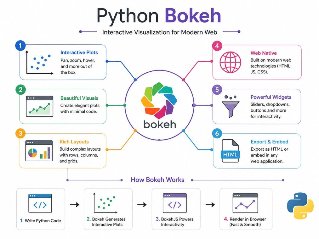
Bokeh is an open source Python library used for data visualization with Bokeh in Python that renders directly in web browsers. Unlike libraries that output static images, Bokeh generates plots as interactive HTML and JavaScript objects behind the scenes, so you never actually have to touch JS yourself.
At its core, Python Bokeh visualisation is built around the idea that charts should respond to user input. You can pan, zoom, select data points, and update plots live, all from Python code.
Benefit |
Why It Matters |
| Interactivity | Users explore data instead of just viewing it |
| Scalability | Handles large datasets without slowing down |
| Flexibility | Works for quick plots or full dashboards |
| Python native | No need to learn JavaScript or D3.js |
Most Python plotting libraries were built for static output first. Bokeh Python was designed with the browser in mind from day one, which is why it handles interactivity and live data so naturally.
Also Read: Introduction to Python Tutorials
Free Courses
Before you can start with bokeh python installation, make sure you have Python 3.7 or above installed on your system.
pip install bokeh This is the most common method and works across Windows, macOS, and Linux.
conda install bokeh If you already use Anaconda for data science work, this keeps your environment consistent and avoids version conflicts with other packages.
Once installed, confirm it worked by running:
import bokeh
print(bokeh.__version__)
If this prints a version number without errors, your Bokeh Python installation is complete and ready to use.
Data Science Courses to upskill
Explore Data Science Courses for Career Progression
IIIT Bangalore
Executive Post Graduate Certificate in Data Science & AIPlacement Assistance
Bokeh gives you two ways to build a chart, depending on how much control you want.
The bokeh.plotting interface is where most people start. It handles the small details automatically, like axes, grids, and default tools, so you can focus on the data.
from bokeh.plotting import figure, show
p = figure(title="Sample Plot")
p.line([1, 2, 3], [4, 6, 2])
show(p)
This is the fastest way to get a chart on screen and covers almost everything a beginner needs.
bokeh.models gives you direct access to every component of a plot, such as individual glyphs, axes, and tools.
It is more verbose but useful when you need fine grained control, for example building a custom widget layout or a reusable plotting template for your team.
Most Bokeh plotting python projects rely on bokeh.plotting for daily work and only drop down to bokeh.models when the high level interface cannot do what is needed.
Understanding tools like Bokeh is just the starting point. To turn these skills into a career in data science and AI, check out the Executive Diploma in Data Science & Artificial Intelligence from IIIT Bangalore by upGrad, and build hands-on expertise through real-world projects.
This Python Bokeh tutorial section walks you through the basic workflow, from importing to your first visible chart.
from bokeh.plotting import figure, show, output_notebook If you are working in Jupyter, add output_notebook() so plots render inline.
from bokeh.plotting import figure, show

p = figure(title="My First Plot", x_axis_label="X", y_axis_label="Y")
p.line([1, 2, 3, 4], [10, 15, 13, 17], legend_label="Trend", line_width=2)
show(p) The figure() function is the starting point of almost every Bokeh chart. It defines the canvas, sets axis labels, and lets you control size and title before you add any data.
A typical Bokeh python tutorial follows this pattern:
Glyphs are the visual building blocks of every Bokeh chart and understanding them makes the rest of the library much easier to follow.
A glyph is a shape used to represent data, such as a line, circle, bar, or patch. Every chart type in Bokeh is really just a specific glyph, or combination of glyphs, drawn on a figure.
When you call p.line() or p.circle(), you are adding a glyph to the figure object. Each glyph method accepts data coordinates plus styling options like color, size, and transparency.
This design is what makes Bokeh plotting in Python so flexible, since you can layer multiple glyphs on one chart to compare datasets side by side.
Subscribe to upGrad's Newsletter
Join thousands of learners who receive useful tips
Beyond glyphs, a few core concepts show up in almost every Python Bokeh project.
ColumnDataSource is Bokeh's way of managing data behind a plot. It stores your data as columns and lets you update the chart dynamically without redrawing it from scratch.
from bokeh.models import ColumnDataSource
source = ColumnDataSource(data=dict(x=[1, 2, 3], y=[4, 5, 6]))
p.circle('x', 'y', source=source) Bokeh lets you combine multiple charts into a single view using row(), column(), or gridplot(). This is useful when comparing metrics side by side on one dashboard.
The HoverTool shows extra information when a user moves their mouse over a data point, which is one of the most requested features in interactive reports.
from bokeh.models import HoverTool
p.add_tools(HoverTool(tooltips=[("X", "@x"), ("Y", "@y")])) These Python Bokeh examples cover the chart types you will use most often in real projects.
Best for showing trends over time, such as sales figures or sensor readings.
Good for comparing categories, like revenue across regions or products.
Useful for spotting relationships or clusters between two numeric variables.
Patch plots fill an area bound by a set of points, often used for shaded regions like confidence intervals or geographic boundaries.
Each of these Bokeh Python examples follows the same basic pattern: create a figure, add a glyph, then show or embed it.
Interactivity is the main reason people choose Python Bokeh over static plotting libraries.
Bokeh includes ready made widgets such as sliders, dropdowns, checkboxes, and buttons that let users control what a chart displays.
from bokeh.models import Slider
slider = Slider(start=0, end=10, value=1, step=0.1, title="Value") Callbacks connect a widget's action to a change in the plot. In Python, this usually means using CustomJS for browser side updates, or running a full Bokeh server for Python side logic.
For anything beyond a single static chart, the Bokeh server is where python bokeh really shows its strength.
The Bokeh server keeps a live Python process running behind your visualization, so charts can update based on real time events, user input, or new data arriving from a source.
A basic dashboard combines a few charts, some widgets, and a layout function, then runs through the command:
bokeh serve myapp.py Bokeh supports streaming new data into a ColumnDataSource without redrawing the entire chart, which makes it a solid choice for monitoring dashboards and live sensor feeds.
Many data scientists use python bokeh directly inside notebooks for quick exploration.
Call output_notebook() at the top of your notebook before showing any plot. This tells Bokeh to render output inline instead of opening a new browser tab.
If your chart does not appear, check these common causes:
Restarting the kernel after installing or updating Bokeh usually resolves most display issues.
Choosing between plotting libraries depends on what you are building.
Matplotlib is better for static, publication ready charts. Bokeh wins when you need interactivity or browser based output.
Plotly offers a similar interactive experience with a slightly gentler learning curve and more built in chart types out of the box. Bokeh gives you more control over server side behavior and large dataset streaming.
Factor |
Bokeh |
Plotly |
| Learning curve | Moderate | Easier for beginners |
| Server support | Built in Bokeh server | Requires Dash |
| Large datasets | Strong | Good, but heavier |
| Customization | High | High |
Dash is built on top of Plotly and is meant for full web applications. Bokeh server can also build apps, but Dash tends to be more structured for production grade web tools.
Before committing time to learning any library, it helps to weigh the trade offs honestly.
A few extra details that come up often once you start using Python Bokeh in real projects.
Use export_png() or export_svgs() to save a Bokeh chart as a static image. This requires installing Selenium and a web driver, since Bokeh renders through the browser engine.
Bokeh supports geographic plotting using tile providers and GeoJSONDataSource, which makes it possible to build interactive maps for location-based data without switching to a separate mapping library.
Also Read: Python Tutorial: Setting Up, Tools, Features, Applications, Benefits, Comparison
The official Bokeh documentation is the most reliable place to check syntax, since the library updates fairly often. It includes a full API reference, a gallery of examples, and a user guide that walks through every module in detail.
For anyone serious about learning Python Bokeh beyond the basics, going through the gallery examples is one of the fastest ways to pick up new techniques.
Python Bokeh gives you a practical way to move from flat, static charts to visualizations people can actually interact with. Once you understand figures, glyphs, and the ColumnDataSource, the rest of the library builds naturally on those same ideas.
Whether you are plotting a simple line chart or building a full dashboard with the Bokeh server, the workflow stays consistent and Python native throughout.
Want personalized guidance on Machine Learning and upskilling? Speak with an expert for a free 1:1 counselling session today.
Matplotlib is usually easier to pick up first since its syntax is simpler for static charts. Bokeh has a slightly steeper learning curve but is worth it once you need interactivity, hover tools, or live updating dashboards in your projects.
Yes. Many python bokeh charts run entirely standalone using bokeh.plotting, with interactivity handled through CustomJS callbacks in the browser. You only need the Bokeh server when your app requires live Python side logic or real time data updates.
Yes, Bokeh integrates smoothly with Pandas. You can pass a DataFrame directly into ColumnDataSource, and Bokeh will automatically map the columns, making it easy to plot data you have already cleaned or processed.
bokeh.plotting is the high level interface that handles most defaults automatically, while bokeh.models gives direct access to every component for advanced customization. Beginners typically start with bokeh.plotting and move to bokeh.models as their needs grow.
Yes. Bokeh charts can be embedded into HTML pages using components like file_html() or through a running Bokeh server, which makes it suitable for adding live visualizations to existing websites or internal tools.
Bokeh works well for visualizing model outputs, especially when you want users to explore predictions interactively, such as filtering by class or hovering over data points to see feature values alongside predictions.
You update the underlying ColumnDataSource using .stream() or .patch() methods, and the chart refreshes without a full page reload. This is commonly used for live dashboards connected to sensors or APIs.
This usually happens due to a missing show() call, a version mismatch between Bokeh and BokehJS, or a browser blocking local file rendering. Checking the browser console for errors often points directly to the cause.
Yes, using tile providers and GeoJSONDataSource, Bokeh can render interactive maps with location markers, boundaries, or heat overlays, which is useful for logistics, real estate, or regional analytics projects.
It depends on your use case. Bokeh gives more control over server side behavior and large dataset streaming, while Plotly offers a gentler learning curve and more built in chart types. Many data professionals learn both.
Yes, this is one of Bokeh's strongest features. Using the Bokeh server along with ColumnDataSource.stream(), you can build dashboards that update continuously as new data arrives, without manually refreshing the page.
730 articles published
Sriram K is a Senior SEO Executive with a B.Tech in Information Technology from Dr. M.G.R. Educational and Research Institute, Chennai. With over a decade of experience in digital marketing, he specia...
Speak with Data Science Expert
By submitting, I accept the T&C and
Privacy Policy
Start Your Career in Data Science Today
Top Resources
Executive Diploma
12 Months
Master's Degree
18 Months
Bootcamp
6 Months