All courses
Agentic AI
Agentic AI
Artificial Intelligence
Degree / Exec. PG

IIIT Bangalore
Executive Diploma in Machine Learning and AI
OPJ Global University
Master’s Degree in Artificial Intelligence and Data Science
Liverpool John Moores University
Master of Science in Machine Learning & AI
Golden Gate University
DBA in Emerging Technologies with Concentration in Generative AIExecutive Certificate

IIITB & IIM, Udaipur
Chief Technology Officer & AI Leadership Programme
IIIT Bangalore
Executive Programme in Generative AI for Leaders
upGrad | Microsoft
Gen AI Foundations Certificate Program from MicrosoftupGrad | Microsoft
Gen AI Mastery Certificate for Data AnalysisupGrad | Microsoft
Gen AI Mastery Certificate for Software DevelopmentupGrad | Microsoft
Gen AI Mastery Certificate for Managerial ExcellenceOffline Bootcamps

upGrad
Data Science and AI-MLDoctorate
For All Domains
IIITB & IIM, Udaipur
Chief Technology Officer & AI Leadership Programme
Swiss School of Business and Management
Global Doctor of Business Administration from SSBM
Edgewood University
Doctorate in Business Administration by Edgewood UniversityGolden Gate University
Doctor of Business Administration From Golden Gate University
Rushford Business School
Doctor of Business Administration from Rushford Business School, SwitzerlandGolden Gate University
Master + Doctor of Business Administration (MBA+DBA)-d9bdeff6165f4eb1ba2adcebde78e961.svg)
University of Waterloo
Chief Technology and AI Officer ProgramLeadership / AI
Golden Gate University
DBA in Emerging Technologies with Concentration in Generative AIMachine Learning
Machine Learning
Data Science
Degree / Exec. PG
O.P Jindal Global University
Master’s Degree in Artificial Intelligence and Data ScienceIIIT Bangalore
Executive Diploma in Data Science & AILiverpool John Moores University
Master of Science in Data ScienceExecutive Certificate
upGrad | Microsoft
Gen AI Foundations Certificate Program from MicrosoftupGrad | Microsoft
Gen AI Mastery Certificate for Data AnalysisupGrad | Microsoft
Gen AI Mastery Certificate for Software DevelopmentupGrad | Microsoft
Gen AI Mastery Certificate for Managerial ExcellenceupGrad | Microsoft
Gen AI Mastery Certificate for Content CreationOffline Bootcamps
upGrad
Data Science and AI-MLupGrad
Data AnalyticsMBA
Masters

Paris School of Business
Master of Science in Business Management and TechnologyO.P.Jindal Global University
MBA (with Career Acceleration Program by upGrad)Edgewood University
MBA from Edgewood UniversityO.P.Jindal Global University
MBA from O.P.Jindal Global UniversityGolden Gate University
Master + Doctor of Business Administration (MBA+DBA)Executive Certificate

IMT, Ghaziabad
Advanced General Management ProgramMarketing
Executive Certificate
Offline Bootcamps
upGrad
Digital MarketingManagement
Degree
O.P Jindal Global University
MSc in International Accounting & Finance (ACCA integrated)Paris School of Business
Master of Science in Business Management and Technology
Golden Gate University
Master of Arts in Industrial-Organizational PsychologyExecutive Certificate

IIM Kozhikode
Human Resource Analytics Course from IIM-KupGrad | Microsoft
Gen AI Foundations Certificate Program from MicrosoftEducation
Education

Northeastern University
Master of Education (M.Ed.) from Northeastern UniversityEdgewood University
Doctor of Education (Ed.D.)Edgewood University
Master of Education (M.Ed.) from Edgewood UniversityCertifications
Project Management
Certification

Knowledgehut
Leadership And Communications In ProjectsKnowledgehut
Microsoft Project 2007/2010-ae8d039bbd2a41318308f8d26b52ac8f.svg)
Knowledgehut
Financial Management For Project ManagersKnowledgehut
Fundamentals of Earned Value Management (EVM)Knowledgehut
Fundamentals of Portfolio ManagementKnowledgehut
Fundamentals of Program Management-35c169da468a4cc481c6a8505a74826d.webp&w=128&q=75)
Knowledgehut
CAPM® CertificationsKnowledgehut
Microsoft® Project 2016Certifications & Trainings
-7f4b4f34e09d42bfa73b58f4a230cffa.webp&w=128&q=75)
Knowledgehut
PMP® CertificationKnowledgehut
PMI-RMP® CertificationKnowledgehut
PMP Renewal Learning PathKnowledgehut
Oracle Primavera P6 V18.8Knowledgehut
Microsoft® Project 2013Knowledgehut
PfMP® Certification CourseKnowledgehut
Project Planning and MonitoringPrince2 Certifications

Knowledgehut
PRINCE2® FoundationKnowledgehut
PRINCE2® PractitionerKnowledgehut
PRINCE2 Agile Foundation and PractitionerKnowledgehut
PRINCE2 Agile® Foundation CertificationKnowledgehut
PRINCE2 Agile® Practitioner CertificationManagement Certifications
Knowledgehut
Project Management Masters Certification ProgramKnowledgehut
Change ManagementKnowledgehut
Project Management TechniquesKnowledgehut
Product Management Certification ProgramKnowledgehut
Project Risk Management- Study abroad
- Offline centres
- uGSOT - B.Tech
More


49. Variance in ML
Comprehensive Guide on Density Plot in Machine Learning
Did you know? In 1986, Bernard W. Silverman introduced kernel density estimation (KDE), and with it, density plots were born! Unlike rigid histograms that depend on bin choices, KDE uses smooth, continuous curves with Gaussian kernels, revealing the true shape and peaks of your data without any predefined limits. It’s like giving your data a clearer, more flexible voice!
Density plots are visualization tools in machine learning and data analysis. They help understand the distribution of continuous variables by providing a smooth, continuous data estimate. This makes them more insightful than histograms in many scenarios. By helping identify patterns, skewness, and outliers, density plots play a critical role in exploratory data analysis and model diagnostics.
Understanding density plots empowers data scientists and ML practitioners to make informed decisions during data preprocessing, feature engineering, and model evaluation.
This blog explores density plots, how they differ from histograms, when to use them, and how they support deeper insights in modern machine learning workflows.
Improve your machine learning skills with upGrad’s online AI and ML courses. They help you build real-world problem-solving abilities. Learn to design intelligent systems and apply algorithms in practical scenarios.
What is a Density Plot in ML? Key Insights
A density plot (or density graph) is a powerful visualization that helps you understand how data is distributed. Unlike a histogram, which uses discrete bars to show frequency, a density plot displays a smooth curve. This curve represents the probability distribution of a continuous variable, making it easier for you to spot trends, peaks, and anomalies.
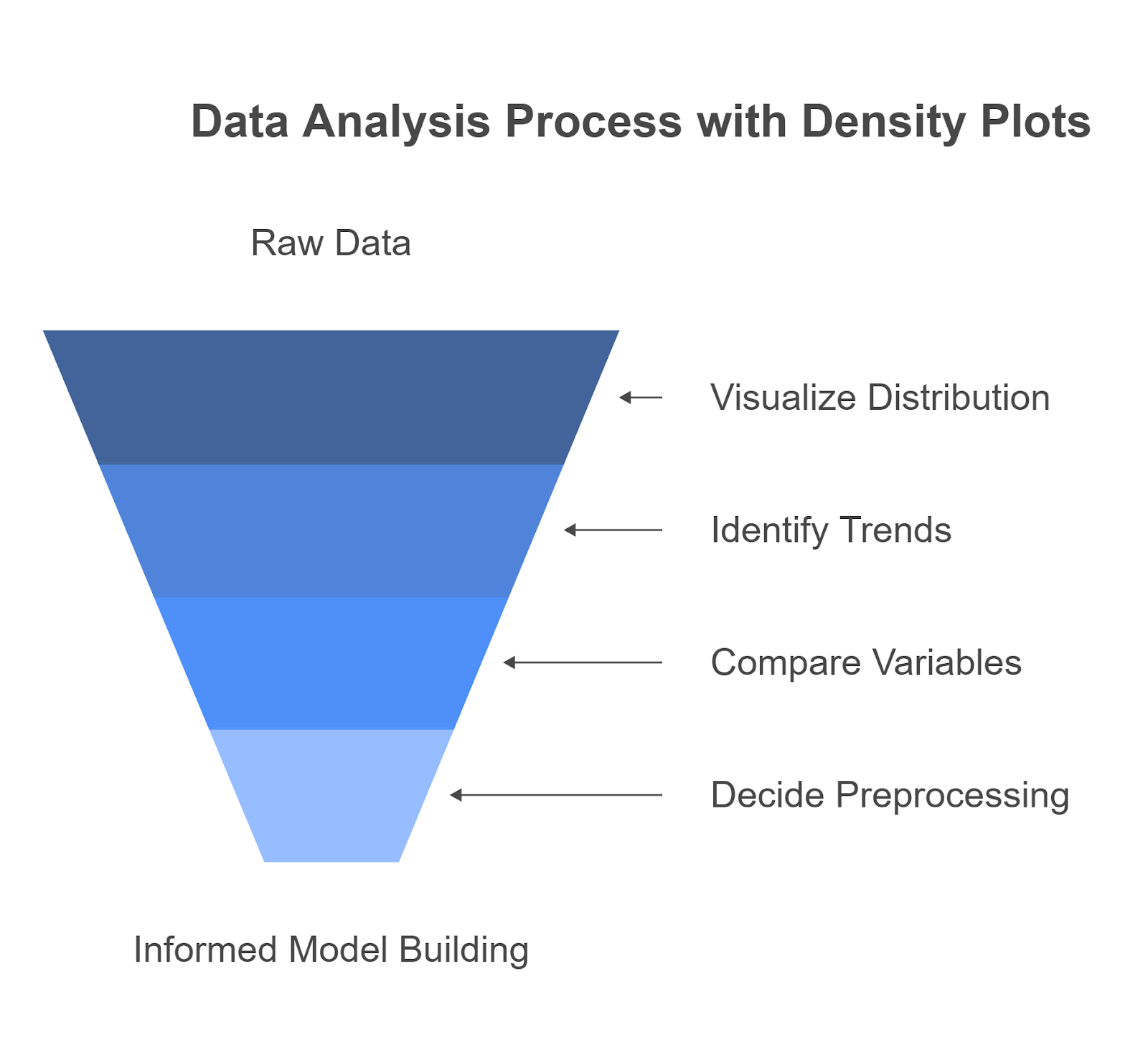
Understanding data distribution is key to working with machine learning models, especially in exploratory data analysis. A density graph helps you understand how features behave, compare variables across groups, and decide on the proper preprocessing techniques.
If you want to build strong foundations in machine learning and data science, consider exploring upGrad’s programs:
- Generative AI Foundations Certificate Program
- Master’s Degree in Artificial Intelligence and Data Science
- Executive Diploma in Machine Learning and AI with IIIT-B
These courses cover real-world projects where visualizing data effectively with tools like density plots is critical.
How Does a Density Plot Visualize Data?
-5f848f103cb641c588952398d78f3142.png)
A density plot visualizes data by estimating the distribution of a continuous variable and displaying it as a smooth curve. Each point on the curve represents the estimated probability of a value occurring in that range. Unlike histograms, which divide the data into bins, a density graph uses kernel smoothing to create a continuous, flowing line.
This makes it easier for you to:
- See where data is concentrated or sparse
- Identify outliers, skewness, or gaps.
- Compare distributions between multiple groups without clutter.
Example:
A density plot lets you compare distributions using smooth curves if you're analyzing income data from two regions. You can easily see where most incomes fall, detect differences in average earnings, and identify which region shows more variability. Unlike histograms, density plots reveal subtle patterns that may indicate economic disparity, seasonal trends, or urban-rural differences.
Also Read: Top 15 Data Visualization Project Ideas: For Beginners, Intermediate, and Expert Professionals
Characteristics of a Density Plot
A density plot offers a more refined view of how values are distributed across a continuous variable. It focuses on estimating the probability density rather than counting frequencies. This helps you better understand the data’s shape and distribution. It’s handy when comparing complex datasets, like customer spending across regions, sensor readings from IoT systems, or test scores from different student groups.
- Continuous Output: The plot displays a smooth, continuous curve instead of discrete bars.
- Area Equals One: The total area under the curve is always 1, representing a complete probability distribution.
- Bandwidth Sensitive: The shape of the curve depends on bandwidth (smoothing parameter). Smaller bandwidth captures more detail; larger bandwidth smoothens the curve.
- Supports Multiple Distributions: You can overlay several density plots to compare data distributions across groups.
Example: Imagine you're analyzing trip durations on traffic data. A density plot lets you compare the duration for weekdays vs. weekends on the same graph, clearly showing if one distribution is wider, has more peaks, or skews differently.
Also Read: Top 50 IoT Projects For all Levels in 2025 [With Source Code]
Why Choose Density Plots Over Histograms?
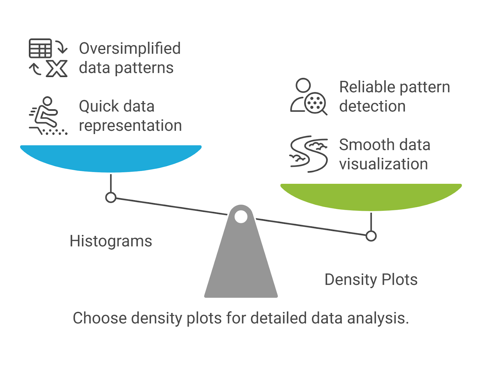
Histograms are quick to create, but they often oversimplify your data. They rely on bin choices that can distort patterns, especially when dealing with skewed or complex distributions. Density plots solve this by providing a smooth, continuous view of your data’s underlying structure, making them a more reliable tool for comparison, transformation analysis, and pattern detection in machine learning workflows.
Here are the key factors why you should choose density plots over histograms to get a clearer, more accurate understanding of your data’s distribution.
1. Smoothness and Continuity
Histograms often create jagged, stepped visuals, especially when the data is sparse or unevenly distributed. The shape of a histogram can vary drastically depending on how you choose the bin width, which can lead to misleading interpretations of your data. A density plot, on the other hand, gives you a smooth, continuous curve that accurately represents the underlying trends in your data.
How It Helps You: A smooth density curve lets you immediately identify patterns that a histogram may obscure, making it easier to detect trends over time, shifts in distribution, or structural changes in the data.
Example: Imagine you're analyzing ride fare data. When you apply a log transformation to the fare amounts, a histogram with fixed bins may not clearly show how the distribution is being normalized. A density plot, however, will reveal how the transformation has made the distribution more symmetric and closer to a standard curve, making it easier to spot changes in user behavior or anomalies.
2. Variable Bin Widths
Histograms are inherently dependent on the choice of bin size. If you set the bin width too large, you may lose valuable data details. If the bin width is too small, your histogram might become too noisy or misleading. This inconsistency is avoided in a density plot because it uses kernel smoothing, which adapts to the data structure and automatically adjusts the width and the number of "bins."
How It Helps You: You don’t need to worry about tuning the bin size or making subjective decisions about the best width. The smooth curve of a density plot automatically provides an accurate representation of the data without forcing you into arbitrary choices. This is especially useful when comparing data across different groups with varying characteristics.
Example: When analyzing temperature data across multiple cities, histograms might lead to different interpretations depending on the bin size chosen. However, a density plot will give you a consistent, continuous visualization of how temperature distributions compare across cities, without losing essential details due to binning.
3. Enhanced Multimodal Visualization
One of the most significant advantages of a density plot is its ability to visualize multimodal distributions, where there are multiple peaks or clusters in the data. A histogram might miss these nuances because it groups data into fixed bins, which could lead to the merging of distinct groups. Density plots allow you to easily identify multiple peaks, signaling the presence of different subgroups or behaviors.
How It Helps You: A density plot can help you understand complex data structures by visualizing multiple modes. It allows you to identify distinct groups in the data, which may represent different customer segments, user behaviors, or operational patterns. This information is critical for segmentation, targeted marketing, or anomaly detection tasks.
Example: Consider transaction data from an online retail platform. If you generate a density plot of purchase amounts, you may observe two distinct peaks: one for low-cost, frequent purchases and another for high-cost, infrequent purchases. This helps you identify different customer segments, which would be difficult to detect using a histogram that might group these purchases into a single range.
Also Read: Anomaly Detection and Outlier Detection: Techniques, Tools & Use Cases
4. Kernel Density Estimation
The core method behind a density plot is Kernel Density Estimation (KDE). KDE estimates the probability density function of the variable by placing a small, smooth "bump" (or kernel) over each data point. These bumps overlap and combine to form a smooth curve representing the data’s overall distribution. This approach provides a far more detailed, accurate picture of how values are spread compared to counting the frequency of data points in bins.
How It Helps You: KDE provides a finer, more nuanced view of the data than histograms. Instead of just counting occurrences, KDE smooths the data and shows you where values are more concentrated, how they spread out, and where gaps or outliers may occur. This is crucial when performing tasks like anomaly detection, detecting skew, or understanding underlying patterns in your data.
Example: If you're analyzing product prices in an e-commerce dataset, KDE allows you to see whether the price distribution is uniform, skewed, or bimodal. You might find that most products are clustered in the low price range, but there’s another peak in the high price range. With KDE, you get a much clearer picture of the pricing than you would from a histogram that lumps the data into bins that could hide such insights.
Also Read: Bar Chart vs. Histogram: Which is Right for Your Data?
Now that you understand a density plot and why it matters in machine learning, let’s look at how to create one and make sense of its shape.
Creating & Interpreting a Density Curve
Creating a density plot helps you better understand the distribution of your data. A continuous probability curve represents how data points are spread over a range. Here's how to create and interpret a density curve:
Choose the Right Data
First, select the continuous data you want to visualize. For example, you could use data from customer transactions at a local shop, such as the time spent on purchases, or temperature readings across various locations in a city. A density plot is ideal for these types of data.
Imagine you have a dataset that shows the height (in inches) of 20 different plants in a particular field. You have the following data: 4, 5, 5, 6, 6, 6, 6, 7, 7, 7, 7, 7, 8, 8, 8, 9, 9, 9, 2, 2.
If you plotted this data as a histogram, you'd see the relative frequency of each height grouped in bars. Instead of bars, imagine a smooth curve flowing over these values. That’s your density plot. It gives you a clearer view of where most data points lie and how they are spread out.
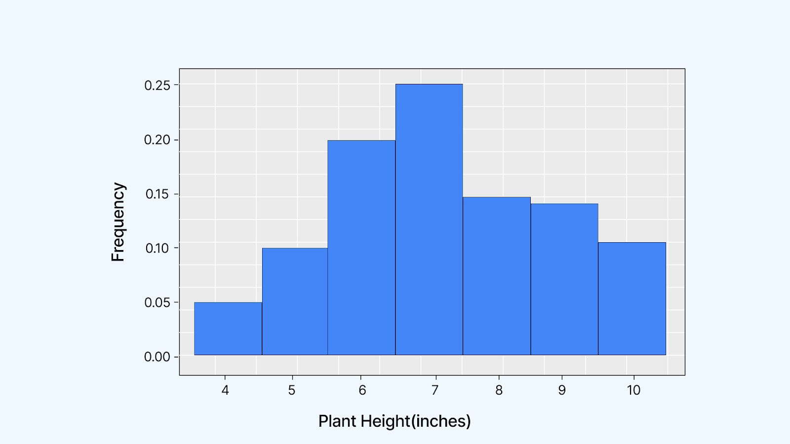
On the x-axis, you’ll see the actual data values, and the y-axis shows their relative frequencies. For example, if the value 7 appears 5 times in your dataset of 20 plant heights, its relative frequency is 5 ÷ 20 = 0.25 or 25%.
If you create a density curve instead of a histogram, you’re not just counting how often values appear. You’re capturing the overall shape of how your data is spread. This curve gives you a smoother, more intuitive view of where your data is concentrated.
-a77a85f801b843c499c928023c6ae85d.png)
The curve rises highest near the center because that’s where most of your data points are concentrated. It drops near the edges since fewer plants in your dataset have extreme values, like 4 or 10 inches.
Advance your career with UpGrad’s Master's in Data Science from Liverpool John Moores University. In 18 months, you'll gain expertise in data analysis, machine learning, and AI. Earn a globally recognized degree and elevate your career with UpGrad today.
Also Read: How does Unsupervised Machine Learning Work?
How to Interpret a Density Plot?
Once you’ve created a density plot, learning how to read it is the next step. The curve's shape, peaks, spread, and tails all give you important clues about your data. Here's how you can break it down:
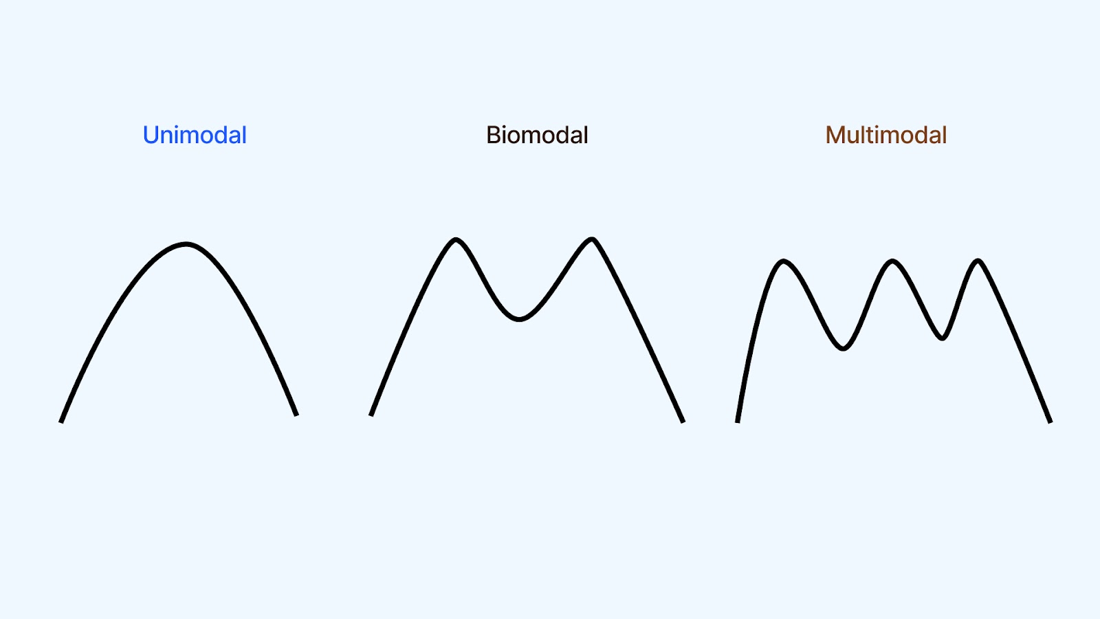
1. Shape
The shape of the density curve tells you a lot about the distribution of your data. The curve can be:
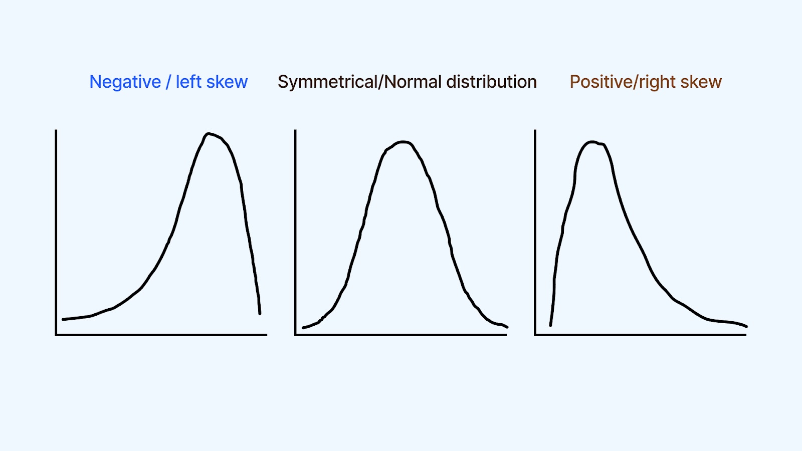
- Symmetrical: The data is evenly distributed around the central value, with similar frequencies of observations on both sides.
- Skewed: Asymmetrical, with a tail extending more to one side than the other. Positive skewness (right-skewed) means the tail extends to the right, while negative skewness (left-skewed) means the tail extends to the left.
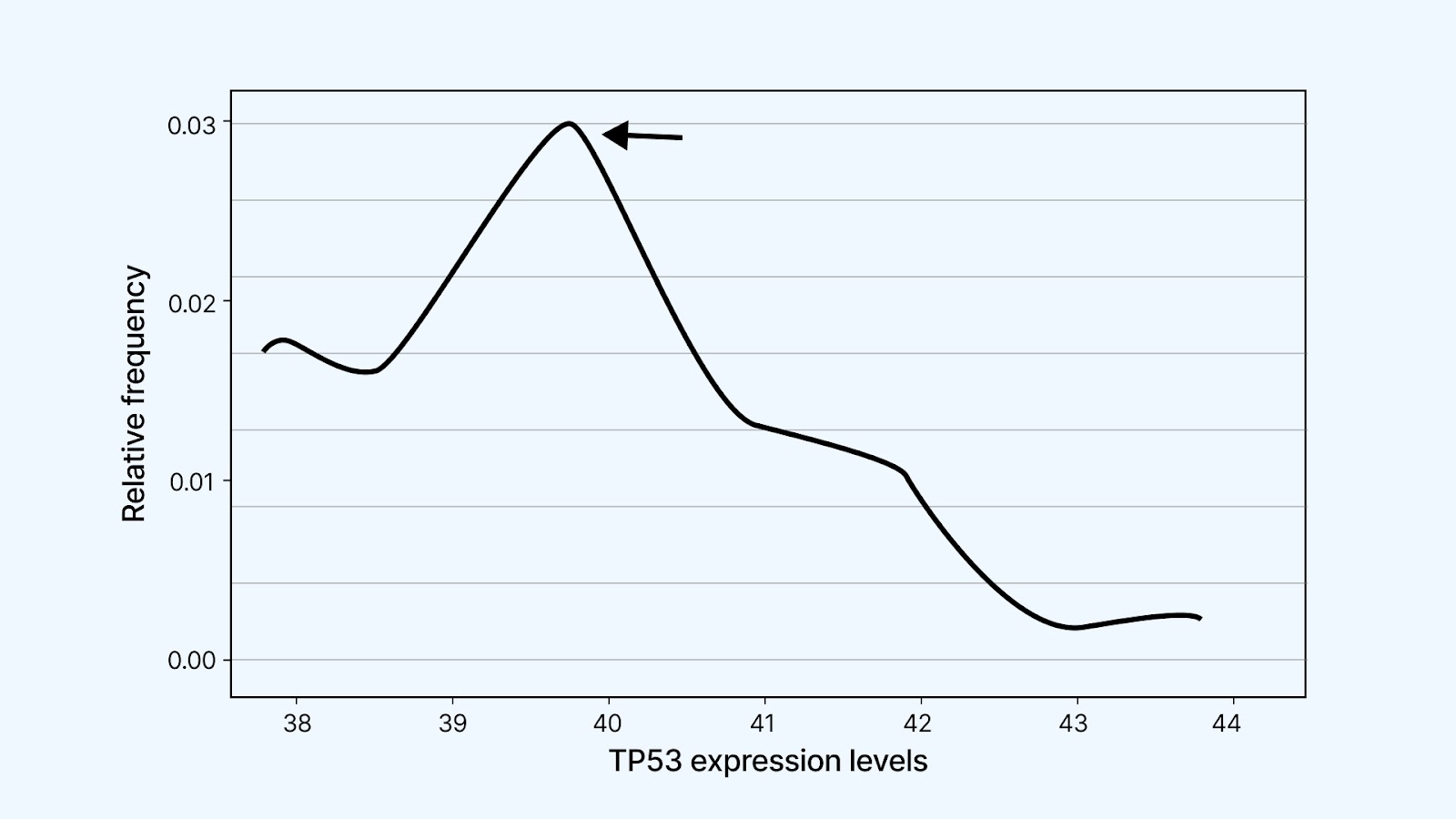
A density curve can be unimodal if it has one clear peak, bimodal if there are two, or multimodal when multiple peaks appear. These peaks usually point to distinct subgroups or clusters within your data.
Let’s say you're studying TP53 gene expression in cancer tissue. You might notice three separate peaks in the density plot. This tells you there could be three underlying groups of cells:
- One group shows very low TP53 expression, possibly due to a deletion, where one gene copy is missing.
- Another group has normal expression levels, representing typical, healthy cell behavior.
- The third group shows high TP53 expression, possibly resulting from DNA duplication events where the gene is overexpressed.
This insight is crucial. It helps you detect biological heterogeneity in your sample, which can influence diagnosis or treatment decisions. These subgroups might remain hidden in the raw numbers without the density plot.
Also Read: Clustering vs Classification: What is Clustering & Classification
2. Central Tendency
The highest point of the density curve shows you where most of your data points are concentrated. This point represents the mode, your dataset's most frequently occurring value. Unlike the mean or median, which you have to calculate, the mode is visible directly on the plot as the peak of the curve.
This helps you quickly understand what’s typical or standard in your data. For example, if you’re analyzing delivery times for an e-commerce app, the peak might show that most deliveries happen around 30 minutes. That gives you a baseline for performance, helping you set expectations or detect if future batches are shifting away from the norm.
3. Variability
-f087b8645de04466bbe836bda1e775ef.png)
Now, take a look at the width of the curve. This tells you how much your data varies. If the curve is broad, your values are spread out, like when different users spend drastically different amounts of time on your app. A narrow curve, on the other hand, means most values are closely packed together, showing more consistency.
Understanding variability helps you measure how stable or unpredictable your data is. If you're seeing a wide spread in delivery times, for example, it may signal issues with logistics or external delays. A tighter curve would suggest your system is running smoothly with minimal fluctuation.
4. Tails and Outliers
-3b8c4dd9790b4a43a323a9a805248f56.png)
The ends of the curve, known as tails, show you how often extreme values appear in your dataset. If you notice a long tail stretching to one side, it usually signals the presence of outlier values that are far from the rest of your data.
For example, if you're analyzing household electricity usage and see a long tail on the right side of your density plot, it might mean that a few homes are consuming significantly more electricity. This could be due to the use of industrial equipment or commercial-grade appliances.
Identifying these tails helps you spot anomalies, perform data quality checks, and decide whether specific values need closer inspection or removal. It can also reveal whether your data distribution is skewed, which is essential before choosing a machine learning model or statistical test.
5. Area Under the Curve
-4b1bc489bc7e4967a634ae2a7aac4d45.png)
This part helps you understand probabilities within your data. When you look at a density plot, the area under the curve between two points on the x-axis shows the likelihood of a value falling within that range.
For example, if you’re analyzing delivery times and the area under the curve between 10 and 20 minutes is 70 percent, 70 percent of your deliveries are completed in that time frame.
This helps you answer questions like: “What’s the chance a delivery takes less than 15 minutes?” or “How often do deliveries exceed 25 minutes?”
The total area under the curve is always 100 percent, because it represents the full range of possible values in your dataset. Understanding this area lets you estimate likelihoods and make data-backed decisions based on how your values are distributed.
6. Comparison Between Groups
You can use multiple density plots to compare how different groups behave across the same variable. For example, plotting both curves on the same graph helps you do more than visualize the data if you're analyzing sales data from two regions.
You’ll quickly see which region has a higher average, whether one region has more variability, or if either shows unusual values. This comparison helps you identify customer behavior, purchasing patterns, or performance differences across areas without sifting through raw data or summary tables.
Overlaying density plots is especially useful when evaluating a feature's behavior under different conditions or segments. It gives you both a visual and statistical perspective to guide deeper analysis.
Ready to start your programming journey but not sure where to begin? UpGrad’s free Python course for beginners teaches core concepts like loops, data structures, and object-oriented programming step by step. Build confidence with hands-on coding so you’re not stuck watching endless tutorials without real progress.
Now that you understand how to create and interpret a density curve, let’s look at how you can plot a density plot in Python step by step.
Plotting a Density Plot in Python
To plot a density graph in Python, you can use libraries like Seaborn and Matplotlib, which are widely used for data visualization. These tools help you create smooth and informative plots with minimal code.
Let’s walk through how you can plot a density plot step by step.
Step 1: Install Required Libraries
If you haven’t already installed Seaborn and Matplotlib, run:
pip install seaborn matplotlibStep 2: Import Libraries
import seaborn as sns
import matplotlib.pyplot as plt
import numpy as np
Step 3: Create or Load Your Data
Load the 'tips' dataset, a built-in dataset in Seaborn. It contains information about restaurant bills and tips. Each row represents a customer’s dining experience, including total bill, tip amount, gender, and more. You can use your dataset or simulate some values. Here's an example using random data:
data = sns.load_dataset('tips')
Step 4: Plot the Density Graph
import seaborn as sns
import matplotlib.pyplot as plt

data = sns.load_dataset('tips')
sns.kdeplot(data['total_bill'], shade=True)
plt.title('Density Plot of Total Bill')
plt.show()
Code Explanation: This code helps you visualize how total bill values are distributed in the restaurant dataset. It's useful when you're trying to understand common spending patterns, such as whether most customers spend between ₹200 and ₹500 or if there are unusual spikes.
- data['total_bill'] selects the total bill amounts.
- kdeplot() generates a smooth density graph to show how these bill amounts are distributed.
- shade=True fills the area under the curve, making the plot easier to interpret visually.
- plt.title() sets the title of the plot.
- plt.show() displays the plot in your output window.
Output:
-50df5a9d603e4882b4a1f5fe612ff8d1.png)
Struggling with data manipulation and visualization? Check out upGrad’s free Learn Python Libraries: NumPy, Matplotlib & Pandas course. Gain the skills to handle complex datasets and create powerful visualizations. Start learning today!
Now that you’ve seen how to plot a density graph in Python, it’s essential to understand its benefits and where it may fall short.
Benefits and Limitations of Density Plot
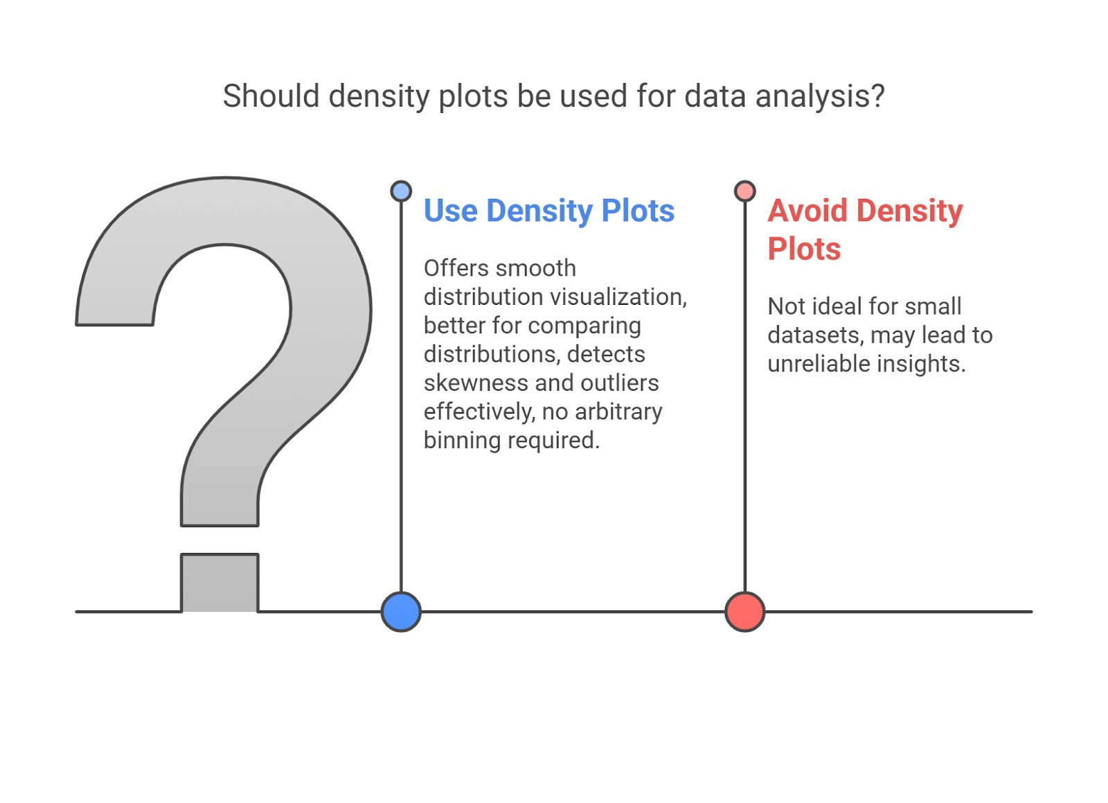
When analyzing continuous numerical data, density plots offer clarity that traditional histograms sometimes miss. But before using them in your analysis workflow, you should understand their strengths and where they may fall short.
Here are some benefits and limitations of using density plots in machine learning and data analysis:
Benefits:
- Smooth Distribution Visualization:
- Unlike histograms, density plots show a smooth curve that provides a clear view of data distribution, without worrying about bin sizes.
- Example: In a retail analysis, a density plot clearly shows that most customers spend between ₹500–₹700, with a secondary peak around ₹1000, which histograms may miss due to bin settings.
- Better for Comparing Multiple Distributions:
- You can overlay multiple density plots to compare different datasets or categories.
- Example: A marketing team uses density plots to compare customer engagement levels before and after a campaign, spotting more significant changes in behavior.
- Detects Skewness and Outliers Effectively:
- Density plots reveal the overall shape of the data, making it easier to identify skewness or detect outliers.
- Example: A bank uses density plots to visualize loan repayment amounts. It quickly shows that most loans have early repayments, but some show extremely late payments.
- No Arbitrary Binning Required:
- Unlike histograms, which require you to choose bin sizes, density plots automatically adjust their smoothing, making them more flexible.
- Example: A data scientist working with e-commerce cart values doesn’t have to choose bin widths for transaction amounts; the density plot adapts naturally to the data distribution.
Limitations:
- Not Ideal for Small Datasets:
- When you have limited data, density plots may not provide reliable insights due to unstable estimates.
- Example: A small startup with only 50 customer transactions finds the density plot too noisy and inconsistent, leading to poor decision-making.
- Requires Proper Bandwidth Tuning:
- The smoothness of the density curve depends on the bandwidth setting. If the bandwidth is too small, the plot may appear jagged; essential details may be smoothed out if it is too large.
- Example: An HR team is analyzing employee tenure with a wide bandwidth, but fails to notice a small but significant group of employees with a tenure of exactly 3 years.
- Can Be Hard to Interpret for Non-Experts:
- Density plots might confuse you if you are unfamiliar with statistical visualizations, primarily if multiple curves exist.
- Example: While presenting customer spending patterns, a product manager finds that the team struggles to understand the significance of overlapping curves in the density plot.
- Overlapping Curves Can Be Confusing:
- When comparing multiple groups, density plots can become cluttered, making it harder to differentiate between distributions.
- Example: A fintech company comparing spending habits across age groups experiences difficulty interpreting overlapping density plots of the 18-24 and 25-34 age groups without clear color distinctions.
Also read: 5 Significant Benefits of Artificial Intelligence [Deep Analysis]
How Can upGrad Help You Become an Expert in Machine Learning?
Density plots help you go beyond raw numbers and uncover hidden patterns in continuous data. They make detecting skewness, spotting outliers, and comparing multiple distributions in one frame easier.
In machine learning workflows, you can use density plots during exploratory data analysis (EDA) to fine-tune feature selection and improve your model’s understanding of underlying patterns. Whether you're building churn models or analyzing sensor data, density plots let you make more informed decisions by visualizing the shape of your data.
If you're looking to strengthen your practical ML and data visualization skills, these additional courses may help you stay relevant and job-ready.
- Advanced Generative AI Certification Course
- Executive Program in Generative AI for Leaders
- Artificial Intelligence in the Real World
- Professional Certificate Program in AI and Data Science
Curious which courses can help you gain expertise in AI in 2025? Contact upGrad for personalized counseling and valuable insights. For more details, you can also visit your nearest upGrad offline center.
FAQs
1. What Python libraries are best suited for creating density plots?
The most developer-friendly libraries for density plots are Seaborn and Matplotlib. With Seaborn’s kdeplot() or displot(kind='kde'), you can quickly create smooth and insightful visualizations directly from a Pandas DataFrame. These functions are intuitive, especially for EDA tasks. For interactive dashboards, Plotly is ideal. It allows zooming, hovering, and dynamic updates, which is helpful in data apps built with Streamlit or Dash.
2. What are bandwidth and kernel functions in KDE, and how do they affect the density plot?
Bandwidth determines how much smoothing is applied. If the bandwidth is too low, your plot becomes noisy with too many local peaks (overfitting). Too high, and you lose critical variation (underfitting). Kernel functions define how each data point contributes to the estimate. Gaussian is the default, but you can explore others like Epanechnikov if you're tuning performance for large datasets. In Seaborn, use bw_adjust to experiment and find the right balance.
3. Can I use density plots for feature engineering in ML models?
Absolutely. By plotting density curves for each class label, you can detect which features show clear separation and are more helpful to models like logistic regression or tree-based classifiers. For instance, if salary shows distinct density curves for churned vs non-churned users, it’s likely a strong predictor. You can also identify features with skewed distributions that may require normalization or transformation.
4. How do I interpret overlapping density plots in multi-class problems?
When plotting a feature across multiple classes (e.g., user types: Free, Premium, Trial), check how the KDE curves align. High overlap means the feature doesn’t differentiate between classes. Minimal overlap suggests strong class separation. This visual validation is beneficial before feeding the data into models, as it acts as a quick diagnostic of feature quality.
5. Are density plots applicable to categorical data?
No, density plots assume a continuous range of values. However, you can segment your continuous variable by a categorical variable (e.g., plot salary KDE by department). This helps you analyze how distributions shift across categories. However, to visualize raw categorical features, use count plots or bar charts, which are more appropriate.
6. Can density plots be used in real-time or interactive dashboards?
Yes. Tools like Plotly or Altair allow real-time rendering of density plots that respond to user inputs (filters, sliders). In a Streamlit app, for instance, you can build an input-based density visualization that updates as users filter by city, product, or time window. This is extremely useful in operations dashboards or customer analytics platforms.
7. What common pitfalls should one avoid when using density plots in ML?
One mistake is plotting KDE on tiny datasets, which gives misleading curves due to low sampling. Also, using the default bandwidth might either over-smooth or clutter the graph. Another issue is overlaying too many curves, which makes interpretation hard. Stick to 2–4 class comparisons, and always visually validate bandwidth tuning using bw_adjust or cross-validation if programmatically done.
8. How do density plots integrate into ML pipelines programmatically?
While not part of model training, you can integrate KDE visualizations into automated EDA flows using Sweetviz, Pandas-Profiling, or Great Expectations. You can also extract insights (e.g., whether the feature is skewed or multimodal) to decide transformation logic automatically. Developers often log these plots to MLFlow or integrate them into notebook-based reporting layers. While not part of model training, you can integrate KDE visualizations into automated EDA flows using Sweetviz, Pandas -Profiling, or Great Expectations. You can also extract insights (e.g., whether the feature is skewed or multimodal) to decide transformation logic automatically. Developers often log these plots to MLFlow or integrate them into notebook-based reporting layers.
9. Can density plots highlight feature interactions or correlations?
While standard (single-variable) KDEs focus on individual features, bivariate KDE plots (like sns.kdeplot(x=feature1, y=feature2)) allow you to visualize how two variables relate to each other. This helps you spot interactions or clustering patterns across different classes. For instance, in fraud detection, you might see that specific transaction amounts and times cluster differently for fraudulent vs legitimate cases. This kind of visual can guide feature engineering or model refinement.
10. Are density plots suitable for model monitoring or drift detection?
Yes. Plot the KDE of a feature in the training data vs live input to see if its distribution has shifted (concept drift). If the live data’s KDE curve looks very different, you may need to retrain or investigate data pipeline issues. This lightweight alternative to statistical drift tests works well as part of your monitoring dashboard.
11. How can density plots support data imputation strategies?
KDE helps you visually validate imputed data. Using mean, median, or model-based methods, you can see if the new values blend naturally or create sharp spikes by plotting the feature's distribution before and after imputation. If imputed values break the smooth shape of the curve, it could signal that your imputation method is introducing bias or artificial patterns, which might confuse your model later.


upGrad Learner Support
Talk to our experts. We are available 7 days a week, 10 AM to 7 PM
Indian Nationals
Foreign Nationals
Disclaimer
The above statistics depend on various factors and individual results may vary. Past performance is no guarantee of future results.
The student assumes full responsibility for all expenses associated with visas, travel, & related costs. upGrad does not .