All courses
Agentic AI
Agentic AI
Artificial Intelligence
Degree / Exec. PG

IIIT Bangalore
Executive Diploma in Machine Learning and AI
OPJ Global University
Master’s Degree in Artificial Intelligence and Data Science
Liverpool John Moores University
Master of Science in Machine Learning & AI
Golden Gate University
DBA in Emerging Technologies with Concentration in Generative AIExecutive Certificate

IIITB & IIM, Udaipur
Chief Technology Officer & AI Leadership Programme
IIIT Bangalore
Executive Programme in Generative AI for Leaders
upGrad | Microsoft
Gen AI Mastery Certificate for Software DevelopmentupGrad | Microsoft
Gen AI Mastery Certificate for Managerial ExcellenceOffline Bootcamps

upGrad
Data Science and AI-MLDoctorate
For All Domains
IIITB & IIM, Udaipur
Chief Technology Officer & AI Leadership Programme
Swiss School of Business and Management
Global Doctor of Business Administration from SSBM
Edgewood University
Doctorate in Business Administration by Edgewood UniversityGolden Gate University
Doctor of Business Administration From Golden Gate University
Rushford Business School
Doctor of Business Administration from Rushford Business School, Switzerland-d9bdeff6165f4eb1ba2adcebde78e961.svg)
University of Waterloo
Chief Technology and AI Officer ProgramLeadership / AI
Golden Gate University
DBA in Emerging Technologies with Concentration in Generative AIMachine Learning
Machine Learning
Data Science
Degree / Exec. PG
O.P Jindal Global University
Master’s Degree in Artificial Intelligence and Data ScienceIIIT Bangalore
Executive Diploma in Data Science & AILiverpool John Moores University
Master of Science in Data ScienceExecutive Certificate
upGrad | Microsoft
Gen AI Foundations Certificate Program from MicrosoftupGrad | Microsoft
Gen AI Mastery Certificate for Data AnalysisupGrad | Microsoft
Gen AI Mastery Certificate for Software DevelopmentupGrad | Microsoft
Gen AI Mastery Certificate for Managerial ExcellenceupGrad | Microsoft
Gen AI Mastery Certificate for Content CreationOffline Bootcamps
upGrad
Data Science and AI-MLMBA
Masters

Liverpool School of Business
Master of Business Administration from Liverpool Business School with IIM Udaipur Certification
Paris School of Business
Master of Science in Business Management and TechnologyO.P.Jindal Global University
MBA (with Career Acceleration Program by upGrad)Edgewood University
MBA from Edgewood UniversityO.P.Jindal Global University
MBA from O.P.Jindal Global UniversityExecutive Certificate

IMT, Ghaziabad
Advanced General Management ProgramMarketing
Executive Certificate
upGrad | Microsoft
Gen AI Foundations Certificate Program from MicrosoftupGrad | Microsoft
Gen AI Mastery Certificate for Content CreationOffline Bootcamps
upGrad
Digital MarketingManagement
Degree
O.P Jindal Global University
MSc in International Accounting & Finance (ACCA integrated)
Golden Gate University
Master of Arts in Industrial-Organizational PsychologyExecutive Certificate

IIIT-B & IIM, Udaipur
Chief Technology Officer & AI Leadership ProgrammeIIIT-B & IIM, Udaipur
Chief Data and AI Officer Programme
IIM Kozhikode
Human Resource Analytics Course from IIM-KupGrad | Microsoft
Gen AI Foundations Certificate Program from MicrosoftEducation
Education

Northeastern University
Master of Education (M.Ed.) from Northeastern UniversityEdgewood University
Doctor of Education (Ed.D.)Edgewood University
Master of Education (M.Ed.) from Edgewood UniversityCertifications
Project Management
Certification

Knowledgehut
Leadership And Communications In ProjectsKnowledgehut
Microsoft Project 2007/2010-ae8d039bbd2a41318308f8d26b52ac8f.svg)
Knowledgehut
Financial Management For Project ManagersKnowledgehut
Fundamentals of Earned Value Management (EVM)Knowledgehut
Fundamentals of Portfolio ManagementKnowledgehut
Fundamentals of Program Management-35c169da468a4cc481c6a8505a74826d.webp&w=128&q=75)
Knowledgehut
CAPM® CertificationsKnowledgehut
Microsoft® Project 2016Certifications & Trainings
-7f4b4f34e09d42bfa73b58f4a230cffa.webp&w=128&q=75)
Knowledgehut
PMP® CertificationKnowledgehut
PMI-RMP® CertificationKnowledgehut
PMP Renewal Learning PathKnowledgehut
Oracle Primavera P6 V18.8Knowledgehut
Microsoft® Project 2013Knowledgehut
PfMP® Certification CourseKnowledgehut
Project Planning and MonitoringPrince2 Certifications

Knowledgehut
PRINCE2® FoundationKnowledgehut
PRINCE2® PractitionerKnowledgehut
PRINCE2 Agile Foundation and PractitionerKnowledgehut
PRINCE2 Agile® Foundation CertificationKnowledgehut
PRINCE2 Agile® Practitioner CertificationManagement Certifications
Knowledgehut
Project Management Masters Certification ProgramKnowledgehut
Change ManagementKnowledgehut
Project Management TechniquesKnowledgehut
Product Management Certification ProgramKnowledgehut
Project Risk Management- Study abroad
- Offline centres
- uGSOT - B.Tech
More
%20(2)-db0b6f38da9c485faf76e366793c9b9e.webp&w=128&q=75)


48. Variance in ML
Data Understanding for Machine Learning: Techniques and Best Practices
Did you know that in 2024, the world generated a remarkable 149 zettabytes of data, and this figure is projected to reach 175 zettabytes by the end of 2025? This rapid data growth emphasizes the critical need for advanced data understanding techniques and machine learning to efficiently manage and extract valuable insights from vast information. |
Data understanding in machine learning is the crucial first step before preparing or modeling any dataset. It involves thoroughly exploring and analyzing the data to ensure that it's clean, structured, and ready for modeling. By understanding the dataset's characteristics, you can make informed decisions about how to preprocess it, which algorithms to choose, and how to interpret the results. Without a clear foundation of data understanding, ML models are at risk of being built on flawed assumptions, leading to inaccurate or unreliable predictions.
In this blog, you’ll explore the importance of data understanding, learn how to avoid common mistakes, and discover practical techniques to prepare your data for machine learning.
Looking to strengthen your data understanding for machine learning? upGrad’s Artificial Intelligence & Machine Learning - AI ML Courses equip you with the skills to interpret, prepare, and apply data effectively. Learn how to turn raw information into actionable insights that drive better ML outcomes.
What Is Data Understanding in Machine Learning? Definition & Scope
Data understanding refers to the process of familiarizing oneself with the dataset's structure, distribution, and quality. It's a crucial phase in CRISP-DM and any ML pipeline. Unlike data cleaning or feature engineering, it focuses on exploring and interpreting raw data to identify patterns, anomalies, or gaps. This helps prevent model failures by identifying issues with the data early on.
 What Is Data Understanding in Machine Learning_ Definition & Scope - visual selection-1757cbf9dbc24e50a93b41ec727bab04.png)
Below are a few key aspects of data understanding:
- Understands data structure, types, and relationships.
- Analyzes distribution to detect outliers or skew.
- Assesses data quality, such as missing and inconsistent values.
- Distinct from cleaning or feature engineering.
- Helps prevent model failures by spotting issues such as data leakage, label inconsistency, or target leakage early in the pipeline.
To strengthen your capabilities in this essential phase of machine learning, consider the following courses that offer practical tools and techniques for mastering data understanding.
- Master’s Degree in Artificial Intelligence and Data Science
- Generative AI Mastery Certificate for Data Analysis
- Executive Diploma in Machine Learning and AI with IIIT-B
Understand the Data Before Uploading it in ML Projects
Understanding your dataset before modifying it is a crucial diagnostic step in any machine learning project. This phase allows you to explore the structure, distribution, and relationships within the data to identify potential issues and opportunities for modeling. The following are key components of this understanding phase:
- Data Profiling: Examine the basic structure of your dataset—data types, ranges, unique values, and null counts.
- Exploratory Analysis: Visualize distributions, detect outliers, and analyze patterns and correlations between variables.
- Initial Feature Assessment: Identify which features may be informative, redundant, or irrelevant for your model.
Example: Before uploading your data, examine distributions of numerical features, analyze patterns and relationships between variables, and flag anomalies or missing trends. These insights guide your decisions when transitioning to preprocessing steps like cleaning or feature engineering.
Role of Data Understanding in the CRISP-DM and ML Workflow
The Data Understanding phase is the first step in the CRISP-DM (Cross-Industry Standard Process for Data Mining) framework. It plays a crucial role in shaping the direction of the data science project by revealing key insights and preparing the data for subsequent phases. Below are a few key aspects of the Data Understanding phase:
- Identifying Potential Issues and Opportunities: Thorough exploration helps detect data inconsistencies, missing values, outliers, and business-relevant patterns early on.
- Assessing Data Quality: Evaluates completeness, accuracy, and consistency of the data to determine its suitability for analysis.
- Analyzing Data Patterns and Anomalies: Highlights relationships, trends, and irregularities that may impact model performance or business decisions.
- Guiding Subsequent Phases: Insights gathered inform Data Preparation, Modeling, and Evaluation steps, ensuring efficient project flow.
- Applicability to All Data Types: Supports both structured (e.g., databases, spreadsheets) and unstructured data (e.g., text, images).
- Establishing a Feedback Loop: Acts as a continuous cycle, allowing for data refinement and optimization throughout the project lifecycle.
- Enhancing Model Accuracy: Ensures data is well-understood and appropriately transformed to support reliable and insightful model-building.
Also Read: Automated Machine Learning Workflow: Best Practices and Optimization Tips
Now, let's thoroughly explore and understand your data by examining its structure and visualizing attribute distributions to deepen your insights into the dataset.
Initial Statistical and Visual Checks for Machine Learning Data Understanding
Performing initial statistical and visual checks reveals data issues and patterns, guiding your cleaning and feature engineering for better model performance. Below, you’ll explore these essential steps in detail to prepare your data effectively.
Inspecting Raw Data and Structure
Inspecting the raw data is an essential first step in understanding a dataset and identifying any issues that may affect your analysis. You can use methods like .head(), .tail(), and .sample() to get a quick overview of the data. These methods display:Impute
- .head(): Displays the first few rows, useful for verifying column names and formats.
- .tail(): Displays the last few rows, which can help catch trailing formatting errors or incomplete records; common when concatenating files or merging datasets.
- .sample(): Returns a random sample of rows, which can expose inconsistencies that don’t appear at the top or bottom of the dataset.
By inspecting these, you can easily spot inconsistencies, rogue characters, or formatting errors. For instance, you may find extra header rows, unexpected symbols in certain fields, or discrepancies in date formats or numerical values being stored as text.
To gain a better understanding of the dataset’s structure, the .shape and .info() methods are invaluable:
- .shape: Returns the number of rows and columns, confirming the dataset’s dimensions.
- .info(): Summarizes each column’s data type and the number of non-null entries. While it doesn’t explicitly list missing values, you can infer them by comparing non-null counts to the total number of rows.
These initial checks help ensure the dataset matches its expected structure, making it easier to proceed with data cleaning and analysis.
Code for Inspecting Raw Data and Structure:
import pandas as pd

# Load dataset
df = pd.read_csv('data.csv')

# Inspect first few rows
print(df.head())
print(df.tail())

# Random sample
print(df.sample(10))

# Check dataset shape
print(df.shape)

# Check column data types and missing values
print(df.info())
Code Explanation:
- head(), tail(), and sample(): These methods are used to inspect rows of the data.
- shape: Returns the number of rows and columns in the dataset.
- info(): Provides details about data types and missing values.
Output: The output shows the first and last few rows, helping to spot formatting errors or extra headers. The shape confirms the dataset's dimensions, and .info() provides data types and missing values, enabling an initial structural check.
First 5 rows:
column1 column2 column3
0 1 1000 Yes
1 2 1500 No
2 3 1200 Yes
3 4 1300 Yes
4 5 1400 No
Last 5 rows:
column1 column2 column3
95 96 1900 No
96 97 2000 Yes
97 98 2100 No
98 99 2200 Yes
99 100 2300 No
Random sample:
column1 column2 column3
10 15 1600 Yes
45 46 2300 No
Shape: (100, 3)
Data Types and Missing Values:
<class 'pandas.core.frame.DataFrame'>
RangeIndex: 100 entries, 0 to 99
Data columns (total 3 columns):
# Column Non-Null Count Dtype
--- ------ -------------- -----
0 column1 100 non-null int64
1 column2 100 non-null int64
2 column3 100 non-null object
dtypes: int64(2), object(1)
memory usage: 2.5+ KB
The output confirms the dataset has no missing values and a consistent structure. Viewing rows from different sections of the data helps detect anomalies or formatting issues.
Checking Data Types and Missing Values
Before beginning your analysis, it's essential to understand the data types in your dataset. The .dtypes method helps you identify whether columns are numeric, categorical, datetime, or text. Misclassified data types, like numbers stored as strings, can interfere with your analysis and modeling. Spotting and correcting these early ensures smoother data processing.
Next, it's important to check for missing values. You can use the .isnull().sum() method to count how many missing values there are in each column. Additionally, visualizing missing data with a heatmap provides a clear view of where the gaps are in your dataset.
If any columns have missing values, you’ll need to decide how to handle them. Possible options include:
- Drop rows or columns containing missing data.
- Impute missing values using the mean, median, or other strategies.
- Create an indicator column that flags missing entries. For e.g., with a "1" for missing and "0" for non-missing.
By properly handling data types and missing values, you ensure that your dataset is ready for analysis and modeling.
Code for Checking Data Types and Missing Values:
# Importing necessary libraries
import pandas as pd
import numpy as np
import seaborn as sns
import matplotlib.pyplot as plt

# Sample data generation
np.random.seed(0)
data = {
    'column1': np.random.randint(1, 100, size=100),
    'column2': np.random.normal(loc=1500, scale=300, size=100),
    'column3': np.random.choice(['Yes', 'No'], size=100)
}

# Introduce missing values in column2
data['column2'][5:10] = np.nan

df = pd.DataFrame(data)

# Check data types
print("Data Types:\n", df.dtypes)

# Check for missing values
print("\nMissing Values:\n", df.isnull().sum())

# Heatmap for missing values
plt.figure(figsize=(10, 6))
sns.heatmap(df.isnull(), cbar=False, cmap='viridis')
plt.title('Heatmap of Missing Values')
plt.show()
Code Explanation:
- df.dtypes: This command checks and prints the data types of each column in the DataFrame. It helps you identify if any columns are misclassified (e.g., numeric data stored as strings).
- df.isnull().sum(): This counts the number of missing values (NaN) in each column. It's essential for determining if any data imputation or deletion is necessary.
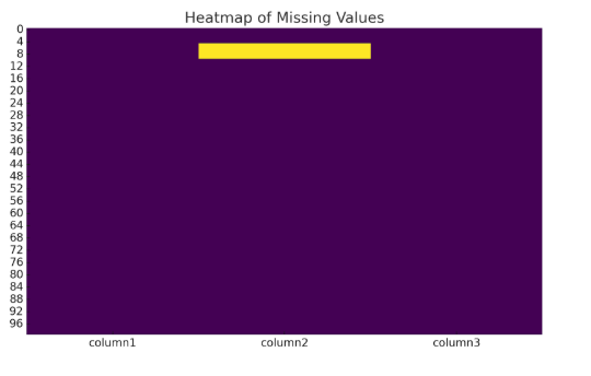
- sns.heatmap(df.isnull(), cbar=False, cmap='viridis'): This creates a heatmap to visualize missing data. The heatmap will show a color-coded map where missing values are highlighted, making it easy to identify columns with gaps.
Output: The following output shows that column2 has 5 missing values, while column1 and column3 have no missing values.
column1 int64
column2 int64
column3 object
dtype: object
Missing values per column:
column1 0
column2 5
column3 0
dtype: int64
Heatmap of Missing Values: The following heatmap highlights the missing entries in column 2, making it clear where the gaps are in the data. The color intensity indicates the presence of missing values.
Reviewing Class Balance and Feature Relationships
Assessing class balance is crucial for classification tasks. An imbalanced class distribution can cause the model to favor the more frequent class. Use the .value_counts() method to check the count of each class in the target variable and visualize this with a bar plot. If an imbalance is detected, techniques like SMOTE (Synthetic Minority Over-sampling Technique) or undersampling can help balance the data.
Understanding feature relationships is essential to detect multicollinearity. Use the .corr() method to calculate pairwise correlations between numeric features and visualize them with a heatmap. High correlations (e.g., above 0.8) between features may signal redundancy, especially in linear models where multicollinearity can inflate variance and distort coefficient estimates. In such cases:
- For linear models (e.g., logistic regression, linear regression), consider dropping one of the correlated features or applying dimensionality reduction techniques like PCA.
- For tree-based models (e.g., decision trees, random forests algorithm, XGBoost), multicollinearity is less problematic, but simplifying the feature space may still improve interpretability and reduce overfitting.
Instead of dropping, you may consider combining features when they capture complementary information. For example, combining highly correlated financial ratios into a single composite score can retain meaningful variance while reducing feature count.
Additionally, check feature distributions using histograms or Kernel Density Estimation plots to assess skewness. If distributions are highly skewed, consider applying transformations such as logarithmic, square root, or Box-Cox transformations to improve model performance and ensure algorithmic assumptions are met.
Code for Reviewing Class Balance and Feature Relationships:
import pandas as pd
import seaborn as sns
import matplotlib.pyplot as plt
# Sample dataset creation (replace with your actual dataset)
data = {
'column1': [1, 2, 3, 4, 5, 6, 7, 8, 9, 10],
'column2': [100, 150, 120, 130, 140, 190, 200, 210, 220, 230],
'column3': ['Yes', 'No', 'Yes', 'Yes', 'No', 'Yes', 'No', 'Yes', 'No', 'Yes']
}
# Creating a DataFrame from the dataset
df = pd.DataFrame(data)
# 1. Class Distribution of the Target Variable (column3)
print("Class Distribution (Yes/No):")
print(df['column3'].value_counts())
# Plot class distribution (visualizing the balance between classes)
plt.figure(figsize=(6, 4))
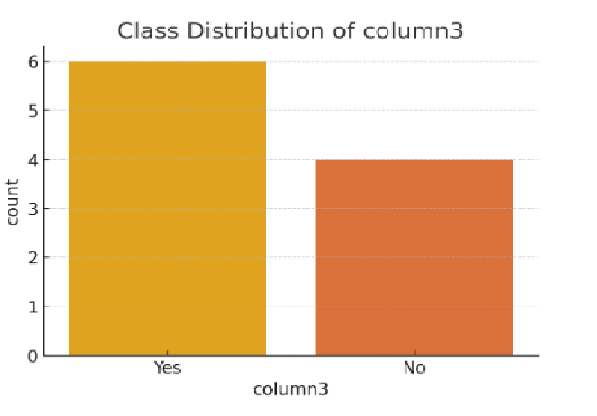
sns.countplot(x='column3', data=df)
plt.title('Class Distribution of column3 (Yes/No)')
plt.show()
# 2. Correlation Matrix for Numeric Features (columns with numeric values)
corr_matrix = df[['column1', 'column2']].corr() # Compute correlation between numeric columns
# Plotting the Correlation Heatmap
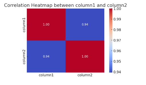
plt.figure(figsize=(6, 4))
sns.heatmap(corr_matrix, annot=True, cmap='coolwarm', fmt=".2f")
plt.title('Correlation Heatmap between column1 and column2')
plt.show()
Code Explanation:
- Class Distribution:
- df['column3'].value_counts(): This gives the count of unique values in the target variable (column3). You can use this to inspect if there is a class imbalance (e.g., how many "Yes" vs "No" in the target variable).
- sns.countplot(): This visualizes the class distribution with a bar plot to help you visually confirm the balance of classes in the target variable.
- Correlation Heatmap:
- df[['column1', 'column2']].corr(): This calculates the correlation between numeric features (column1 and column2). It tells us whether and how strongly these features are related.
- sns.heatmap(): This generates a heatmap for the correlation matrix, where you can visually inspect the relationships between numeric features. The annot=True argument annotates the heatmap with the correlation values, and cmap='coolwarm' sets the color scheme.
Output:
- Class Distribution: The following is an example of class distribution that prints the frequency count of 'Yes' and 'No' classes.
Class Distribution (Yes/No):
Yes    6
No     4
- Class Distribution Plot: The bar plot shows the distribution of the target variable (column3), with 6 instances of "Yes" and 4 instances of "No", indicating a slight imbalance.
- Correlation Heatmap: The heatmap shows the correlation between column1 and column2. The values in the heatmap indicate the degree of linear relationship between the two numeric features. In this case, the value shows the strength and direction of the correlation.
Visualizing Attribute Distributions and Relationships
Visualizing data distributions and feature relationships helps reveal patterns, outliers, and correlations, aiding in better decision-making. Below are key visualizations for understanding your dataset:
- Distributions of Continuous Variables: Use histograms to see the frequency of values across ranges; ideal for spotting skewness, modality, and central tendencies. Boxplots add nuance by visualizing spread, medians, and outliers, making them great for comparing distributions across multiple groups.
- Categorical vs. Numerical Features: Violin plots blend boxplots with kernel density estimates, revealing the shape of a distribution within each category. For more granularity, swarm plots show individual data points, helping you see overlaps and detect outliers hidden in summary stats.
- Relationships Between Features: Pair plots provide an at-a-glance matrix of scatter plots across multiple variables, useful for detecting collinearity or clusters. For focused exploration, scatter plots between two variables let you spot linearity, heteroscedasticity, or segment-specific trends.
- High-Dimensional Data: When you’re working with many features, dimensionality reduction techniques like PCA and t-SNE help simplify the data while preserving its underlying structure.
- With PCA, focus on the explained variance: if the first few components account for 80% or more of the variance, you can confidently reduce dimensions with minimal information loss. The direction and length of feature vectors in PCA biplots also reveal which features contribute most to variance.
- t-SNE is more non-linear and better for visualizing local structure; great for identifying clusters that PCA might miss, though less interpretable.
Code for Visualizing Attribute Distributions and Relationships:
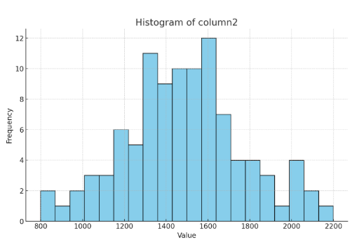
# Plot histogram for a feature
df['column2'].hist()
plt.show()

# Plot boxplot for the same feature
sns.boxplot(x=df['column2'])
plt.show()

# Plot violin plot for categorical target vs. numeric feature
sns.violinplot(x='column3', y='column2', data=df)
plt.show()

# Apply PCA for dimensionality reduction
from sklearn.decomposition import PCA
from sklearn.preprocessing import StandardScaler

scaler = StandardScaler()
scaled_data = scaler.fit_transform(df[['column1', 'column2']])

pca = PCA(n_components=2)
pca_result = pca.fit_transform(scaled_data)

# Plot the PCA results
plt.scatter(pca_result[:, 0], pca_result[:, 1])
plt.show()
Code Explanation:
- hist(): Plots the distribution of a continuous variable.
- boxplot(): Displays the spread and outliers in the feature.
- violinplot(): Shows the distribution of numerical data for each category in a categorical variable.
- PCA: Reduces the dimensionality of the data for visualization.
Below are the 4 outputs of the code that will highlight the distribution, relationships, and patterns within the dataset.
- Output: The histogram below illustrates the spread and distribution of column2, highlighting any potential outliers in the data.
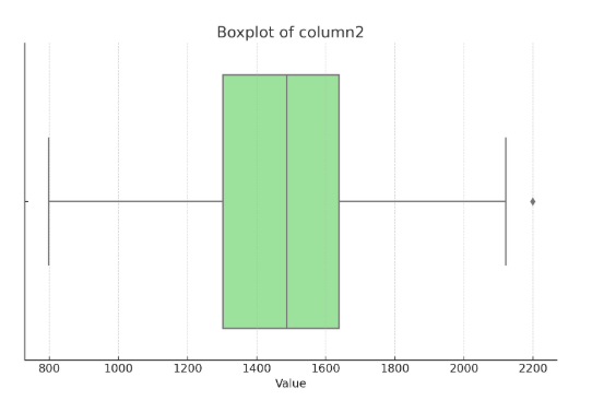
- Output: The following is the Boxplot of column2 highlighting the spread and potential outliers.
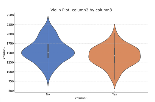
- Output: The following is the Violin Plot of column2 by column3 showing how column2 varies across the categories in column3.
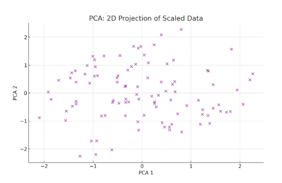
- Output: The following is the PCA Plot showing the 2D projection of the scaled data from column1 and column2, highlighting potential clusters and patterns within the dataset.
If you're looking to develop expertise in ML and full-stack development, explore upGrad’s AI-Powered Full Stack Development Course by IIITB. This program provides essential knowledge of data understanding, structures and algorithms, enabling AI and ML integration into enterprise-level applications.
To gain deeper insights into your data, let's explore its statistical properties and distributions, which are crucial for making informed decisions before applying machine learning models.
Also Read: Measures of Dispersion in Statistics: Meaning, Types & Examples
Data Understanding with Statistics and Distributions
Gaining insights into the statistics and distributions of your dataset is essential for effective analysis and model building. Below are key techniques for examining, analyzing, and refining your data prior to applying machine learning models.
Generating a Statistical Summary of the Dataset
Creating a statistical summary is a crucial step in data analysis that helps you understand the core characteristics of your dataset. Here’s how you can approach it effectively:
- Numeric Features: Use Pandas’ .describe() method to obtain key statistics:
- Mean and standard deviation (std) provide insights into the central tendency and variability.
- Minimum and maximum values identify the range of data.
- Quartiles (25th, 50th, 75th percentiles) help understand the distribution and detect skewness.
This information is vital for spotting outliers, understanding data spread, and determining if any transformations are needed before modeling.
- Categorical Features: Apply .value_counts() to count the frequency of each category.
- This helps reveal imbalances or dominant classes.
- It’s essential for understanding the distribution of categorical variables and for preparing data encoding or grouping strategies.
- Advanced Tools: Use libraries like Pandas Profiling and Sweetviz to automate comprehensive EDA (Exploratory Data Analysis) reports.
- These tools generate detailed summaries with visualizations such as histograms, box plots, and correlation matrices.
- They also highlight missing values, correlations, and potential data quality issues, saving time and improving insights.
Generating these summaries early in your workflow ensures a thorough understanding of your dataset’s structure and quality, guiding better feature engineering and modeling decisions.
import pandas as pd

# Example dataframe
data = {
    'Age': [23, 45, 35, 50, 24, 30, 23, 60, 45, 30],
    'Salary': [40000, 60000, 50000, 80000, 45000, 55000, 40000, 100000, 60000, 50000],
    'Gender': ['M', 'F', 'M', 'F', 'M', 'F', 'M', 'F', 'M', 'F']
}
df = pd.DataFrame(data)

# Statistical summary for numeric columns
numeric_summary = df.describe()

# Frequency counts for categorical column
gender_counts = df['Gender'].value_counts()

numeric_summary, gender_counts
Code Explanation:
The code starts by importing the Pandas library and creating a sample DataFrame containing three columns: Age, Salary, and Gender.
- df.describe() generates the statistical summary for numeric columns, providing values like the mean, standard deviation, minimum, maximum, and quartiles (25th, 50th, and 75th percentiles) for Age and Salary.
- df['Gender'].value_counts() is used to compute the frequency of each category in the Gender column, showing how many 'M' and 'F' values are present.
Output:
- The Age column has a mean value of 38.2, with a standard deviation of 11.4, indicating some variation around the mean. The range of ages spans from 23 to 60.
- The Salary column has a mean of 57,000, with a wide spread (standard deviation of 20,615). Salaries range from 40,000 to 100,000.
- In this example, there is an equal gender distribution between 'M' and 'F', with 5 occurrences of each.
Age Salary
count 10.0 10.0
mean 38.2 57000.0
std 11.4 20615.2
min 23.0 40000.0
25% 24.0 45000.0
50% 30.0 50000.0
75% 45.0 60000.0
max 60.0 100000.0
M 5
F 5
Name: Gender, dtype: int64
Reviewing Class Distribution for Target Variables
Class distribution is crucial when analyzing a target variable in classification tasks. Using .value_counts(), we can observe how the data is distributed across different classes. A balanced dataset ensures that the model will treat each class fairly. However, if the target variable has a significant class imbalance, the model might become biased, leading to poor generalization, especially for the minority class.
In such cases, techniques like stratified sampling or oversampling (such as SMOTE) can help address the imbalance by either ensuring equal representation in training subsets or creating synthetic samples for the minority class. It's important to note that this imbalance might influence performance metrics, with a trade-off between accuracy and recall.
Code For Reviewing Class Distribution for Target Variables:
# Simulating class imbalance in target variable
data = {
    'Target': ['Yes', 'No', 'No', 'Yes', 'No', 'No', 'Yes', 'Yes', 'No', 'No', 'No']
}
df = pd.DataFrame(data)

# Class distribution
class_distribution = df['Target'].value_counts()

class_distribution
Code Explanation:
Here, a sample dataset is created with the Target variable having a class imbalance, with more 'No' than 'Yes' values. The function df['Target'].value_counts() computes how many instances of each class ('Yes' and 'No') are present in the dataset. The output helps identify the level of class imbalance.
Output:
The Target variable shows that there are 7 instances of 'No' and 4 instances of 'Yes', indicating an imbalance where the majority class is 'No'. This imbalance may cause issues in machine learning models, as they may tend to predict the majority class more often, which can reduce the model's ability to identify the minority class effectively.
No 7
Yes 4
Name: Target, dtype: int64
Detecting Skew in Attribute Distributions
Skewness refers to the asymmetry in the distribution of data. A positive skew indicates a longer right tail, while a negative skew reflects a longer left tail. Skewness can distort statistical analysis, especially in models assuming normality.
Kurtosis, on the other hand, measures the "tailedness" of a distribution—how heavy or light the tails are compared to a normal distribution.
- High kurtosis (leptokurtic) indicates heavy tails, meaning the data has more extreme outliers.
- Low kurtosis (platykurtic) implies light tails, where outliers are less frequent and the distribution is flatter.
Both skewness and kurtosis are essential for identifying non-normal distributions. Data that is highly skewed or leptokurtic can negatively impact models like linear regression, which assume normally distributed residuals.
To address skewness, transformations such as log, Box-Cox, or square root can help normalize the data. Visual tools like histograms and kernel density estimates (KDE) are useful for assessing the shape and skew of a distribution.
Code:
import scipy.stats as stats
import matplotlib.pyplot as plt

# Simulating skewed data
data = {'Income': [20000, 25000, 22000, 30000, 45000, 120000, 100000, 80000, 75000, 50000]}
df = pd.DataFrame(data)

# Skewness and kurtosis
skewness = df['Income'].skew()
kurtosis = df['Income'].kurt()

# Histogram
df['Income'].hist(bins=10)
plt.title("Income Distribution")
plt.show()

skewness, kurtosis
Code Explanation:
In this code, the Income column contains skewed data. The skew() function calculates the skewness of the Income data, while the kurt() function calculates the kurtosis. A histogram is plotted to visually inspect the distribution of Income for skewness.
Output:
- Skewness: The skewness value of 1.56 indicates a positive skew (right tail), meaning that most of the data are clustered on the left, with a few high-income values stretching the right tail.
- Kurtosis: A kurtosis of 2.51 suggests that the data has a moderate peak, and it's not excessively flat or peaked compared to a normal distribution.
Skewness: 1.56
Kurtosis: 2.51
Reviewing Correlation Between Attributes
Understanding the correlation between features is vital, especially for numeric attributes. The .corr() method in Pandas computes the correlation coefficient between pairs of features, which indicates the strength and direction of their linear relationship. Highly correlated features can lead to multicollinearity in regression models, affecting the model's ability to estimate coefficients accurately.
To visualize correlation, a heatmap is a great tool, as it makes it easy to detect redundant features that could be removed or combined. If the correlation is high (e.g., above 0.9), dimension reduction techniques like Principal Component Analysis (PCA) may be employed to reduce the number of variables without losing much information.
Code:
import seaborn as sns

# Example dataset with two correlated features
data = {
    'Height': [150, 160, 165, 170, 180, 185, 190],
    'Weight': [50, 60, 65, 70, 80, 85, 90]
}
df = pd.DataFrame(data)

# Correlation matrix
correlation_matrix = df.corr()

# Heatmap
sns.heatmap(correlation_matrix, annot=True, cmap='coolwarm', fmt='.2f')
plt.title("Correlation Heatmap")
plt.show()
Code Explanation:
This code calculates the correlation matrix for the Height and Weight columns using df.corr(). It then plots a heatmap of the correlation matrix, with annotations showing the correlation coefficients between the variables.
Output:
The correlation matrix shows a value of 0.997 for the relationship between Height and Weight, indicating a very strong positive correlation. This means that as Height increases, Weight tends to increase in a nearly linear fashion.
Height Weight
Height 1.000000 0.997755
Weight 0.997755 1.000000
Identifying Outliers and Redundant Features
Outliers can skew data and lead to incorrect model predictions. Identifying outliers can be done using methods such as the Interquartile Range (IQR), Z-scores, or more advanced techniques like the Isolation Forest Algorithm.
When using Z-scores, a common threshold to identify outliers is a Z-score above 3 or below -3. This means the data point is more than three standard deviations away from the mean, which is a strong indication that it is an outlier.
Once outliers are detected, they can be either removed or transformed based on the specific data context and domain knowledge.
Redundant features can also reduce model effectiveness and should be examined closely. Examples include:
- Low variance features: Features that hardly change across samples provide little to no useful information.
- Highly correlated features: These can cause multicollinearity in models like linear regression, reducing interpretability and stability.
Removing or consolidating such redundant features helps improve model performance and reliability.
Code:
from scipy.stats import zscore

# Identifying outliers using z-score
df = pd.DataFrame({'Value': [10, 12, 13, 100, 15, 16, 10]})
z_scores = zscore(df)

# Flagging outliers based on z-score threshold
outliers = df[(z_scores > 3) | (z_scores < -3)]

outliers
Code Explanation:
In this example, the zscore function is used to calculate the Z-scores for each value in the Value column. Values with a Z-score above 3 or below -3 are considered outliers. The code filters and shows the rows where outliers are detected.
Output:
The value 100 has a Z-score greater than 3, which indicates that it is significantly different from the other values in the dataset, making it an outlier.
Value
3 100
Boost your data understanding and machine learning skills with upGrad’s advanced Master’s Degree in Artificial Intelligence and Data Science. Enroll now to excel key techniques and build powerful ML models for hands-on success.
Let's take a closer look at some effective visual techniques that can help you understand data distributions, assess feature relevance, and communicate insights effectively for better machine learning outcomes.
Also Read: How to Use Heatmaps in Data Visualization? Steps and Insights for 2025
Visual Techniques for Exploring Machine Learning Data
Visual techniques are essential tools for understanding and exploring ML data. They allow data scientists and machine learning practitioners to gain insights, detect patterns, and identify issues in the data before applying algorithms. Below are several key visual techniques for exploring and analyzing machine learning data:
Visual Technique | Purpose | Use Case |
Plot two continuous variables against each other to spot correlations, clusters, or outliers. | Plotting height vs weight to detect clusters of people by age groups; spotting outliers with unusual values. | |
Show distribution of a single variable’s values, revealing frequency, skew, and outliers. | Visualizing the distribution of customer ages to identify whether data is normally distributed or skewed. | |
Box Plots (Box-and-Whisker Plots) | Summarizes data distribution based on key statistics: min, 1st quartile, median, 3rd quartile, and max. Identifies outliers and spreads. | Comparing exam scores across different schools to identify variation and outliers in performance. |
Pair Plots | Display scatter plots for all variable pairs; helps find relationships and interactions. | Exploring relationships in small datasets like Titanic data; checking if fare correlates with survival. |
Visualize matrices like correlation matrices using color intensity to show relationships. | Using a correlation heatmap to identify redundant features before feature selection in modeling. | |
PCA Visualization | Reduce dimensions while preserving variance; visualize principal components to see data structure. | Plotting first two principal components of handwritten digit images to check if digits form distinct clusters. |
t-SNE | Non-linear dimensionality reduction preserving local neighborhoods; good for cluster detection. | Visualizing word embeddings or single-cell RNA-seq data to identify groups of semantically or biologically related items. |
Violin Plots | Combine box plots with kernel density estimation to show full distribution shape per group. | Comparing test score distributions between different teaching methods to see differences beyond median. |
Show counts or aggregated values for categorical variables; easy for comparisons. | Displaying class distribution in an imbalanced dataset or feature importance scores from a model. | |
UMAP (Uniform Manifold Approximation and Projection) | Dimensionality reduction that is faster than t-SNE, preserving both local and global structure well. | Exploring cell-type clusters in large single-cell datasets or visualizing image embeddings for thousands of images. |
Confusion Matrix | Summarizes classification results by showing true/false positives/negatives per class. | Evaluating performance of a multi-class image classifier to see which classes are often confused. |
Learning Curves | Show training and validation performance over epochs or data size to diagnose under/overfitting. | Checking whether adding more training data improves the model or if the model is overfitting early on. |
Decision Boundaries | Plot model’s class separation boundaries in 2D or 3D feature space; limited to simple models. | Visualizing logistic regression boundaries for two features; note deep learning models with many features cannot be visualized this way. |
Feature Importance Plots | Display relative influence of features on model predictions, especially for tree-based models. | Identifying top predictors for customer churn using Random Forest feature importances. |
Using these visual techniques in combination can provide a more comprehensive understanding of the data, aiding in data cleaning, feature selection, and model evaluation.
Want to strengthen your skills in data understanding and algorithms? Join upGrad’s Data Structures & Algorithms course for expert-led guidance and practical experience. Learn flexibly online and earn a certification to boost your career in machine learning and data science.
To move from insights to action, let’s explore the right tools to examine and understand your structured data effectively.
Also read: Top 5 Machine Learning Models Explained For Beginners
Tools to Perform Structured Data Understanding
Analyzing structured data effectively requires a combination of automated profiling tools and manual techniques. The following tools help you explore data quality, detect patterns, and identify insights essential for building reliable machine learning models:
1. Automated Profiling Tools: Pandas Profiling, Sweetviz, and D-Tale
- Auto-Generated EDA Reports: These tools generate comprehensive exploration reports automatically, offering charts, statistics, and potential issues in the dataset (e.g., missing values, outliers).
- Quick Dataset Overview: They are excellent for quickly understanding the structure and distribution of the data, especially when working with new or unfamiliar datasets.
- Side-by-Side Comparison: Some tools (e.g., Sweetviz) allow users to compare datasets, helping in scenarios like pre- and post-cleaning comparisons.
- Ideal for Early-Stage Exploration: Perfect for early-stage data analysis when you need to quickly gauge a dataset before moving into deeper exploration.
2. Manual Methods Using Pandas, Matplotlib, and Seaborn
- Customizable Insights: Unlike automated tools, this approach provides flexibility, allowing you to filter, transform, and analyze data according to your specific needs.
- Precision and Control: While this method enables granular customization and control over analysis, it often comes with a steeper learning curve and requires more effort compared to automated tools.
- Higher Effort, But More Precision: Though manual, this method offers a deeper, more detailed understanding and is crucial when you need custom analysis or visualizations.
- Ideal for Project Documentation: When working on projects where documentation and reproducibility are important, code-based methods ensure that the analysis is transparent and repeatable.
3. Choosing Between Notebooks and No-Code EDA Tools
Use notebooks for in-depth, reproducible analysis with full control; choose no-code tools for quick, accessible insights; especially when collaborating with non-technical users. The table below summarizes the key differences between Notebooks and No-Code EDA tools, helping you choose the right approach based on your needs and audience.
Notebooks | No-Code Tools | |
Features | Provide reproducible, customizable workflows with flexibility in code, analysis, and visualizations. | Fast, intuitive interfaces for quick data exploration without writing code. |
Best For | Technical users and Data Scientists requiring deep, repeatable, and highly customized analysis. | Business analysts or beginners needing quick insights without coding knowledge |
When to Use | When you need full control, complex analysis, or want to document and reproduce results. | When time is limited, collaboration with non-technical users is needed, or you're exploring early insights quickly. |
Examples | Jupyter, Colab, Zeppelin | Tableau Prep, Google AutoML |
Depending on your needs, you can opt for automated tools for a quick overview or manual methods for a more detailed analysis. Choose the right approach based on the level of detail required and the target audience.
If you want to gain hands-on expertise in exploring, analyzing, and preparing data for machine learning, check out upGrad’s Executive Diploma in Data Science & AI with IIIT-B. This program covers best practices in data understanding, EDA, and more; making you industry-ready in the field of Data Science.
Let’s now explore how to understand a dataset in the context of machine learning.
Data Understanding in Practice: Sample ML Dataset Walkthrough
Below are the key steps to explore a machine learning dataset. You'll learn how to inspect data, check for statistical insights, and visualize relationships between features.
1. Initial Inspection and Type Checking
You begin by loading the dataset and conducting an initial inspection. This involves examining the dataset’s shape, reviewing the data types of each feature, and identifying any missing values. This step helps you understand the overall structure and highlights potential data quality issues.
Code:
import pandas as pd

# Load the dataset
data = pd.read_csv('sample_dataset.csv')

# Check the first few rows of the dataset
print(data.head())

# Get information about the data types and missing values
print(data.info())

# Get the shape of the dataset
print(f"Dataset Shape: {data.shape}")
Explanation:
- data.head() shows the first 5 rows to give us a glimpse of the dataset.
- data.info() provides the data types of each column, along with the number of non-null values.
- data.shape shows the number of rows and columns in the dataset.
Output:
- This shows the first 5 rows with the feature values (Feature_1, Feature_2, Feature_3) and the corresponding target variable (Target).
- It helps confirm the data format and see if there are any obvious issues (such as missing values or outliers) in the first few rows.
Feature_1 Feature_2 Feature_3 Target
0 5.2 3.1 1.5 0
1 6.3 2.9 1.4 1
2 5.9 3.2 1.6 0
3 5.6 3.0 1.3 0
4 6.1 3.3 1.8 1
Dataset Shape: (1000, 4)
2. Statistical Summary and Skew Detection
Next, you generate statistical summaries for the numeric attributes to gain insights into their central tendencies and variability. You also assess the skewness of feature distributions, as skewed data may require transformation to improve model performance.
Code:
# Statistical summary
print(data.describe())

# Check for skewness
skewness = data.skew()
print(f"Skewness:\n{skewness}")
Explanation:
- data.describe() gives us key statistics like mean, median, standard deviation, and percentiles for each numeric column.
- data.skew() helps detect skewness in the data. A value greater than 1 or less than -1 indicates a highly skewed distribution.
Output:
- The dataset is approximately normally distributed based on the skewness values, which are close to zero.
- Skewed features might need transformations (logarithmic or Box-Cox transformations) if they deviate significantly from a normal distribution.
Feature_1 Feature_2 Feature_3 Target
count 1000.0000 1000.0000 1000.0000 1000.0000
mean 5.8 3.0 1.5 0.5
std 0.7 0.5 0.2 0.5
min 4.5 2.5 1.0 0
25% 5.1 2.7 1.3 0
50% 5.7 3.0 1.5 0
75% 6.3 3.3 1.7 1
max 7.2 3.9 2.0 1
Skewness:
Feature_1 0.2
Feature_2 0.1
Feature_3 0.3
Target -0.1
dtype: float64
3. Visual Analysis and Attribute Correlation
Then apply visualization techniques to identify patterns and relationships among features. Conducting correlation analysis enables you to identify strong associations and detect multicollinearity, which can influence model selection and interpretation.
Code:
import matplotlib.pyplot as plt
import seaborn as sns

# Plotting pairplot for feature relationships
sns.pairplot(data)
plt.show()

# Plotting the correlation matrix
correlation_matrix = data.corr()
sns.heatmap(correlation_matrix, annot=True, cmap='coolwarm')
plt.show()
Explanation:
- sns.pairplot(data) creates a grid of scatterplots to visualize relationships between all pairs of features.
- sns.heatmap(correlation_matrix) visualizes the correlation matrix, where higher correlation values (close to 1 or -1) suggest a strong linear relationship.
Output:
- The first plot (pairplot) will show the scatterplot grid for each feature against others.
- The second plot (heatmap) will show how features correlate with each other.
4. Target Variable Behavior and Insights
Finally, you analyze the target variable to understand its distribution and behavior. This understanding guides you in choosing suitable modeling approaches and evaluation criteria.
Code:
# Plotting the distribution of the target variable
sns.countplot(x='Target', data=data)
plt.show()

# Summary statistics for the target variable
target_summary = data['Target'].describe()
print(f"Target Variable Summary:\n{target_summary}")
Explanation:
- sns.countplot() shows the distribution of the target variable (e.g., binary classification or regression target).
- data['Target'].describe() provides key statistics for the target variable, helping us understand its distribution and behavior.
Output:
The target variable is evenly distributed between classes 0 and 1, which is ideal for training binary classification models in this example.
Target Variable Summary:
count 1000.000000
mean 0.500000
std 0.500000
min 0.000000
25% 0.000000
50% 0.500000
75% 1.000000
max 1.000000
Name: Target, dtype: float64
By following this structured approach, you gain a comprehensive understanding of the dataset, which is essential for making informed decisions about data cleaning, data preprocessing, and modeling steps in machine learning.
To ensure the success of your machine learning project, let's focus on the quality and understanding of your data. By following certain best practices, you can enhance the effectiveness of your models and make informed decisions during the process.
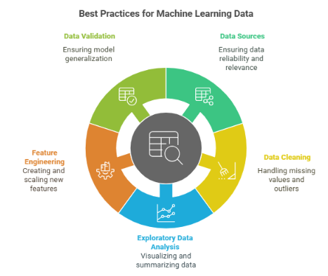
Best Practices for Understanding Machine Learning Data
The quality of your data significantly influences the effectiveness of your model. Understanding your data thoroughly is key to building accurate models and achieving reliable results. Here are some best practices to help you better understand your machine learning data and enhance model performance.
1. Know Your Data Sources
- Data Collection: Ensure the data comes from a reliable source. Understand where the data originates, who collected it, and what potential biases may be present.
- Relevance: Data should be relevant to the problem you are trying to solve. If it’s not directly related to your goals, the model may not be useful.
2. Data Cleaning
- Missing Data: Handle missing values appropriately, using imputation, removing rows/columns, or marking them as “missing.”
- Outliers: Outliers can distort model predictions. Depending on the context, you can remove, transform, or cap outliers to minimize their impact.
- Consistency: Ensure consistency in data, like proper formatting of text fields (e.g., ‘USA’ vs ‘U.S.A.’).
3. Exploratory Data Analysis (EDA)
- Visualizations: Use graphs such as scatter plots, histograms, box plots, etc, to spot patterns, distributions, and potential anomalies in the data.
- Summary Statistics: Understand the central tendency (mean, median) and variability (standard deviation, variance) of the data to guide decisions.
- Correlations: Investigate relationships between variables using correlation matrices, helping you identify potential predictive relationships.
4. Feature Engineering
- Feature Creation: Based on your domain knowledge, create new features from the data that might be valuable for prediction. For example, combining ‘height’ and ‘weight’ to create a ‘BMI’ feature.
- Dimensionality Reduction: If you have many features, apply techniques like PCA or feature selection methods to reduce the number of dimensions and remove noise.
- Scaling and Normalization: Some algorithms, such as K-Nearest Neighbors (KNN) and Support Vector Machines (SVM), are sensitive to the scale of the data and require features to be standardized (zero mean, unit variance) or normalized (scaled to [0, 1]). However, tree-based models like decision trees, random forests, and gradient boosting do not require scaling, as they are invariant to monotonic transformations of features.
5. Data Validation
- Training vs. Testing Data: Always split your data into training and testing sets to ensure that the model generalizes well to unseen data.
- Cross-validation: Use cross-validation techniques to ensure your model’s performance is stable and consistent across different subsets of data.
- Leakage Prevention: Take care to prevent data leakage by ensuring that no information from the test set is used during training or feature engineering, which could lead to overly optimistic performance estimates.
- Stratified Splitting: For imbalanced datasets, use stratified splitting to maintain the same distribution of classes in both training and testing sets. This ensures the model learns representative patterns and is fairly evaluated.
Want to take your data skills to the next level? Check out upGrad’s Python Libraries course on NumPy, Matplotlib & Pandas to gain powerful data manipulation, visualization, and analysis capabilities. Strengthen your data understanding, crucial for successful ML, and enroll now to revolutionize the way you work with data!
Also read: 50+ Must-Know Machine Learning Interview Questions for 2025
Test Your Understanding of Data Understanding for Machine Learning Data
Data understanding in machine learning involves identifying issues such as missing values, outliers, and feature relationships to ensure the data is suitable for modeling. A thorough understanding of the data enables effective preprocessing and helps in making informed decisions for model development.
Here are some questions that will let you assess how well you understand the process of data understanding in machine learning:
1. Which step is most crucial when initially analyzing a dataset for machine learning tasks?
- Cleaning and preprocessing the data
- Identifying key patterns and relationships in the data
- Dividing the data into training and testing sets
- Selecting the machine learning algorithm to apply
2. What type of plot is specifically used to explore the pairwise relationships between variables in a dataset?
- Scatter plot
- Pair plot
- Heatmap
- Line plot
3. In the context of the CRISP-DM model, which phase involves analyzing and understanding the dataset before modeling?
- Data preparation
- Data understanding
- Model training
- Evaluation
4. Which technique is used to transform high-dimensional data into fewer dimensions while retaining its variability?
- PCA (Principal Component Analysis)
- Logistic regression
- K-means clustering
- Support Vector Machines
5. What is the primary purpose of using a box plot when analyzing data?
- To visualize the spread and distribution of a numerical feature
- To compare the distribution of multiple categorical variables
- To identify outliers and central tendency in the data
- To visualize relationships between two continuous features
6. What is an effective strategy to balance class distribution in a dataset with imbalanced classes?
- Use only the majority class data
- Apply oversampling or undersampling methods
- Ignore the imbalance and train the model on all data
- Remove all instances of the minority class
7. What is the first step in data understanding before building a machine learning model?
- Conducting exploratory data analysis (EDA)
- Splitting the dataset into training and testing sets
- Fine-tuning the model's hyperparameters
- Visualizing the performance of the model
8. Which of the following tools is designed to simplify the exploratory data analysis process through automated reports?
- Matplotlib
- Pandas Profiling
- TensorFlow
- PyCaret
9. What benefit does examining the statistical summary of a dataset provide during the initial data analysis phase?
- To clean and preprocess the dataset
- To identify data distributions, central tendencies, and outliers
- To determine the best machine learning algorithm
- To evaluate the model's predictive accuracy
10. How does visualizing the correlation matrix assist in understanding the relationships within the data?
- It detects missing data values
- It helps identify which features are highly correlated and may need to be handled for multicollinearity
- It suggests which features to include in the final model
- It visualizes the distribution of individual features across samples
Conclusion
Data understanding is a crucial first step in any machine learning pipeline. Through techniques like exploration, preprocessing, and visualization, you gain the insights needed to make informed decisions and improve model accuracy. Proactively addressing challenges like missing values and inconsistent data can significantly improve model performance and reliability.
upGrad offers comprehensive training to help you overcome these challenges and build robust machine learning systems. To further enhance your expertise in data understanding and deepen your knowledge of core ML principles, consider enrolling in the following courses:
- Masters in Artificial Intelligence and Machine Learning - IIITB
- Executive Diploma in Machine Learning and AI with IIIT-B
If you are uncertain about which courses to pursue or how to advance your machine learning skills, upGrad’s personalized counseling can provide the clarity you need. Contact us today or visit your nearest upGrad offline center for expert advice and support on your ML journey!
FAQs
1. What is the significance of the data understanding phase in machine learning?
The data understanding phase lays the foundation for successful modeling by thoroughly exploring and interpreting your raw data. For example, discovering that height and weight columns have missing values only in elderly patients might suggest a need for special handling or data imputation strategies for that demographic. Early detection of inconsistencies or outliers here prevents misleading model results downstream and guides tailored preprocessing decisions.
2. How can I detect if my dataset has missing values?
You can use pandas’ .isnull().sum() to get a quick count of missing values per column. Visual tools like missingno’s heatmaps or matrix plots provide a visual snapshot, making it easier to identify patterns. For instance, if missing values cluster around specific dates or categories, hinting at systemic data collection issues that require domain-informed fixes.
3. What methods can be used to handle imbalanced classes in a dataset?
Techniques like SMOTE (Synthetic Minority Oversampling Technique) create synthetic samples for minority classes, while undersampling reduces majority class size to balance the dataset. In fraud detection, for example, oversampling rare fraud cases helps the model learn to detect them without bias towards the majority of non-fraud cases. Alternatively, cost-sensitive algorithms or ensemble methods like Balanced Random Forests can also mitigate imbalance effects.
4. Why is feature engineering important in the data understanding process?
Feature engineering transforms raw data into meaningful inputs that improve model insights. For example, creating a BMI feature from height and weight can significantly boost health risk prediction models, capturing nonlinear relationships that raw features miss. Thoughtful feature construction often reveals hidden patterns, making models more robust and interpretable.
5. What tools can automate the process of exploratory data analysis (EDA)?
Automated EDA tools like Pandas Profiling, Sweetviz, and D-Tale generate comprehensive reports showing distributions, correlations, missing data, and warnings about data quality. These tools accelerate insight discovery; for example, spotting unexpected zero-variance columns that you might overlook manually, saving valuable preprocessing time.
6. How can I check if my features are highly correlated, and why is this important?
Use pandas .corr() to compute pairwise correlations and visualize them with heatmaps to spot strong relationships. In a credit scoring model, for instance, two highly correlated features like "total debt" and "number of credit cards" can cause multicollinearity, which inflates variance in coefficient estimates and reduces model interpretability. Identifying such pairs allows you to combine or remove redundant features for cleaner, more stable models.
7. What is the role of data visualization in machine learning?
Visualization helps you grasp data distribution, spot anomalies, and identify relationships. For example, scatter plots can reveal clusters or group separations that suggest natural class boundaries, while histograms uncover skewness needing transformation. Visual insights guide preprocessing choices, like deciding between log-transform or binning, thus improving model readiness.
8. When should I use PCA (Principal Component Analysis) in the data understanding phase?
PCA is ideal for reducing dimensionality in high-feature datasets while retaining variance. For example, in image processing, PCA compresses thousands of pixel values into a few components, speeding up training without sacrificing much detail. It also helps detect dominant patterns and noise, improving visualization and preventing overfitting in models like logistic regression or SVM.
9. How can I check the statistical summary of my dataset, and what should I look for?
The .describe() method provides mean, median, quartiles, and spread metrics to understand your data’s central tendency and variability. For example, if the max value in an “age” column is 150, this might indicate data entry errors or outliers. Comparing means and medians can highlight skewed distributions that require transformations before modeling.
10. What steps should I take if I detect outliers in my dataset?
Handling outliers depends on context: in credit risk models, extreme values might represent fraud and should be flagged, not removed. Sometimes applying transformations (log, winsorization) reduces their impact while preserving information. Alternatively, domain knowledge might guide removal, like excluding sensor errors in IoT data, to avoid biasing the model with invalid data points.
11. How can I ensure that my data is ready for machine learning modeling?
Beyond basic checks for missing values and outliers, readiness means aligning data with model assumptions and goals. For example, scaling features matter if you’re using distance-based models like k-NN or SVM, while categorical encoding is essential for tree-based models. Feature engineering and validation on subsets or cross-validation ensure your data supports generalizable, robust models ready for deployment.


upGrad Learner Support
Talk to our experts. We are available 7 days a week, 10 AM to 7 PM
Indian Nationals
Foreign Nationals
