All courses
Agentic AI
Agentic AI
Artificial Intelligence
Degree / Exec. PG

IIIT Bangalore
Executive Diploma in Machine Learning and AI
OPJ Global University
Master’s Degree in Artificial Intelligence and Data Science
Liverpool John Moores University
Master of Science in Machine Learning & AI
Golden Gate University
DBA in Emerging Technologies with Concentration in Generative AIExecutive Certificate

IIITB & IIM, Udaipur
Chief Technology Officer & AI Leadership Programme
IIIT Bangalore
Executive Programme in Generative AI for Leaders
upGrad | Microsoft
Gen AI Mastery Certificate for Software DevelopmentupGrad | Microsoft
Gen AI Mastery Certificate for Managerial ExcellenceOffline Bootcamps

upGrad
Data Science and AI-MLDoctorate
For All Domains
IIITB & IIM, Udaipur
Chief Technology Officer & AI Leadership Programme
Swiss School of Business and Management
Global Doctor of Business Administration from SSBM
Edgewood University
Doctorate in Business Administration by Edgewood UniversityGolden Gate University
Doctor of Business Administration From Golden Gate University
Rushford Business School
Doctor of Business Administration from Rushford Business School, Switzerland-d9bdeff6165f4eb1ba2adcebde78e961.svg)
University of Waterloo
Chief Technology and AI Officer ProgramLeadership / AI
Golden Gate University
DBA in Emerging Technologies with Concentration in Generative AIMachine Learning
Machine Learning
Data Science
Degree / Exec. PG
O.P Jindal Global University
Master’s Degree in Artificial Intelligence and Data ScienceIIIT Bangalore
Executive Diploma in Data Science & AILiverpool John Moores University
Master of Science in Data ScienceExecutive Certificate
upGrad | Microsoft
Gen AI Foundations Certificate Program from MicrosoftupGrad | Microsoft
Gen AI Mastery Certificate for Data AnalysisupGrad | Microsoft
Gen AI Mastery Certificate for Software DevelopmentupGrad | Microsoft
Gen AI Mastery Certificate for Managerial ExcellenceupGrad | Microsoft
Gen AI Mastery Certificate for Content CreationOffline Bootcamps
upGrad
Data Science and AI-MLMBA
Masters

Liverpool School of Business
Master of Business Administration from Liverpool Business School with IIM Udaipur Certification
Paris School of Business
Master of Science in Business Management and TechnologyO.P.Jindal Global University
MBA (with Career Acceleration Program by upGrad)Edgewood University
MBA from Edgewood UniversityO.P.Jindal Global University
MBA from O.P.Jindal Global UniversityExecutive Certificate

IMT, Ghaziabad
Advanced General Management ProgramMarketing
Executive Certificate
upGrad | Microsoft
Gen AI Foundations Certificate Program from MicrosoftupGrad | Microsoft
Gen AI Mastery Certificate for Content CreationOffline Bootcamps
upGrad
Digital MarketingManagement
Degree
O.P Jindal Global University
MSc in International Accounting & Finance (ACCA integrated)
Golden Gate University
Master of Arts in Industrial-Organizational PsychologyExecutive Certificate

IIIT-B & IIM, Udaipur
Chief Technology Officer & AI Leadership ProgrammeIIIT-B & IIM, Udaipur
Chief Data and AI Officer Programme
IIM Kozhikode
Human Resource Analytics Course from IIM-KupGrad | Microsoft
Gen AI Foundations Certificate Program from MicrosoftEducation
Education

Northeastern University
Master of Education (M.Ed.) from Northeastern UniversityEdgewood University
Doctor of Education (Ed.D.)Edgewood University
Master of Education (M.Ed.) from Edgewood UniversityCertifications
Project Management
Certification

Knowledgehut
Leadership And Communications In ProjectsKnowledgehut
Microsoft Project 2007/2010-ae8d039bbd2a41318308f8d26b52ac8f.svg)
Knowledgehut
Financial Management For Project ManagersKnowledgehut
Fundamentals of Earned Value Management (EVM)Knowledgehut
Fundamentals of Portfolio ManagementKnowledgehut
Fundamentals of Program Management-35c169da468a4cc481c6a8505a74826d.webp&w=128&q=75)
Knowledgehut
CAPM® CertificationsKnowledgehut
Microsoft® Project 2016Certifications & Trainings
-7f4b4f34e09d42bfa73b58f4a230cffa.webp&w=128&q=75)
Knowledgehut
PMP® CertificationKnowledgehut
PMI-RMP® CertificationKnowledgehut
PMP Renewal Learning PathKnowledgehut
Oracle Primavera P6 V18.8Knowledgehut
Microsoft® Project 2013Knowledgehut
PfMP® Certification CourseKnowledgehut
Project Planning and MonitoringPrince2 Certifications

Knowledgehut
PRINCE2® FoundationKnowledgehut
PRINCE2® PractitionerKnowledgehut
PRINCE2 Agile Foundation and PractitionerKnowledgehut
PRINCE2 Agile® Foundation CertificationKnowledgehut
PRINCE2 Agile® Practitioner CertificationManagement Certifications
Knowledgehut
Project Management Masters Certification ProgramKnowledgehut
Change ManagementKnowledgehut
Project Management TechniquesKnowledgehut
Product Management Certification ProgramKnowledgehut
Project Risk Management- Study abroad
- Offline centres
- uGSOT - B.Tech
More
%20(2)-db0b6f38da9c485faf76e366793c9b9e.webp&w=128&q=75)


48. Variance in ML
Data Distribution in Machine Learning: Normal, Gaussian, and Statistical Types
Did you know? As of 2025, approximately 495.89 million terabytes of data are processed globally each day. This would theoretically need around 48,470 supercomputers with 10 PB of storage each.
Data distribution is the pattern in which data points are spread out in a dataset. Some points may cluster together, while others are more dispersed. Understanding these patterns is crucial in machine learning because it impacts how we preprocess data and make predictions.
Why does it matter? ML algorithms often assume specific distributions. For example, many algorithms expect data to follow a normal or Gaussian distribution. If your data doesn’t match this assumption, model performance could suffer. In this blog, we’ll cover the importance of data distributions and their types, including visualizations, Python code, and key data distribution statistical concepts.
Join thousands enrolled in upGrad’s courses in Artificial Intelligence & Machine Learning, which offers an industry-aligned program created with top universities and trusted by 1000+ companies worldwide. Receive expert mentorship, real-world projects, and career support that prepares you for success!
What Is Data Distribution in Machine Learning?
In both machine learning and statistics for machine learning, data distribution refers to how data points are spread across a dataset. It tells us about the overall structure of the data, such as whether the data is concentrated in certain areas or spread out across a range of values.
Since model performance often hinges on the shape of input data, understanding the distribution is key. For example, certain models assume that the data follows a normal distribution, while others might work better with uniform or skewed distributions.
Ready to enhance your career in data science? Explore upGrad’s Data Science programs, designed to provide you with hands-on skills and in-depth knowledge to succeed in the data field.
- Masters Degree in Artificial Intelligence and Data Science
- Masters in Data Science Degree
- Executive Diploma in Data Science & AI with IIIT-B
This is how different machine learning algorithms make different assumptions about data distribution:
-009c42fc808341d3ae65fb3b60ccf041.png)
- Linear regression assumes that the data demonstrates a linear relationship and may perform poorly if the distribution is non-linear.
- Naive Bayes assumes that features are normally distributed (in some cases) for classification tasks.
- K-means clustering assumes clusters are spherical and equally sized, due to its reliance on Euclidean distance.
These assumptions are essential when selecting an appropriate model for your data. If the underlying data doesn't match the algorithm's assumptions, the model’s performance could be compromised.
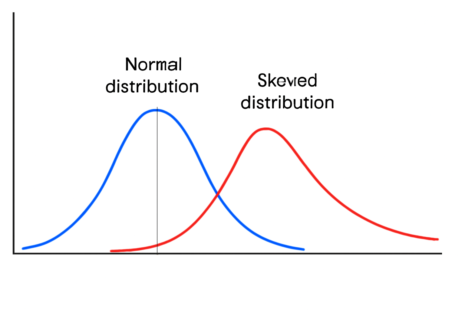
Python Code Example: You can visualize data distributions using Python’s Seaborn library. Let's take a sample dataset and visualize a normal distribution versus a skewed distribution.
import seaborn as sns
import matplotlib.pyplot as plt

# Sample data
import numpy as np
data_normal = np.random.normal(size=1000)
data_skewed = np.random.exponential(scale=2, size=1000)

# Create histograms and KDE plots
sns.histplot(data_normal, kde=True, color='blue', label='Normal Distribution')
sns.histplot(data_skewed, kde=True, color='red', label='Skewed Distribution')

# Customize the plot
plt.legend()
plt.title('Histogram and KDE of Normal vs Skewed Distribution')
plt.show()
Output:
-0cbbc213fbe34375b9fcabef00aace1d.png)
In this visualization, you’ll see:
- Normal distribution: A bell-shaped curve, symmetric around the mean.
- Skewed distribution: A right-skewed curve, with a long tail on the positive side.
Explanation:
The above plot compares the distribution of a normal dataset versus a skewed dataset using histograms and Kernel Density Estimation (KDE):
- Blue Curve (Normal Distribution): The bell-shaped curve indicates symmetry around the mean, which is typical of normally distributed data.
- Red Curve (Skewed Distribution): The exponential distribution is positively skewed with a long right tail, highlighting asymmetry and a concentration of values near zero.
This kind of visualization helps in identifying skewness, which is crucial when deciding on transformations (like Box-Cox or Yeo-Johnson) for machine learning models that assume normality.
Learn more about data visualization tools and enhance your skills with a Masters in Data Science Degree with upGrad. Get hands-on training for 100+ programming and GenAI tools from industry experts. To practice further, you also get a month of Copilot Pro. Enroll now!
Now, let’s move ahead and explore the common types of data distribution used in ML.
Common Data Distribution Types Used in Machine Learning
Understanding the different data distribution types is essential for choosing the right machine learning model. Let’s explore some of the most commonly encountered distributions in machine learning.
1. Uniform Distribution
A uniform distribution is one where all values within a given range have an equal chance of occurring. It is often used in simulations, as well as in machine learning models for random weight initialization (e.g., in neural networks). In this data distribution type, there is no bias toward any particular value.
Equation:
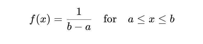
Where:
- 𝑎 is the lower bound,
- 𝑏 is the upper bound,
- 𝑥 is the data point.
Python Code Example:
import numpy as np
import seaborn as sns
import matplotlib.pyplot as plt

# Generate uniform data
data_uniform = np.random.uniform(0, 1, 1000)

# Plot
sns.histplot(data_uniform, kde=False, color='green')
plt.title('Uniform Distribution')
plt.show()
Output:
-3f2e3471453d4266be2c917bc04d1530.png)
Explanation:
The output shows a histogram of the uniform distribution data. The bars are the same height across the range from 0 to 1, reflecting that every value within this interval is equally likely to occur. Unlike bell-shaped or skewed distributions, there’s no peak or bias toward any specific value—this flat, even spread is what defines a uniform distribution.
Here, the histogram will be flat, showing that all values have an equal probability of occurring.
2. Normal Distribution in Machine Learning
The normal distribution, also commonly known as the Gaussian distribution in machine learning, is among the most important. Many algorithms, including Linear Regression and Naive Bayes, assume that the data follows this distribution.
This distribution is symmetric, and most of the data points cluster around the mean, with fewer points at the extremes.
Equation:
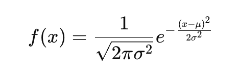
Where:
- μ is the mean,
- σ2 is the variance.
Python Code Example:
# Generate normal distribution
data_normal = np.random.normal(loc=0, scale=1, size=1000)

# Plot
sns.histplot(data_normal, kde=True, color='blue')
plt.title('Normal Distribution')
plt.show()
Output:
-224ce79b3953456b8926c71b277adf81.png)
Explanation:
The plot above shows a normal distribution, also known as a Gaussian distribution, which is symmetric and bell-shaped. Here's why this is important in machine learning:
- Centered at the Mean (μ): Most data points cluster around the center.
- Predictable Spread: The spread is controlled by the standard deviation (σ). About 68% of data lies within ±1σ, 95% within ±2σ.
- ML Relevance: Algorithms like Linear Regression and Naive Bayes assume data is normally distributed for better prediction and parameter estimation.
- KDE Line: The smooth blue curve (Kernel Density Estimate) approximates the probability density function.
Also Read: Gaussian Mixture Model Explained: What are they & when to use?
3. Gaussian Distribution in Machine Learning
The Gaussian distribution is essentially the same as the normal distribution in machine learning, but it is particularly mentioned when dealing with multivariate data. Models like Gaussian Naive Bayes assume normally distributed features, and Principal Component Analysis (PCA) in machine learning performs best when data follows a Gaussian-like structure.
Assumptions:
- Data follows a bell curve.
- Many models assume normality when making predictions, especially in classification tasks.
Python Code Example (Multivariate Gaussian):
from scipy.stats import multivariate_normal

# Mean and covariance for 2D Gaussian
mean = [0, 0]
cov = [[1, 0], [0, 1]]

# Generate multivariate Gaussian
data_gaussian = multivariate_normal.rvs(mean=mean, cov=cov, size=1000)

# Plot
plt.scatter(data_gaussian[:, 0], data_gaussian[:, 1], alpha=0.5)
plt.title('Multivariate Gaussian Distribution')
plt.show()
Output:
-188d426acef94e28b0f9c18dcf393ab0.png)
Explanation:
The scatter plot above visualizes a multivariate Gaussian distribution, where two features (variables) are generated using a mean vector of [0, 0] and an identity covariance matrix. This creates a symmetric, bell-shaped distribution in 2D space.
Key Points:
- Each point represents a sample with two correlated features.
- The circular spread indicates that both variables are normally distributed with equal variance and no correlation.
- Such distributions are crucial for algorithms like Gaussian Naive Bayes and PCA, which assume or work best with normally distributed data
4. Skewed and Kurtotic Distributions
Skewness and kurtosis are statistical measures in data used to understand the shape of the distribution:
Skewness measures the asymmetry of the data.
- Positive skew: The distribution has a long tail on the right side.
- Negative skew: The distribution has a long tail on the left side.
Kurtosis measures the "peakedness" or the tails of the distribution.
- High kurtosis: Indicates heavy tails or the presence of outliers.
- Low kurtosis: Indicates light tails or a lack of outliers.
Models like linear regression may misestimate predictions if skewness or high kurtosis isn’t handled.
Also Read: Basic Concepts of Data Science: Technical Concept Every Beginner Should Know
Python Code Example:
from scipy.stats import skew, kurtosis

# Generate skewed data
data_skewed = np.random.exponential(scale=2, size=1000)

# Calculate skewness and kurtosis
skew_value = skew(data_skewed)
kurt_value = kurtosis(data_skewed)

print(f"Skewness: {skew_value}, Kurtosis: {kurt_value}")
Output:
-3f80160a18384b2b973fd48c59d55fff.png)
Explanation:
The histogram visualizes 1,000 data points drawn from an exponential distribution, which is inherently right-skewed. This means:
- Skewness > 0: The positive skewness (typically around 2 for exponential data) indicates that the tail on the right side is longer. Most values cluster on the left, but a few larger values stretch the graph to the right.
- Kurtosis > 0: The positive kurtosis (greater than 0, often around 6–8 for exponential data) shows that the distribution has heavier tails and a sharper peak compared to a normal distribution. This is known as leptokurtic behavior.
To gain a deeper understanding of data distribution and master the techniques essential for machine learning success, consider enrolling in upGrad's Data Science programs:
- Executive Post Graduate Certificate Programme in Data Science & AI
- Professional Certificate Program in Data Science and AI
- Professional Certificate Program in Business Analytics & Consulting
When working with data distribution, it’s always helpful to understand which tool can help with the task at hand. Let’s take a look at some useful tools.
Tools to Analyze Data Distribution in Machine Learning
Analyzing and visualizing data distributions is an essential part of preprocessing data in machine learning. Python offers a powerful set of libraries that make this task straightforward, whether you are generating random data, calculating statistical metrics, or visualizing complex distributions. Depending on whether you're analyzing summary of data distribution statistics, visual patterns, or testing for normality, these tools serve different purposes.
Here's an overview of some of the most commonly used libraries for analyzing data distributions:
Library | Purpose | Common Use Case |
Handles numerical computations, array operations, and random data generation | Use it for generating synthetic datasets and performing basic numerical tasks before deeper analysis | |
SciPy | Provides statistical functions, tests, and probability distributions | Ideal for hypothesis testing, generating specific statistical distributions, and normality checks |
Manages, cleans, and summarizes structured data | Best for exploring datasets with summary statistics and preparing data tables before visualization | |
Creates a wide range of static, animated, and interactive plots | Great for basic visualizations like histograms; note that KDE plots require extra code or other libraries | |
Seaborn | Simplifies complex visualizations with improved aesthetics | Perfect for combined plots like histograms with KDE overlays and visualizing distribution nuances |
In each example below, we generate or analyze a fresh dataset using the respective library.
Python Code Examples for Each Library
Use these codes to get a visual of data distribution for your chosen datasets.
1. NumPy
import numpy as np
data = np.random.normal(0, 1, 1000)  # Generate normal distribution
2. SciPy
from scipy.stats import norm
data = norm.rvs(size=1000)  # Generate data following a normal distribution
3. Pandas
import pandas as pd
df = pd.DataFrame(data)
df.describe()  # Get basic statistical summary of the data
4. Matplotlib
import matplotlib.pyplot as plt
plt.hist(data, bins=30, alpha=0.5)
plt.title('Histogram of Data')
plt.show()
5. Seaborn
import seaborn as sns
sns.histplot(data, kde=True)  # Histogram with KDE plot overlay
Ready to build a strong foundation in Python? Jump into upGrad’s Python basic programming courses and start coding with clear, hands-on lessons designed for beginners. Open new doors in data science, machine learning, and beyond. Sign up today and take the first step toward mastering Python with upGrad’s expert guidance.
All right! Now that you have a better idea of data distribution analysis tools, let’s see what to do when you’re unsure whether your data follows a specific distribution.
Statistical Tests for Distribution Fit of the Dataset
When you are not sure whether your data follows a specific distribution (e.g., normal, uniform, etc.), statistical tests help you assess how well the data fits a given distribution. These tests are essential tools in data preprocessing for machine learning, as they help determine whether the assumptions made by certain algorithms (e.g., assuming normality) are valid for your dataset.
Here are three commonly used tests to evaluate the fit of your data to a particular distribution:
Test | Purpose | Null Hypothesis | Common Use Case |
Shapiro-Wilk Test | Checks if a sample comes from a normal distribution. | The data is normally distributed. | Best for testing the normality of a dataset. |
Anderson-Darling Test | Tests the goodness-of-fit for various distributions (e.g., normal, exponential). | The data follows a specific distribution (e.g., normal). | Use when comparing data against multiple distribution types, i.e., normal, exponential. |
KS Test | Compares a sample to a reference distribution or compares two samples. | The sample comes from the reference distribution. | Use to compare a sample with a reference distribution or to compare two samples. |
Each test varies slightly. Shapiro-Wilk is best for small samples, while Anderson-Darling offers more flexibility for different distributions. At the same time, KS is suited for comparing distributions or testing against a known one.
Statistical Test Examples Using Python
1. Shapiro-Wilk Test
The provided code performs the Shapiro-Wilk test, a statistical test used to assess whether a given dataset is normally distributed. It's particularly useful in machine learning and statistics when you want to validate assumptions before applying models like linear regression or Naive Bayes that assume normality.
- np.random.normal(0, 1, 1000): Generates 1000 random numbers from a normal distribution with mean 0 and standard deviation 1.
- shapiro(data): Applies the Shapiro-Wilk test on the generated data and returns the test statistic and p-value.
from scipy.stats import shapiro

# Sample data
data = np.random.normal(0, 1, 1000)

# Shapiro-Wilk Test
stat, p_value = shapiro(data)

print(f"Shapiro-Wilk Test Statistic: {stat}, P-value: {p_value}")

if p_value > 0.05:
    print("Data likely follows a normal distribution.")
else:
    print("Data does not follow a normal distribution.")
Output:
Shapiro-Wilk Test Statistic: 0.9983870387077332
P-value: 0.483097642660141
Explanation:
- The test statistic (close to 1) indicates the data fits a normal distribution well.
- The p-value (~0.48) is much greater than the 0.05 significance level.
Interpretation: Since the p-value > 0.05, we fail to reject the null hypothesis, meaning the data likely follows a normal distribution — exactly what you'd expect from normally generated data.
2. Anderson-Darling Test
This code uses the Anderson-Darling Test to determine if a dataset follows a normal distribution. Unlike the Shapiro-Wilk test, the Anderson-Darling test provides multiple critical values across significance levels, giving a broader view of normality.
- np.random.normal(0, 1, 1000) generates 1000 values from a standard normal distribution.
- anderson(data) runs the test and returns:
- A test statistic
- A list of critical values at different significance levels (15%, 10%, 5%, 2.5%, 1%)
from scipy.stats import anderson

# Sample data
data = np.random.normal(0, 1, 1000)

# Anderson-Darling Test for Normal distribution
result = anderson(data)

print(f"Statistic: {result.statistic}")
for i in range(len(result.critical_values)):
    print(f"Critical value at {result.significance_level[i]}%: {result.critical_values[i]}")

if result.statistic > result.critical_values[2]:
    print("Data does not follow a normal distribution.")
else:
    print("Data likely follows a normal distribution.")
Sample Output:
Statistic: 0.234
Critical value at 15.0%: 0.561
Critical value at 10.0%: 0.639
Critical value at 5.0%: 0.766
Critical value at 2.5%: 0.892
Critical value at 1.0%: 1.061
Data likely follows a normal distribution.
Explanation:
- The test statistic (0.234) is compared against a series of critical values.
- In this example, since the statistic is less than all critical values, including the one at 5% (0.766), we fail to reject the null hypothesis at all standard confidence levels.
Interpretation: The data likely follows a normal distribution, consistent with the fact that it was generated using np.random.normal(). The Anderson-Darling test is particularly robust in detecting deviations in the tails of the distribution.
3. KS Test
This Python snippet performs a Kolmogorov-Smirnov (KS) two-sample test to check if two datasets come from the same distribution. It's commonly used in machine learning and statistics to validate data integrity or compare samples during preprocessing.
- data: Simulated from a standard normal distribution.
- reference_data: Another sample from the same normal distribution.
- ks_2samp(): Compares the empirical cumulative distribution functions (ECDFs) of the two samples.
from scipy.stats import ks_2samp

# Sample data
data = np.random.normal(0, 1, 1000)

# Reference data (e.g., normal distribution)
reference_data = np.random.normal(0, 1, 1000)

# KS Test (two-sample test)
stat, p_value = ks_2samp(data, reference_data)

print(f"KS Test Statistic: {stat}, P-value: {p_value}")

if p_value > 0.05:
    print("Data follows the reference distribution.")
else:
    print("Data does not follow the reference distribution.")
Sample Output:
KS Test Statistic: 0.036
P-value: 0.720
Data follows the reference distribution.
Explanation:
- The KS Test Statistic measures the maximum distance between the ECDFs of the two datasets.
- A high p-value (> 0.05) means we fail to reject the null hypothesis that the datasets are drawn from the same distribution.
Interpretation: Since both datasets were generated from the same normal distribution, it’s expected that the KS test confirms they are similar. This test is helpful when checking whether two sets of data (e.g., train/test splits) have consistent distributions.
If you’re working with data in machine learning, here are some key terms you need to understand.
Understanding Data Distribution Statistics: Key Terms
When working with data and statistics, it’s crucial to understand its central tendency. Central tendency refers to the center or typical value in a dataset. Mean, median, and mode are among the most commonly used measures of central tendency. Each measure provides a different way of representing the "center" of the data, and understanding these can help you better interpret the data distribution. Let’s look closely at each of these terms:
1. Mean
The mean, also known as the average, is the sum total of all the data points divided by the total number of data points. It’s the most commonly used measure of central tendency and gives an overall idea of where most data points lie. In ML, the mean is often used in metrics like MSE (mean squared error), which penalizes deviations from average predictions.
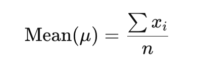
How It Works:
The mean takes all data points into account, meaning it reflects the overall dataset. However, it is sensitive to outliers, i.e., extremely high or low values that can skew the mean. For example, if you have a dataset of salaries, a few extremely high salaries might skew the mean upwards, even if most salaries are closer to the lower end.
2. Median
The median is essentially the middle value of a dataset when the data points are ordered from smallest to largest. It is less sensitive to outliers than the mean, which makes it a better measure of central tendency when the data is skewed.
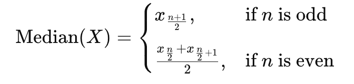
How It Works:
- For a dataset with an odd number of values, the median is the middle value.
- For a dataset with an even number of value points, the median is the average of the two middle values.
Also Read: Outlier Analysis in Data Mining: Techniques, Detection Methods, and Best Practices
3. Mode
The mode is the value that emerges most frequently in the dataset. It is the only measure of central tendency, which can be used with nominal data (categorical data where values cannot be ordered or measured).
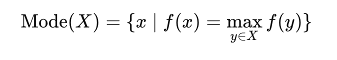
How It Works:
- A dataset can have one mode (unimodal), two modes (bimodal), or more than two modes (multimodal).
- In datasets where multiple values have the same highest frequency, the mode may not be unique.
Python Code Example:
import numpy as np
import statistics as stats

data = np.random.normal(loc=0, scale=1, size=1000)
mean_val = np.mean(data)
median_val = np.median(data)
mode_val = stats.mode(data)

print(f"Mean: {mean_val}, Median: {median_val}, Mode: {mode_val}")
4. Variance and Standard Deviation
Variance and standard deviation measure the spread or dispersion of data points in a dataset. They help understand how much a single data point differs from the mean (average) of the dataset. Both are crucial when analyzing data variability or consistency, and they play a significant role in various machine learning algorithms that rely on understanding the distribution and spread of data.
- Variance: Variance measures how far each data point in a dataset is from the mean. It is the average of the squared differences between each data point and the mean. In simple terms, it quantifies the overall spread of the data points around the mean. If the variance is high, it means the data points are spread out over a large range of values. If the variance is low, it means the data points are clustered closely around the mean.
- Standard Deviation: Standard deviation is simply the square root of the variance. While variance gives a measure of spread in terms of squared units (which can be hard to interpret directly), standard deviation brings the unit back to the original scale of the data. This makes standard deviation much easier to understand and interpret in relation to the original data. Standard deviation is vital in feature scaling and anomaly detection workflows.
Also Read: Bias vs. Variance: Understanding the Tradeoff in Machine Learning
Python Code Example:
# Variance and Standard Deviation
variance = np.var(data)
std_deviation = np.std(data)

print(f"Variance: {variance}, Standard Deviation: {std_deviation}")
5. Histogram and Density Plots
Both histograms and Kernel Density Estimation (KDE) plots are essential tools for visualizing the distribution of data. While they both serve to describe the "shape" of the data, they do so in slightly different ways.
- Histogram: A histogram is like a bar chart that displays the frequency distribution of a dataset. It is one of the simplest and most commonly used visualizations for showing the distribution of numerical data.
- Kernel Density Estimation (KDE) Plot: A KDE plot is a smooth, continuous curve that estimates the probability density function (PDF) of a dataset. Unlike a histogram, which uses bins to group data, a KDE plot applies a kernel function (usually Gaussian) to smooth out the histogram and provide a smoothed curve representing the data distribution.
While histograms are discrete and depend on bin width, KDE plots offer a continuous view of data density.
Now that you know all the key terms and their differences, let’s move on to understanding the assumptions and applications of normal or Gaussian distribution in machine learning.
Gaussian Distribution Assumptions and Applications in Machine Learning
In machine learning, the Gaussian distribution (also known as the normal distribution) is one of the most important distributions. Many parametric models assume that the features or data follow a normal distribution. Understanding these assumptions and how they impact model performance can help improve the accuracy and reliability of your machine learning models.
Assumptions in Parametric Models
Many machine learning algorithms assume normality in the data:
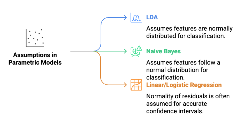
- Linear Discriminant Analysis (LDA): Assumes features are normally distributed for classification.
- Naive Bayes (Gaussian variant): Assumes that features follow a normal distribution, feature independence, and a Gaussian shape for classification.
- Linear and Logistic Regression: While not required, normality of residuals in inference is often assumed for accurate confidence intervals.
Also Read: 18 Types of Regression in Machine Learning [Explained With Examples]
Before training, it’s important to check if features follow a normal distribution in machine learning. If not, transformations or alternative models may be needed.
Feature Scaling and Normalization
Scaling ensures all features influence learning equally, especially in distance- or gradient-based algorithms.
1. Z-score Normalization (Standardization): This transforms data to achieve a distribution with a mean of 0 and a standard deviation of 1.
2. Min-Max Scaling: This scales data to a fixed range, typically [0, 1].
Python Implementation:
from sklearn.preprocessing import StandardScaler

# Example data
data = np.array([[1, 2], [2, 4], [3, 6], [4, 8]])

# Apply StandardScaler
scaler = StandardScaler()
data_scaled = scaler.fit_transform(data)
print("Scaled Data:", data_scaled)
Here, each feature (column) is standardized independently.
Explanation:
The output shows the original data transformed using Z-score normalization (standardization). Each feature is adjusted so its values have a mean of 0 and a standard deviation of 1. This means the data is centered and scaled, allowing features with different original ranges to contribute equally during model training. The printed array displays these standardized values for each feature column, making it easier for algorithms sensitive to scale to perform well.
3. Transformations to Achieve Normality
When data isn’t normally distributed, transformations can help make it more normal, improving model performance.
a) Log Transformation: It reduces the impact of extreme values in positively skewed data.
b) Box-Cox Transformation: A more flexible method for positive data to make it more normal. Box-Cox requires strictly positive data.
c) Yeo-Johnson Transformation: A generalized version of Box-Cox, which can handle both positive and negative data.
Python Implementation:
from sklearn.preprocessing import PowerTransformer

# Example skewed data
data_skewed = np.random.exponential(scale=2, size=1000)

# Apply transformation
pt = PowerTransformer()
data_transformed = pt.fit_transform(data_skewed.reshape(-1, 1))
print("Transformed Data:", data_transformed[:5])
This applies Yeo-Johnson by default, which handles both positive and negative values.
%20(1)-3b6fc5f967704155a6e21ab386bc5178.png)
Explanation:
The image above compares the original skewed data (left) with the Yeo-Johnson transformed data (right). The transformation reshapes the data to follow a more symmetric, Gaussian-like distribution.
- Original Data: Shows right-skew typical of exponential distributions.
- Transformed Data: More bell-shaped and centered around zero, ideal for machine learning models that assume normality.
Sample Transformed Values:
[-0.34286499, 1.64443873, 0.74607282, 0.34070388, -1.11372251]
Before and After Transformation:
You can visualize the effect of the transformations by comparing the data distributions before and after the transformation using histograms or KDE plots.
Now, it’s time to test your knowledge of data distribution in ML. Here’s a quiz for you based on what you read in this blog.
Test Your Understanding of Data Distribution in Machine Learning!
Now that you’ve gone through the essentials, here are a few questions to test your knowledge of data distribution in machine learning:
- What is the main difference between mean, median, and mode in terms of data distribution?
- How does skewness affect the shape of a distribution?
- When would you use log transformation in machine learning?
- What is the purpose of feature scaling in ML?
- Define Gaussian distribution and give an example of where it’s used.
- Explain how normality tests can help in preprocessing data for ML models.
- What is the role of KDE plots in visualizing data distributions?
- Describe uniform distribution and provide an example where it might be used.
- What does variance measure in a dataset?
- When should you use Min-Max scaling vs Z-score normalization?
- How do assumptions of normality impact models like Naive Bayes?
Upskill in Machine Learning with upGrad!
Understanding data distribution is fundamental to building effective machine learning models. Recognizing the patterns and shapes within your data helps you choose the right models and avoid pitfalls. However, it can be challenging to get a deeper understanding of data distribution. To enhance your understanding and acquire practical experience with these essential techniques, consider enrolling in upGrad’s data science and machine learning programs.
Are you ready to advance your skills in machine learning but unsure where to start? Understanding complex concepts like data distributions is crucial for success, and upGrad is here to guide you every step of the way. With a hands-on approach and expert mentorship, you’ll acquire the hands-on skills required to thrive in the world of AI and data science.
upGrad offers flexible online learning options and real-world projects to ensure you're prepared for any challenge. Check out the following courses to accelerate your career:
- Master's Degree in Artificial Intelligence and Data Science
- Master's in Data Science Degree
- Executive Diploma in Data Science & AI with IIIT-B
Kickstart your journey with upGrad today! Book a personalized counseling session or explore free courses to enhance your skills and reach your career goals. You can also visit your nearest offline center to get in-person support.
FAQs
1. How does understanding data distribution improve real-world ML model performance?
Knowing your data distribution helps align the model choice and preprocessing steps. For example, linear regression assumes normally distributed residuals—violating this can lead to biased predictions. Understanding distribution lets you apply transformations (like log or Box-Cox) to normalize skewed data, improving generalization. In fraud detection, where transaction amounts are heavily skewed, adjusting for this ensures better outlier detection and risk scoring. Ultimately, proper distribution handling boosts both accuracy and model reliability in production.
2. What issues arise in production ML systems if data distribution is misjudged?
Misjudging data distribution leads to poor generalization, especially in dynamic environments like finance or e-commerce. If skewed features (e.g., customer spend) aren’t transformed, models may overfit high-value outliers, skewing predictions. This affects pricing models, churn prediction, or demand forecasting, where balance across feature values is key. Incorrect assumptions about normality can also degrade confidence intervals or error metrics. To avoid this, always validate distribution with diagnostics before model deployment.
3. How can different data distributions guide ML model and preprocessing choices?
Identifying whether data is Gaussian, uniform, or skewed helps in choosing the right algorithms and transformations. For example, Gaussian distributions suit models like LDA or linear regression, while tree-based models like Random Forests are robust to skewed data. Skewed distributions may need log or Box-Cox transformations to stabilize variance. Uniform data may call for binning or discretization. Tailoring preprocessing to distribution ensures more accurate, interpretable, and stable models.
4. Which tools should a data scientist use to inspect feature distributions?
Histograms and KDE plots are quick visual tools to spot skewness, modality, or symmetry in a feature. For more precision, use statistical tests like Shapiro-Wilk or Anderson-Darling to test normality. In Python, libraries like seaborn, scipy.stats, or pandas offer built-in support. These tools help determine the need for transformations, feature scaling, or outlier handling, which directly affect model convergence and accuracy. Always combine visuals with statistical evidence before drawing conclusions.
5. Why is the normal distribution particularly relevant to machine learning workflows?
Many ML algorithms assume features or residuals are normally distributed for optimal performance. For instance, in multiple linear regression, normally distributed errors ensure reliable confidence intervals and hypothesis testing. Naive Bayes classifiers also assume normality in feature distribution. Additionally, normalization techniques like Z-score rely on the mean and standard deviation, which are meaningful primarily under normal distribution. Recognizing this helps tailor models and preprocessing for better stability and interpretability.
6. How do skewness and kurtosis metrics improve data preprocessing?
Skewness reveals if data is asymmetrical, while kurtosis highlights outlier influence through “tailedness.” High skewness may cause learning bias in regression or neural networks. High kurtosis can inflate error in models sensitive to outliers. In real-world ML pipelines, these metrics guide the use of transformations (log, square root, Box-Cox) or outlier handling (IQR filtering). For example, in healthcare data with extreme lab values, addressing kurtosis ensures safer diagnostic predictions.
7. How do statistical tests validate distribution assumptions before ML modeling?
Tests like Shapiro-Wilk or Anderson-Darling evaluate if a dataset likely follows a normal distribution, critical for models like linear regression or PCA. In practice, if a feature fails the normality test (p-value < 0.05), transformations might be required. These tests support automated preprocessing pipelines by offering quantifiable thresholds to trigger steps like normalization. For robust models, combine such tests with visual diagnostics to confirm distribution behavior under real-world variability.
8. How should you test for normality in your ML datasets?
Begin with visual tools like histograms or KDE plots to detect shape and skewness. Follow this with statistical tests like Shapiro-Wilk for smaller datasets or Kolmogorov-Smirnov for larger ones. In practice, if a variable like income or age doesn’t meet normality (p-value < 0.05), apply a transformation before fitting models like regression or LDA. Checking normality is crucial in regulated domains like healthcare or finance, where accurate intervals and assumptions matter
9. When is feature scaling crucial in machine learning workflows?
Feature scaling is vital for distance-based or gradient-based algorithms—like SVMs, KNN, and neural networks—where feature magnitude affects model behavior. For example, in a model predicting loan defaults, unscaled income (in lakhs) and age (in years) can mislead optimization. Min-Max scaling and Z-score normalization help standardize ranges, ensuring faster convergence and better accuracy. It’s also key in PCA, where variance across features determines dimensionality reduction priorities.
10. In what situations are Box-Cox or Yeo-Johnson transformations preferred over log transform?
Use Box-Cox or Yeo-Johnson when your dataset includes zero or negative values, which log transformations cannot handle. For example, modeling profit margins that include losses (negatives) requires Yeo-Johnson to normalize skewness. These methods automatically identify the optimal lambda to stabilize variance and approximate normality, improving model interpretability and statistical validity. In automated pipelines, they're often integrated as preprocessing steps for robust regression or Gaussian-based algorithms.


upGrad Learner Support
Talk to our experts. We are available 7 days a week, 10 AM to 7 PM
Indian Nationals
Foreign Nationals
