Treemap Chart: Definition, How It Works, and When to Use One
By Sriram
Updated on Jul 29, 2026 | 16 min read | 4.4K+ views
Share:

All courses
Certifications
More
By Sriram
Updated on Jul 29, 2026 | 16 min read | 4.4K+ views
Share:
Table of Contents
Quick Overview
This blog will help us learn what a treemap chart is, how to read one, the different types you can use, when it works best, common problems people run into, and how to build one step by step.
If you want to go beyond the basics and start building real data visualizations, upGrad's Data Science courses can help you build these skills hands-on, from exploratory data analysis to statistical modeling, and open doors across industries that run on data.
Popular Data Science Programs
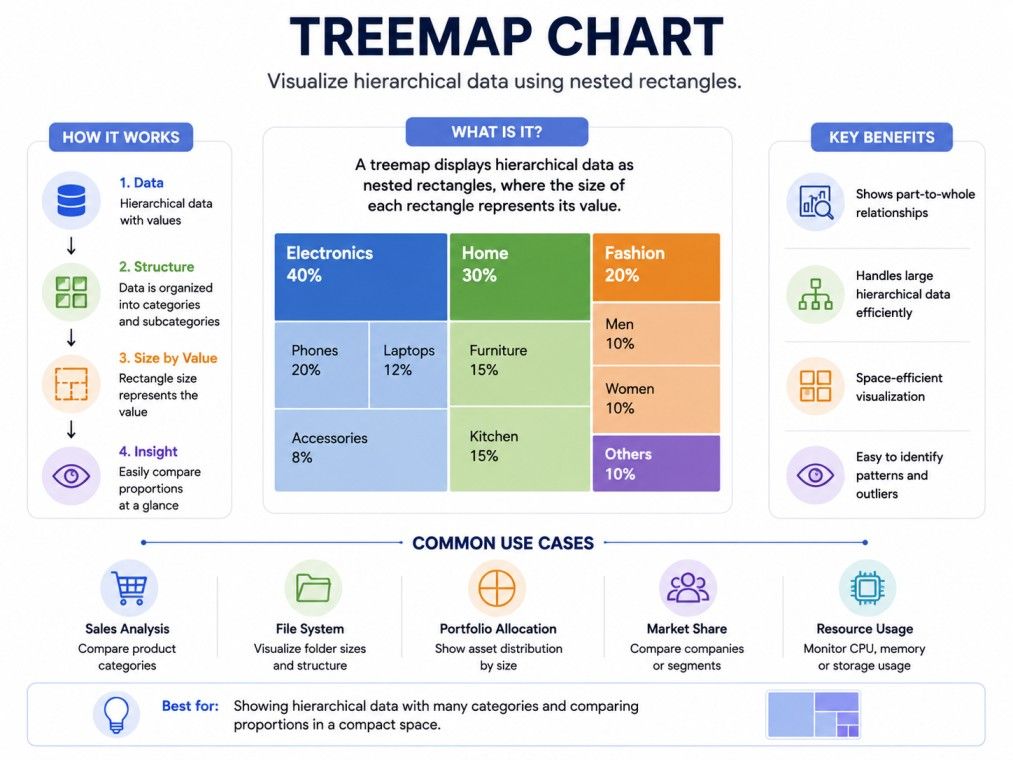
A treemap chart is a way to display hierarchical or part-to-whole data using rectangles of different sizes.
The bigger the rectangle, the bigger its share of the total. This makes treemap charts great for showing proportions across many categories at once, something a regular bar chart struggles to do when you have dozens of items.
Think of a company's total revenue. If you want to show how much each department contributes, a treemap chart divides the whole area into rectangles.
The sales department might take up 40 percent of the space, marketing 25 percent, and so on. You see the entire picture in one glance instead of scrolling through a long list.
Here is what makes a treemap chart different from most other charts:
This part-to-whole framing is really the heart of a treemap chart. Every rectangle only makes sense in relation to the whole area it sits inside. That is what separates it from charts that just compare individual values side by side.
The name comes from how the chart handles hierarchy, similar to a tree structure in computer science. In a tree diagram, you have a root node that branches into smaller nodes, and those branch into even smaller ones.
A treemap chart takes that same branching logic but instead of drawing lines and nodes, it maps the tree into nested rectangles.
So a "treemap" is literally a tree structure mapped onto a two-dimensional space. The outer rectangle is the root or the whole. Every rectangle inside it is a branch or category.
And if that category has sub-categories, you get smaller rectangles nested within it. This is why treemap charts are so useful for multi-level data, like a company's spending broken down by department, then by team, then by project.
The IIM Kozhikode Strategic AI for Business Professionals program in partnership with upGrad is built for turning technical know-how into real business impact. It helps you move from working with data visualization tools to leading AI and data strategy, decisions, and teams at a business level.
Free Courses
Building a treemap chart follows a similar process across most tools, whether you use Excel, Tableau, Power BI, or a coding library like D3.js or Python's Plotly.
Following these steps helps you build a treemap chart that is both accurate and easy to read, regardless of which tool you use.
Data Science Courses to upskill
Explore Data Science Courses for Career Progression
IIIT Bangalore
Executive Post Graduate Certificate in Data Science & AIPlacement Assistance
Let's say a retail company wants to visualize its yearly sales by product category. Here is sample data:
Category |
Sales (in lakhs) |
Share of Total |
| Electronics | 450 | 36% |
| Clothing | 320 | 26% |
| Home Decor | 210 | 17% |
| Groceries | 150 | 12% |
| Books | 110 | 9% |
In a treemap chart, this data would appear as five rectangles. Electronics would take up the largest chunk since it has the highest share.
Books would appear as the smallest rectangle. Each block would likely be colored differently so viewers can tell categories apart instantly.
Now imagine adding a second layer. Under Electronics, you could break it further into Mobiles, Laptops, and Accessories.
This creates nested rectangles within the Electronics block, showing a treemap chart's real strength: displaying multiple levels of data in a single, compact view.
This kind of example is common in:
A well-built treemap chart example like this lets a manager understand the entire sales picture in seconds, without reading a single row of a spreadsheet.
Reading a treemap chart is simple once you know what each visual element means. There are four things to look at: size, color, nesting, and labels.
Size is the primary signal in any treemap chart. The area of each rectangle is directly proportional to its value. A rectangle twice as large as another represents a value twice as big. There is no need to check an axis or a legend for this, the visual size itself tells you the story.
This is different from a bar chart, where you compare bar heights along a fixed scale. In a treemap chart, you are comparing areas, which can sometimes be trickier to judge precisely, but faster to scan overall.
Color in a treemap chart usually does one of two jobs:
For example, a treemap chart showing stock market performance often uses green for stocks that are up and red for stocks that are down, with the size showing market capitalization.
When a treemap chart shows hierarchy, you will notice smaller rectangles grouped inside bigger ones. Each group represents a parent category, and the smaller boxes inside are its children. This lets you drill down mentally, first seeing the big picture, then the details within each section.
Most treemap charts show a label inside each rectangle, usually the category name and its value or percentage. If a rectangle is too small, labels may be hidden or truncated. Good treemap chart design usually adds a tooltip or hover feature so users can still get exact numbers even when a box is tiny.
Behind every treemap chart is a simple idea: convert data values into space. But the actual math involves a few steps that decide how rectangles are sized, positioned, and arranged.
A treemap chart typically needs data in one of two formats:
Most treemap chart tools accept data as a table or a nested JSON-like structure, where each item can optionally contain a list of children.
Here is a simplified way hierarchical data might look:
Level |
Example |
| Level 1 (Root) | Total Company Revenue |
| Level 2 | Department (Sales, Marketing, Ops) |
| Level 3 | Team within Department |
| Level 4 | Individual Project or Product |
Once the data is in place, the chart needs an algorithm to decide how to divide the space. The most common one used today is the squarified treemap algorithm.
Early treemap charts used a simple slice-and-dice method, which often created long, thin rectangles that were hard to read or compare. The squarified algorithm fixes this by trying to keep every rectangle as close to a square as possible.
Here is roughly how it works:
The result is a treemap chart where rectangles are easier to compare visually, since squares and near-squares are simpler for the human eye to judge than long thin strips.
Subscribe to upGrad's Newsletter
Join thousands of learners who receive useful tips
Not every treemap chart looks or works the same way. Depending on the tool and the data, you will come across a few common variations.
This is the most basic form. It shows one level of categories, each as a single rectangle, with no nesting. It works well when your data has a flat structure, like sales by product category with no sub-categories.
This type supports multiple levels of data. You will see big rectangles divided into smaller rectangles, which may be divided further. This is the version most people mean when they talk about a treemap chart being good for hierarchy, since it can show three or four layers of detail in one view.
This is not a different chart exactly, but a specific layout method. As explained earlier, it aims to make each rectangle closer to a square shape, improving readability compared to older layout styles. Most modern tools use squarified layouts by default.
This is the original, simpler algorithm. It divides space by alternating horizontal and vertical cuts, level by level. It is easy to compute but often produces long, thin rectangles, especially with many categories. It is rarely the default choice today but still appears in some legacy tools or specific use cases where strict ordering matters more than visual balance.
Type |
Best For |
Downside |
| Standard | Simple, flat data | No hierarchy support |
| Nested/Hierarchical | Multi-level data | Can get complex with too many layers |
| Squarified | Most general use cases | Slightly harder to compute than slice-and-dice |
| Slice-and-Dice | Ordered or sequential data | Rectangles can look thin and uneven |
A treemap chart is not always the right choice. Comparing it with other common chart types helps clarify when to use it.
A bar chart compares individual values along a common axis, which makes precise comparison easier. A treemap chart sacrifices some precision but fits far more categories into the same space and adds part-to-whole context that a bar chart does not show directly.
A pie chart also shows part-to-whole data, but it struggles once you have more than five or six slices. A treemap chart handles dozens of categories comfortably and can add hierarchy, which a pie chart cannot do at all.
A sunburst chart shows hierarchy using rings instead of rectangles. It can look more visually appealing for deep hierarchies, but it takes up more space and can be harder to read at a glance. A treemap chart is usually more compact and easier to scan quickly.
A heat map uses color intensity across a grid to show values, usually across two dimensions like time and category. A treemap chart focuses on size for value and color as a secondary layer, making it better suited for part-to-whole data rather than matrix-style comparisons.
Chart Type |
Shows Hierarchy |
Shows Part-to-Whole |
Best Category Count |
| Treemap Chart | Yes | Yes | 10-100+ |
| Bar Chart | No | No | 5-20 |
| Pie Chart | No | Yes | 2-6 |
| Sunburst Chart | Yes | Yes | 10-50 |
| Heat Map | No | No | Varies (matrix based) |
A treemap chart offers a few clear benefits that explain why it has become popular in dashboards and business reports.
These strengths are exactly why treemap charts show up so often in financial reporting, website analytics, and business intelligence tools. They turn a long list of numbers into a picture that takes seconds to understand.
A treemap chart works best when your main goal is comparing proportions across many categories, especially when hierarchy is involved.
Here are situations where a treemap chart genuinely helps:
In each case, the data naturally has a whole (total budget, total traffic, total stock) that breaks into meaningful parts. That is exactly the scenario a treemap chart is designed for.
A treemap chart is not always the best fit. Avoid it when:
Even a well-designed treemap chart can run into readability issues. Here are the most common problems and practical fixes.
When there are too many small categories, a treemap chart can look like a messy patchwork. Fix this by grouping smaller categories into an "Others" bucket, or by limiting the display to the top 15-20 categories.
Very small values can shrink into rectangles too tiny to see or click. Consider setting a minimum rectangle size, or grouping small values together instead of showing them individually.
Labels can overlap or get cut off in smaller rectangles. Use tooltips on hover, shorten label text, or only display labels on rectangles above a certain size threshold.
Relying only on color to distinguish categories can be a problem for color-blind users. Pair color with clear labels, patterns, or borders so the treemap chart remains accessible to everyone.
Humans are generally better at comparing lengths than areas. If precise comparison matters, consider pairing your treemap chart with a supporting bar chart or a data table alongside it.
Always sort categories by value, largest to smallest, before rendering. This simple step makes a treemap chart far easier to scan, since viewers naturally expect the biggest block to stand out first.
If you only have three to five categories, skip the treemap chart altogether. A pie chart or a simple bar chart will communicate the same information with less visual complexity.
A treemap chart is one of the most efficient ways to show part-to-whole relationships, especially when your data has many categories or multiple levels of hierarchy. It uses size and color together to help viewers instantly spot what matters most, whether that's a department eating up half the budget or a product category driving most of your sales.
Once you understand how a treemap chart works and how to read it, it becomes one of the most useful tools for making sense of complex data quickly.
Want to get started with Data Science? Speak with an expert for a free 1:1 counselling session today.
A treemap chart is primarily used to show part-to-whole relationships across many categories, especially when the data has a hierarchy. It's common in financial reports, budget breakdowns, and business dashboards where you need to compare proportions at a glance rather than read exact figures.
You read a treemap chart by looking at rectangle size, which shows value, and color, which usually shows category or a second metric. Nested rectangles indicate sub-categories within a larger group, and labels inside each box give you the exact name or number.
A treemap chart indicates value through the area of each rectangle. Bigger rectangles mean bigger values, and this size is calculated proportionally so that all rectangles together represent 100 percent of the total dataset being shown.
It's called a treemap because it maps a tree-like hierarchical structure onto a two-dimensional space using nested rectangles. Instead of drawing branches and nodes like a traditional tree diagram, it converts each branch into a proportionally sized rectangle.
Use a treemap chart when you have many categories, possibly with sub-categories, and want to show how each one contributes to a total. It works especially well for budgets, portfolios, and analytics data where proportions matter more than exact trends.
No, a standard treemap chart cannot represent negative values well, since it relies on positive area to represent size. If your data includes losses or negative growth, a bar chart or a diverging color scale on another chart type usually works better.
Not really. A treemap chart is built for a single snapshot of part-to-whole data, not for showing change across time periods. Line charts or area charts are far better suited for visualizing trends, since they plot data along a continuous timeline.
You can create a treemap chart using Excel, Google Sheets, Tableau, Power BI, or coding libraries like D3.js, Plotly, or Highcharts. Most modern BI and spreadsheet tools now include a built-in treemap chart option under their visualization or insert chart menu.
A treemap chart works well with anywhere from 10 to 100 categories, though readability starts dropping past 50 unless you group smaller items together. For fewer than 5 to 6 categories, a simpler chart type like a bar chart usually communicates the data more clearly.
A treemap chart shows part-to-whole data using rectangle area, often with hierarchy, while a mosaic plot is typically used in statistics to show relationships between two or more categorical variables using a grid of proportional tiles. Both use rectangles, but their purpose and data structure differ.
This usually happens when there are too many low-value categories competing for limited space. Grouping smaller categories into an "Others" bucket, limiting the display to top categories, or setting a minimum rectangle size can make your treemap chart much easier to read.
725 articles published
Sriram K is a Senior SEO Executive with a B.Tech in Information Technology from Dr. M.G.R. Educational and Research Institute, Chennai. With over a decade of experience in digital marketing, he specia...
Speak with Data Science Expert
By submitting, I accept the T&C and
Privacy Policy
Start Your Career in Data Science Today
Top Resources
Executive Diploma
12 Months
Master's Degree
18 Months
Bootcamp
6 Months