Matplotlib vs Seaborn: Which Should You Use for Data Visualization
By Sriram
Updated on Jul 29, 2026 | 16 min read | 4.43K+ views
Share:

All courses
Certifications
More
By Sriram
Updated on Jul 29, 2026 | 16 min read | 4.43K+ views
Share:
Table of Contents
Quick Overview
In this blog, we will break down what each library actually does, how they differ in practice, and when you should reach for one over the other.
If you want to go beyond the basics and start building real data visualizations with tools like Matplotlib, Seaborn, and Plotly, upGrad's Data Science courses can help you build these skills hands-on, from exploratory data analysis to statistical modeling, and open doors across industries that run on data.
Popular Data Science Programs
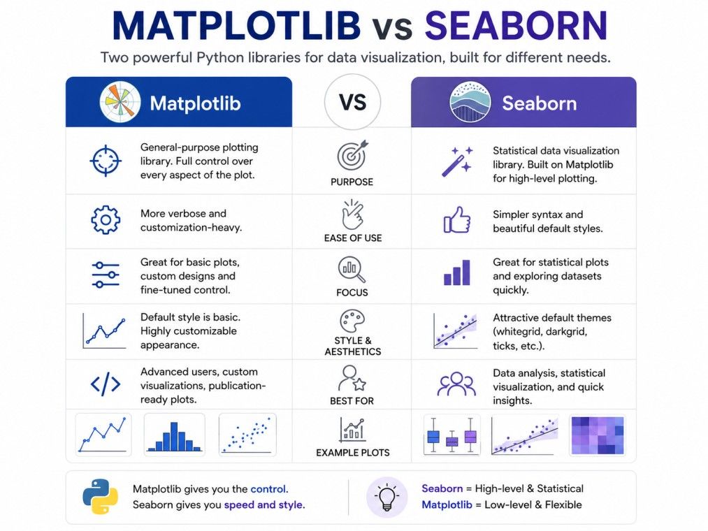
The simplest way to understand matplotlib vs seaborn is this: matplotlib is the foundation, and seaborn is built on top of it.
Matplotlib is a low level plotting library. It gives you full control over every part of a chart, from axis ticks to colors to spacing. This makes it powerful, but it also means you often write more code to get a chart looking the way you want.
Seaborn, on the other hand, is built specifically for statistical visualization. It sits on top of matplotlib and handles a lot of the formatting and styling automatically.
You get cleaner charts with far fewer lines of code, especially when working with structured data like pandas DataFrames.
Here is a quick snapshot of how they compare:
Aspect |
Matplotlib |
Seaborn |
| Purpose | General purpose plotting | Statistical data visualization |
| Built on | Standalone library | Built on top of matplotlib |
| Default styling | Basic, needs manual styling | Attractive, styled by default |
| Code required | More lines for polished charts | Fewer lines for similar results |
| Best for | Custom, detailed control | Quick, clean statistical plots |
| Learning curve | Steeper for beginners | Easier to pick up initially |
Neither library is objectively better. The right choice depends on what you are trying to build. If you need a highly customized dashboard element, matplotlib gives you that control.
If you are exploring a dataset and want quick, good looking statistical plots, seaborn gets you there faster.
It is also worth knowing that this comparison sometimes expands into matplotlib vs seaborn vs plotly, especially when interactivity is a factor. Plotly adds interactive, web based charts into the mix, which neither matplotlib nor seaborn offers natively.
The IIM Kozhikode Strategic AI for Business Professionals program in partnership with upGrad is built for turning technical know-how into real business impact. It helps you move from working with data visualization tools like Matplotlib and Seaborn to leading AI and data strategy, decisions, and teams at a business level.
Free Courses
Matplotlib is one of the oldest and most widely used plotting libraries in Python. It was first released in 2003 and has since become the base layer that many other visualization tools, including seaborn, are built on.
Think of matplotlib as the engine room of Python plotting. It does not make assumptions about what your chart should look like. Instead, it gives you the raw tools to build almost any chart you can imagine, from simple line graphs to complex multi panel figures.
Some things matplotlib is known for:
The tradeoff is that matplotlib expects you to specify a lot of details manually. A basic chart might take just a few lines, but a polished, presentation ready chart often takes considerably more code compared to seaborn.
This is exactly why the matplotlib vs seaborn conversation exists in the first place. Matplotlib is not harder because it is poorly designed. It is harder because it is unopinionated. It will not choose colors, spacing, or styles for you unless you tell it to.
For beginners, this can feel like a lot to manage early on. But learning matplotlib gives you a strong foundation, because seaborn charts are, at their core, matplotlib charts with better defaults applied. Once you understand matplotlib, seaborn becomes much easier to customize when its defaults are not enough.
Also Read: Matplotlib in Python: A Detailed Understanding on Functionalities and Installation
Seaborn is a Python library built specifically for statistical data visualization. It was designed to make common types of statistical charts easier to create and better looking by default.
Where matplotlib is general-purpose, seaborn is focused. It helps data analysts and scientists visualize relationships, distributions, and patterns in data without writing a lot of formatting code.
Since seaborn is built on matplotlib, every seaborn chart is technically a matplotlib figure underneath.
This means you can still use matplotlib functions to fine tune a seaborn plot, which is one of the more practical parts of understanding matplotlib vs seaborn in real projects.
Seaborn shines in exploratory data analysis. If you want to quickly check how two variables relate, or see the distribution of a column, seaborn often does this in a single line of code. That single line would typically require several lines in plain matplotlib.
The tradeoff is that seaborn is less flexible for highly custom or non statistical charts. If your chart type is unusual or you need very specific layout control, you may still end up dropping down to matplotlib functions directly.
Also Read: 10 Must-Know Data Visualization Tips for Beginners in 2025
Data Science Courses to upskill
Explore Data Science Courses for Career Progression
IIIT Bangalore
Executive Post Graduate Certificate in Data Science & AIPlacement Assistance
Reading about the difference between matplotlib and seaborn only goes so far. Seeing the code side by side makes the contrast much clearer.
Here is a simple line chart using matplotlib:
import matplotlib.pyplot as plt
x = [1, 2, 3, 4, 5]
y = [10, 25, 18, 30, 22]
plt.plot(x, y, color='blue', marker='o')
plt.title('Basic Matplotlib Line Chart')
plt.xlabel('X Axis')
plt.ylabel('Y Axis')
plt.show()
This produces a simple line chart with blue markers. Note that you had to manually set the color, marker style, title, and axis labels. Without these lines, the chart would look plain and unstyled.
Now here is a comparable chart using seaborn:
import seaborn as sns
import pandas as pd
data = pd.DataFrame({
'x': [1, 2, 3, 4, 5],
'y': [10, 25, 18, 30, 22]
})
sns.lineplot(data=data, x='x', y='y', marker='o')
This produces a similarly styled line chart, but with better default colors, gridlines, and spacing, using less code overall. This small example captures the essence of the seaborn vs matplotlib debate.
Matplotlib asks you to define more. Seaborn assumes sensible defaults so you can focus on the data itself.
Also Read: Data Science Libraries in Python: The Complete Guide
Now that you have seen both libraries in action, let us go deeper into the specific differences that matter when choosing between them.
Seaborn generally requires less code for statistical charts because it understands DataFrame structures directly. Matplotlib requires you to extract and format data manually in many cases. For beginners, this often makes seaborn feel more approachable at first.
Matplotlib's default charts are functional but plain, with basic colors and no built in themes. Seaborn applies clean, modern styling automatically, including better color palettes and grid formatting, right out of the box.
This is where matplotlib pulls ahead. Because seaborn is built on matplotlib, you can always drop into matplotlib functions to fine tune a seaborn chart. This gives you the best of both: seaborn's quick defaults with matplotlib's deep customization when needed.
Matplotlib has a steeper learning curve because it requires understanding figures, axes, and plotting objects. Seaborn is often easier for beginners initially, since fewer decisions are required to produce a decent looking chart.
Factor |
Matplotlib |
Seaborn |
| Code length | Longer | Shorter |
| Styling effort | Manual | Automatic |
| Customization depth | Very high | High, with matplotlib fallback |
| Beginner friendliness | Moderate | High |
Understanding these differences is the real foundation for deciding in the matplotlib vs seaborn debate. It is not about one library being better across the board. It is about matching the tool to what your project actually needs.
If your work involves statistics, this section matters the most.
Seaborn was built with statistical visualization as its core purpose. It includes functions that would otherwise require several manual calculations and matplotlib calls to replicate.
Some built in seaborn features for statistical work:
With matplotlib, achieving the same result usually means calculating statistics separately using NumPy or SciPy, then plotting the results manually. This is not impossible, but it takes more steps and more code.
For example, adding a regression line in matplotlib means fitting the line yourself, generating prediction values, and plotting them as a separate line on top of your scatter plot. In seaborn, this happens with a single function call.
This is a major reason why data scientists lean toward seaborn during the exploratory phase of a project. When you are trying to quickly understand relationships in your data, speed matters more than pixel-level control.
That said, matplotlib is still commonly used for the final, polished version of statistical charts, especially in academic papers or reports where specific formatting standards apply. Many analysts use seaborn to explore, then switch to matplotlib to refine the final version for publication.
So when comparing matplotlib vs seaborn for statistics specifically, seaborn wins on speed and convenience, while matplotlib wins on precision and formatting control for final outputs.
Subscribe to upGrad's Newsletter
Join thousands of learners who receive useful tips
Different chart types reveal the practical differences between these libraries more clearly than any explanation can. Let us look at two common examples.
Heatmaps are used to visualize correlation matrices, confusion matrices, or any grid based data where color represents value.
In seaborn, creating a heatmap is straightforward:
sns.heatmap(data.corr(), annot=True, cmap='coolwarm')
This single line generates a fully colored, annotated heatmap with a color bar included.
In matplotlib, you would typically use imshow() and then manually add annotations, a color bar, and axis labels, which takes noticeably more code to reach the same result.
Scatter plots are common in both libraries, but the experience differs.
Matplotlib scatter plot:
plt.scatter(x, y, c='green')
This works fine for a basic scatter plot but requires extra code if you want to color points by category or add a trend line.
Seaborn scatter plot:
sns.scatterplot(data=data, x='x', y='y', hue='category')
Seaborn automatically handles color coding by category and integrates cleanly with grouped data, something that takes more manual work in matplotlib.
Plot Type |
Matplotlib Effort |
Seaborn Effort |
| Heatmap | High, manual setup | Low, one line |
| Scatter with categories | Moderate to high | Low, built in support |
| Basic scatter | Low | Low |
For simple charts, both libraries perform similarly. For anything involving grouping, categories, or statistical overlays, seaborn typically requires less effort.
Here is something many beginners do not realize early on: you rarely have to choose one library exclusively. In real projects, matplotlib and seaborn are often used together.
Since every seaborn plot is built on matplotlib's figure and axes system, you can use matplotlib functions to adjust a seaborn chart after creating it. This gives you seaborn's clean defaults with matplotlib's fine grained control.
A common workflow looks like this:
Here is a practical example
import seaborn as sns
import matplotlib.pyplot as plt
sns.scatterplot(data=data, x='x', y='y', hue='category')
plt.title('Sales by Category', fontsize=14)
plt.xlabel('Units Sold')
plt.ylabel('Revenue')
plt.tight_layout()
plt.show()
Notice how sns.scatterplot() builds the chart, while plt.title(), plt.xlabel(), and plt.tight_layout() are all matplotlib functions layered on top.
This approach is extremely common in professional data science work. Rather than treating matplotlib vs seaborn as an either or decision, most experienced users treat it as a workflow.
Seaborn handles the heavy lifting for statistical charts, and matplotlib steps in for final polish.
This is also why learning both libraries, rather than picking just one, tends to be the more practical long term approach for anyone serious about data visualization in Python.
This is one of the most common questions beginners ask, and the answer depends on your immediate goal.
If your priority is getting comfortable with core plotting concepts, start with matplotlib. Understanding figures, axes, and basic plot functions will help you understand what seaborn is doing behind the scenes later on.
If your priority is getting quick, useful charts for data analysis as soon as possible, start with seaborn. You can build meaningful visualizations early without getting stuck on formatting details.
Here is a simple way to decide:
In practice, most people do not need to master matplotlib fully before touching seaborn. A basic understanding of matplotlib, enough to know what figures and axes are, is usually sufficient to start using seaborn effectively.
You can deepen your matplotlib knowledge later, as you run into situations where seaborn's defaults are not enough.
Many beginner Python and data science courses now introduce both libraries close together, precisely because they are meant to complement each other rather than compete.
If you are learning through a structured course, you will likely see matplotlib introduced first as the foundation, followed shortly by seaborn as the statistical layer built on top of it.
So the honest answer to the matplotlib vs seaborn learning order question is that neither approach is wrong. Pick based on what you need to build right now.
Rather than picking a permanent favorite, it helps to think of this as a situational decision. Here is a practical breakdown.
Can seaborn replace matplotlib completely? Not really. Since seaborn is built on matplotlib, you cannot fully separate the two.
Even seaborn users often reach for matplotlib functions for final touches like custom legends or specific axis formatting.
It's also worth noting where matplotlib vs seaborn vs plotly comes in. If your project needs interactive charts, such as zooming, hovering for details, or embedding in a web dashboard, plotly is worth considering alongside these two.
Neither matplotlib nor seaborn are built for interactivity by default, though matplotlib does support some interactive backends.
In short, matplotlib and seaborn are not competitors in the traditional sense. They serve different layers of the same workflow, and knowing when to switch between them is a more useful skill than picking one permanently.
There is no single winner in the matplotlib vs seaborn comparison, and that is not a dodge, it is simply how these tools were designed to work.
Matplotlib is better when you need control, flexibility, and precision. It is the right choice for custom visualizations, publication ready charts, and any situation where seaborn's built in styles do not fit your needs.
Seaborn is better when you need speed, clean defaults, and built in statistical functionality. It is the right choice for exploratory data analysis, quick insights, and charts involving grouped or categorical data.
A simple rule of thumb:
Most professional data analysts do not pick one over the other permanently. They use seaborn for the first pass because it is fast, then switch to matplotlib when they need specific formatting control.
Over time, this combination becomes second nature, and the matplotlib vs seaborn question stops feeling like a decision and starts feeling like a workflow.
If you are just starting out, do not overthink this choice. Try both on a small dataset. Notice where each one feels easier and where each one feels limiting. That hands on comparison will teach you more than any single article can.
The matplotlib vs seaborn debate is not about finding a single correct answer. Matplotlib gives you a flexible foundation with complete control over your charts. Seaborn builds on that foundation to make statistical visualization faster and more approachable.
If you are new to Python data visualization, start with whichever library matches your immediate goal, then plan to learn both. In real projects, matplotlib and seaborn are frequently used side by side, with seaborn handling quick statistical charts and matplotlib stepping in for detailed customization.
Want to get started with Data Science? Speak with an expert for a free 1:1 counselling session today.
Seaborn is generally faster to code with because it requires fewer lines to produce a polished chart, especially for statistical plots. However, matplotlib can be just as quick for simple charts once you are familiar with its syntax and functions.
Yes, you can start with seaborn without deep matplotlib knowledge. Seaborn handles most formatting automatically. That said, understanding basic matplotlib concepts like figures and axes will help you customize seaborn charts further when needed.
No. Seaborn focuses on statistical and categorical plots like heatmaps, violin plots, and regression plots. Matplotlib supports a much wider range of chart types, including 3D plots, custom shapes, and highly specialized visualizations seaborn does not cover.
Seaborn applies its own styling theme automatically, including different color palettes, grid lines, and fonts. Matplotlib uses plain default styling unless you customize it manually, which is why the same data can look noticeably different across the two libraries.
Yes, matplotlib remains essential because seaborn is built directly on top of it. Many customizations in seaborn charts still require matplotlib functions. It also remains the standard for publication quality and highly customized visualizations across research and industry.
Matplotlib and seaborn create static charts, while plotly specializes in interactive, web based visualizations. Seaborn adds statistical convenience over matplotlib, while plotly adds features like zooming, hovering, and dashboard integration that neither matplotlib nor seaborn offers by default.
Both are used in machine learning, often together. Seaborn is common during data exploration and feature analysis due to its statistical plots. Matplotlib is often used for visualizing model performance metrics, training curves, and custom evaluation charts that need precise formatting.
Yes, seaborn is designed to work directly with pandas DataFrames. You can pass column names as arguments instead of extracting data manually, which makes seaborn noticeably more convenient than matplotlib when your data is already in a DataFrame.
Yes, seaborn allows you to reset or customize its styling using functions like sns.set_theme() or by switching to matplotlib's default style. This flexibility means you are not locked into seaborn's look if you prefer a more minimal or custom appearance.
It depends on your goal. For learning core visualization concepts, matplotlib and seaborn are usually recommended first since they are simpler and widely taught. Plotly is often introduced later, once you need interactive charts for dashboards or web applications.
This reflects how these libraries are actually used in practice. Since seaborn is built on matplotlib, developers commonly use seaborn to generate the base chart quickly, then use matplotlib functions to fine tune titles, labels, or layout before finalizing the visualization.
730 articles published
Sriram K is a Senior SEO Executive with a B.Tech in Information Technology from Dr. M.G.R. Educational and Research Institute, Chennai. With over a decade of experience in digital marketing, he specia...
Speak with Data Science Expert
By submitting, I accept the T&C and
Privacy Policy
Start Your Career in Data Science Today
Top Resources
Master's Degree
18 Months
Executive Diploma
12 Months
Bootcamp
6 Months