All courses
Agentic AI
Agentic AI

IIIT Bangalore
Executive Programme in Generative AI for LeadersArtificial Intelligence
Degree / Exec. PG

IIIT Bangalore
Executive Diploma in Machine Learning and AI
OPJ Global University
Master’s Degree in Artificial Intelligence and Data Science
Liverpool John Moores University
Master of Science in Machine Learning & AI
Golden Gate University
DBA in Emerging Technologies with Concentration in Generative AIExecutive Certificate

IIITB & IIM, Udaipur
Chief Technology Officer & AI Leadership ProgrammeIIIT Bangalore
Executive Programme in Generative AI for Leaders
upGrad | Microsoft
Gen AI Foundations Certificate Program from MicrosoftupGrad | Microsoft
Gen AI Mastery Certificate for Data AnalysisupGrad | Microsoft
Gen AI Mastery Certificate for Software DevelopmentupGrad | Microsoft
Gen AI Mastery Certificate for Managerial ExcellenceOffline Bootcamps

upGrad
Data Science and AI-MLDoctorate
For All Domains
IIITB & IIM, Udaipur
Chief Technology Officer & AI Leadership Programme
Swiss School of Business and Management
Global Doctor of Business Administration from SSBM
Edgewood University
Doctorate in Business Administration by Edgewood UniversityGolden Gate University
Doctor of Business Administration From Golden Gate University
Rushford Business School
Doctor of Business Administration from Rushford Business School, SwitzerlandGolden Gate University
Master + Doctor of Business Administration (MBA+DBA)-d9bdeff6165f4eb1ba2adcebde78e961.svg)
University of Waterloo
Chief Technology and AI Officer ProgramLeadership / AI
Golden Gate University
DBA in Emerging Technologies with Concentration in Generative AIMachine Learning
Machine Learning
Data Science
Degree / Exec. PG
O.P Jindal Global University
Master’s Degree in Artificial Intelligence and Data ScienceIIIT Bangalore
Executive Diploma in Data Science & AILiverpool John Moores University
Master of Science in Data ScienceExecutive Certificate
upGrad | Microsoft
Gen AI Foundations Certificate Program from MicrosoftupGrad | Microsoft
Gen AI Mastery Certificate for Data AnalysisupGrad | Microsoft
Gen AI Mastery Certificate for Software DevelopmentupGrad | Microsoft
Gen AI Mastery Certificate for Managerial ExcellenceupGrad | Microsoft
Gen AI Mastery Certificate for Content CreationOffline Bootcamps
upGrad
Data Science and AI-MLupGrad
Data AnalyticsMBA
Masters

Paris School of Business
Master of Science in Business Management and TechnologyO.P.Jindal Global University
MBA (with Career Acceleration Program by upGrad)Edgewood University
MBA from Edgewood UniversityO.P.Jindal Global University
MBA from O.P.Jindal Global UniversityGolden Gate University
Master + Doctor of Business Administration (MBA+DBA)Executive Certificate

IMT, Ghaziabad
Advanced General Management ProgramMarketing
Executive Certificate
Offline Bootcamps
upGrad
Digital MarketingManagement
Degree
O.P Jindal Global University
MSc in International Accounting & Finance (ACCA integrated)Paris School of Business
Master of Science in Business Management and Technology
Golden Gate University
Master of Arts in Industrial-Organizational PsychologyExecutive Certificate

IIM Kozhikode
Human Resource Analytics Course from IIM-KupGrad | Microsoft
Gen AI Foundations Certificate Program from MicrosoftEducation
Education

Northeastern University
Master of Education (M.Ed.) from Northeastern UniversityEdgewood University
Doctor of Education (Ed.D.)Edgewood University
Master of Education (M.Ed.) from Edgewood UniversityCertifications
Project Management
Certification

Knowledgehut
Leadership And Communications In ProjectsKnowledgehut
Microsoft Project 2007/2010-ae8d039bbd2a41318308f8d26b52ac8f.svg)
Knowledgehut
Financial Management For Project ManagersKnowledgehut
Fundamentals of Earned Value Management (EVM)Knowledgehut
Fundamentals of Portfolio ManagementKnowledgehut
Fundamentals of Program Management-35c169da468a4cc481c6a8505a74826d.webp&w=128&q=75)
Knowledgehut
CAPM® CertificationsKnowledgehut
Microsoft® Project 2016Certifications & Trainings
-7f4b4f34e09d42bfa73b58f4a230cffa.webp&w=128&q=75)
Knowledgehut
PMP® CertificationKnowledgehut
PMI-RMP® CertificationKnowledgehut
PMP Renewal Learning PathKnowledgehut
Oracle Primavera P6 V18.8Knowledgehut
Microsoft® Project 2013Knowledgehut
PfMP® Certification CourseKnowledgehut
Project Planning and MonitoringPrince2 Certifications

Knowledgehut
PRINCE2® FoundationKnowledgehut
PRINCE2® PractitionerKnowledgehut
PRINCE2 Agile Foundation and PractitionerKnowledgehut
PRINCE2 Agile® Foundation CertificationKnowledgehut
PRINCE2 Agile® Practitioner CertificationManagement Certifications
Knowledgehut
Project Management Masters Certification ProgramKnowledgehut
Change ManagementKnowledgehut
Project Management TechniquesKnowledgehut
Product Management Certification ProgramKnowledgehut
Project Risk Management- Study abroad
- Offline centres
- uGSOT - B.Tech
More
%20(1)-d5498f0f972b4c99be680c2ee3b792d7.svg)


49. Variance in ML
Understanding Histogram in Data Science, Machine Learning, and Mining
Did you know that India is projected to need around 1.5 million data professionals in 2025, with the data science industry growing at 33.7% annually? As a result, histograms have become an essential statistical visualization technique in data science, helping to represent the distribution of data.
Histograms display the distribution of data, showing the frequency of data points within specific ranges or bins. They are widely used in Exploratory Data Analysis (EDA) to visualize data spread, detect patterns, and identify outliers. This makes histograms essential for data-driven decision-making in data science, machine learning, and data mining.
Unlike bar charts, which focus on categorical data, histograms are designed for continuous variables, offering deeper insights into data distribution and enabling more effective analysis.
In this blog, you'll discover the role of histogram in data science, machine learning, and mining. We'll also cover its visualizations and python implementations.
If you're looking to elevate your career in Data Science, upGrad's Online Data Science Courses offer a comprehensive curriculum that covers Python, Machine Learning, AI, Tableau, and SQL. Gain the in-demand skills to reach your potential and advance in the data science field.
Histogram in Data Science: Meaning, Role, and Visualization
Histograms provide a clear visual overview of how continuous data is spread across different ranges. This visual structure of a histogram in data science allows for easy identification of trends, variations, and irregularities in the data, offering crucial insights into the data's underlying distribution. Histograms in data science are essential for data preprocessing and feature engineering. They help detect skewness, assess normality, and guide necessary transformations to enhance model performance.
Here’s how to interpret skewness and distribution shape in histograms:
- Positive skew: Longer tail on the right; data concentrated on the left with large outliers.
- Negative skew: Longer tail on the left; data concentrated on the right with small outliers.
- Normal distribution: Symmetric, bell-shaped curve centered around the mean.
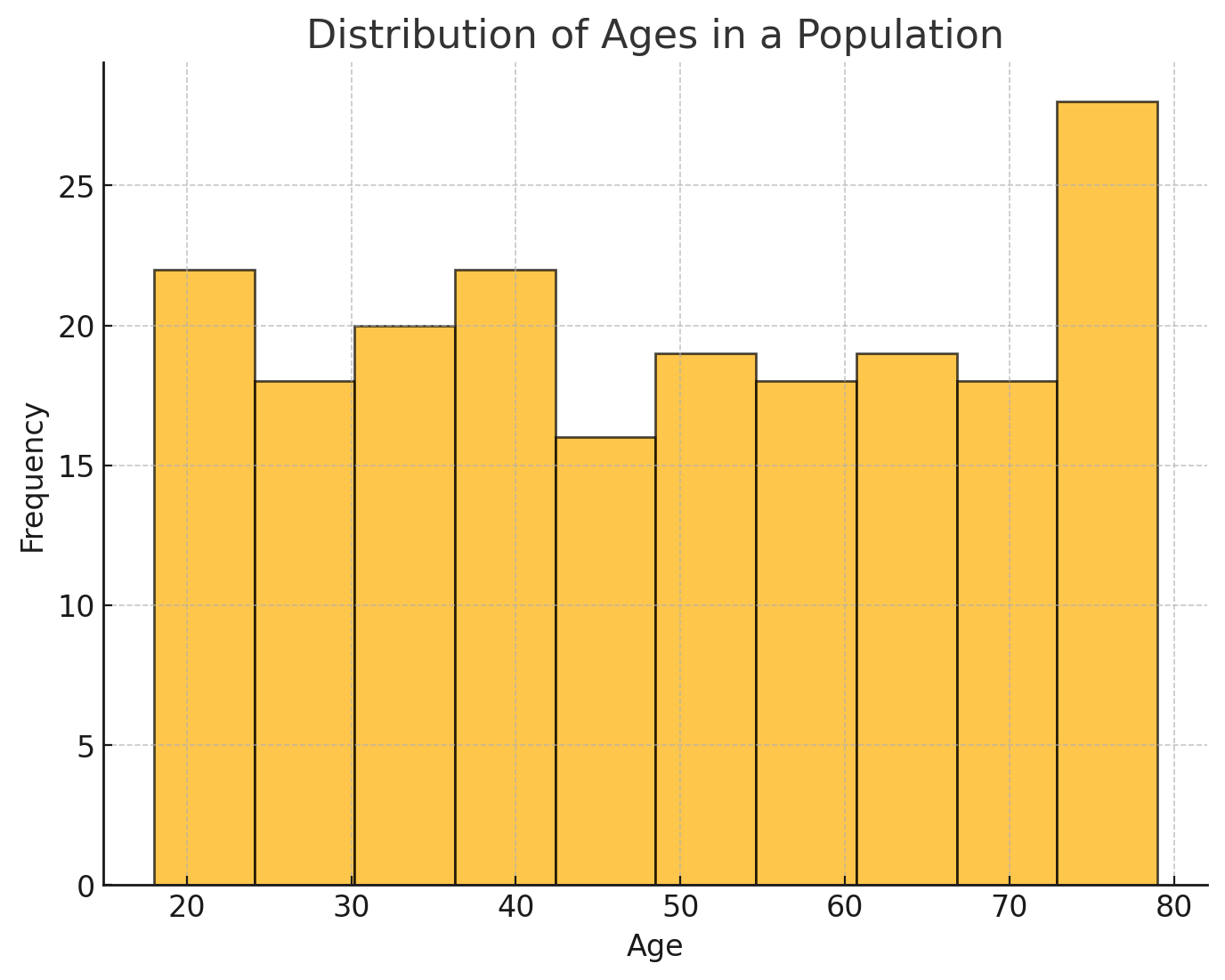
Here is an example of a histogram visualizing the distribution of ages in a population. The x-axis represents the age groups (bins), while the y-axis shows the frequency of people in each bin. This chart helps identify the population's age distribution and central tendencies.
Developing strong skills in data visualization techniques like histograms is key to gaining valuable insights from your data. To build your expertise further, consider these comprehensive data science courses:
- Generative AI Mastery Certificate for Data Analysis
- Generative AI Mastery Certificate for Managerial Excellence
- Generative AI Mastery Certificate for Software Development
Python Implementation of Histogram in Data Science
Histograms in data science are essential for compelling data exploration and analysis. With Python, libraries like Matplotlib, Seaborn, and Pandas make it easy to create and customize histograms. These libraries enable data scientists to visualize the distribution of individual features, identify patterns, and gain meaningful insights from the data.
Below is a Python code example that demonstrates how to plot a single-feature histogram with Matplotlib:
import matplotlib.pyplot as plt
import numpy as np

# Generate random data (e.g., from a normal distribution)
data = np.random.randn(1000)

# Create the histogram
plt.hist(data, bins=30, edgecolor='black')

# Adding gridlines
plt.grid(True, which='both', axis='both', linestyle='--', alpha=0.7)

# Adding titles and axis labels
plt.title('Single-Feature Histogram', fontsize=14)
plt.xlabel('Data Values', fontsize=12)
plt.ylabel('Frequency', fontsize=12)

# Displaying the plot
plt.show()
Explanation of the Code:
- Data Generation: We use np.random.randn(1000) to generate 1000 random numbers from a standard normal distribution (mean = 0, standard deviation = 1). This is the data for which we will create the histogram.
- Creating the Histogram: The plt.hist(data, bins=30, edgecolor='black') function creates a histogram with 30 bins and black edges around each bin for better visual clarity.
- Gridlines: The plt.grid(True, which='both', axis='both', linestyle='--', alpha=0.7) function adds gridlines to the plot. The gridlines help in interpreting the data more easily by providing reference points. The alpha=0.7 adds some transparency to the gridlines, so they don't overpower the histogram.
- Adding Titles and Axis Labels: Titles and labels are added using plt.title(), plt.xlabel(), and plt.ylabel(). These elements provide context to the plot, making it easier for others to understand what the histogram represents.
- Displaying the Plot: Finally, plt.show() displays the histogram on the screen.
Output: The histogram below shows the distribution of 1,000 random data points sampled from a standard normal distribution. It groups the data into 30 bins and displays the frequency of values within each bin.
-a943eccf67054650bc660671a94967d5.png)
The number of bins in a histogram affects the distribution of the data. Too few bins can oversimplify the data, hiding important patterns, while too many bins can create a cluttered, noisy visualization. The optimal bin size balances these extremes and can be found through methods like the Freedman-Diaconis or Sturges' rule.
To better understand histogram visualization, let’s look at how to display and compare multiple data sets using overlapping histograms.
Histogram with Multiple Data Sets
Histograms are an effective way to compare distributions with multiple data sets. Plotting overlapping histograms using plt.hist() in Matplotlib, allows you to visualize how two or more data sets differ or share standard features. This approach helps in examining the relationships between the distributions. The following are the key parameters that enhance the clarity of this comparison:
- Transparency: The alpha() parameter is used to adjust transparency. A lower alpha value (e.g., 0.5) makes the histograms more transparent, making it easier to see overlapping areas between multiple histograms. Higher alpha values (e.g., 0.9) result in more opaque bars.
- Legends: The label() parameter helps you add a label to each data set, which can be displayed in the chart legend. This makes it clear which histogram corresponds to which data set, enhancing the chart's interpretability.
Code Example: Multiple datasets
import matplotlib.pyplot as plt
import numpy as np

# Creating multiple random datasets
data1 = np.random.normal(0, 1, 1000)  # Mean 0, Standard deviation 1
data2 = np.random.normal(2, 1.5, 1000)  # Mean 2, Standard deviation 1.5

# Plotting the histograms
plt.hist(data1, bins=30, alpha=0.5, label='Data Set 1')
plt.hist(data2, bins=30, alpha=0.5, label='Data Set 2')

# Adding labels and title
plt.xlabel('Value')
plt.ylabel('Frequency')
plt.title('Histogram with Multiple Data Sets')

# Adding legend
plt.legend()

# Show plot
plt.show()
Explanation of the Code:
- Creating Data: We are creating two sets of random data, data1 and data2, using np.random.normal(). The first set has a mean of 0 and a standard deviation of 1, and the second set has a mean of 2 and a standard deviation of 1.5.
- Plotting Histograms: Both data sets are plotted using plt.hist(). The alpha=0.5 parameter makes the bars semi-transparent, allowing the overlapping areas to be visible.
- Adding Labels and Title: The xlabel(), ylabel(), and title() methods add labels and a title to the plot.
- Adding a Legend: The plt.legend() method adds a legend to the plot, which helps distinguish between the two data sets.
Output: This code will produce the following histogram with two overlapping sets of data.
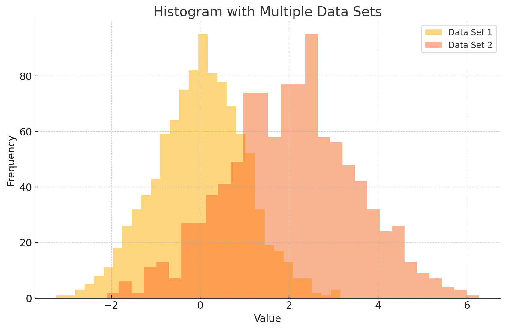
The transparency (alpha) will help you clearly see where the data sets overlap, and the legend will show which color corresponds to which data set.
Want to enhance your skills in using histograms for Data Science, ML, and Data Mining? Take the next step with upGrad’s Postgraduate Degree in Artificial Intelligence and Data Science and acquire the advanced knowledge and practical expertise needed to excel in the field of data science.
Now, let's discuss how histograms are useful for feature distribution analysis, detecting skewness, and handling imbalanced data.
Histogram in Data Science for Machine Learning Models
Histograms in Data Science are essential for building robust machine learning models as they facilitate the visualization of data distribution. This enables the identification of patterns, detection of potential data issues, and evaluation of feature suitability.
Below are a few ways histograms contribute to the data preprocessing and feature engineering pipeline for machine learning models.
1. Feature Distribution Analysis Before Model Building
Before developing any machine learning model, it's vital to assess the distribution of the input features. Histograms in data science provide a clear picture of these distributions and help identify potential issues that could influence model performance. Let’s take a closer look at the key factors to consider when analyzing feature distributions and addressing scaling issues in machine learning model development:
- Distribution Shape: The way data is distributed (e.g., normal, skewed, or uniform) plays a key role in model selection. For example, linear models work best with data that follows a normal distribution.
- Outliers: Histograms can highlight outliers or extreme values, which may skew the results of some models.
- Scaling Problems: Features with different value ranges (e.g., one feature with values from 0 to 1,000 and another from 0 to 1) can cause poor model performance, especially in scale-sensitive algorithms. Examining histograms helps identify these disparities, which can then be corrected using scaling methods like normalization or standardization.
Code Example: Overlay Histogram of All Input Features
import pandas as pd
import numpy as np
import matplotlib.pyplot as plt

# Generate synthetic dataset with realistic feature distributions
np.random.seed(0)
data = pd.DataFrame({
    'Age': np.random.normal(30, 10, 1000),  # Age centered around 30 with a standard deviation of 10
    'Income': np.random.normal(50000, 15000, 1000),  # Income centered around 50,000 with a standard deviation of 15,000
    'Height': np.random.normal(170, 7, 1000),  # Height centered around 170 cm with a standard deviation of 7
    'Weight': np.random.normal(70, 15, 1000)  # Weight centered around 70 kg with a standard deviation of 15
})

# Create overlay histograms for all input features
data.hist(bins=30, figsize=(10, 8), alpha=0.5)

# Show the plot
plt.show()
Explanation of the Code:
- Age: Values are generated using a normal distribution with a mean of 30 and a standard deviation of 10, which means the majority of ages will fall between 20 and 40.
- Income: Values are generated using a normal distribution with a mean of 50,000 and a standard deviation of 15,000, simulating a wide variety of income levels.
- Height: Values are generated with a mean of 170 cm and a standard deviation of 7, representing typical human heights.
- Weight: Values are generated with a mean of 70 kg and a standard deviation of 15, simulating average weights.
Output: The above code generates the following set of histograms.
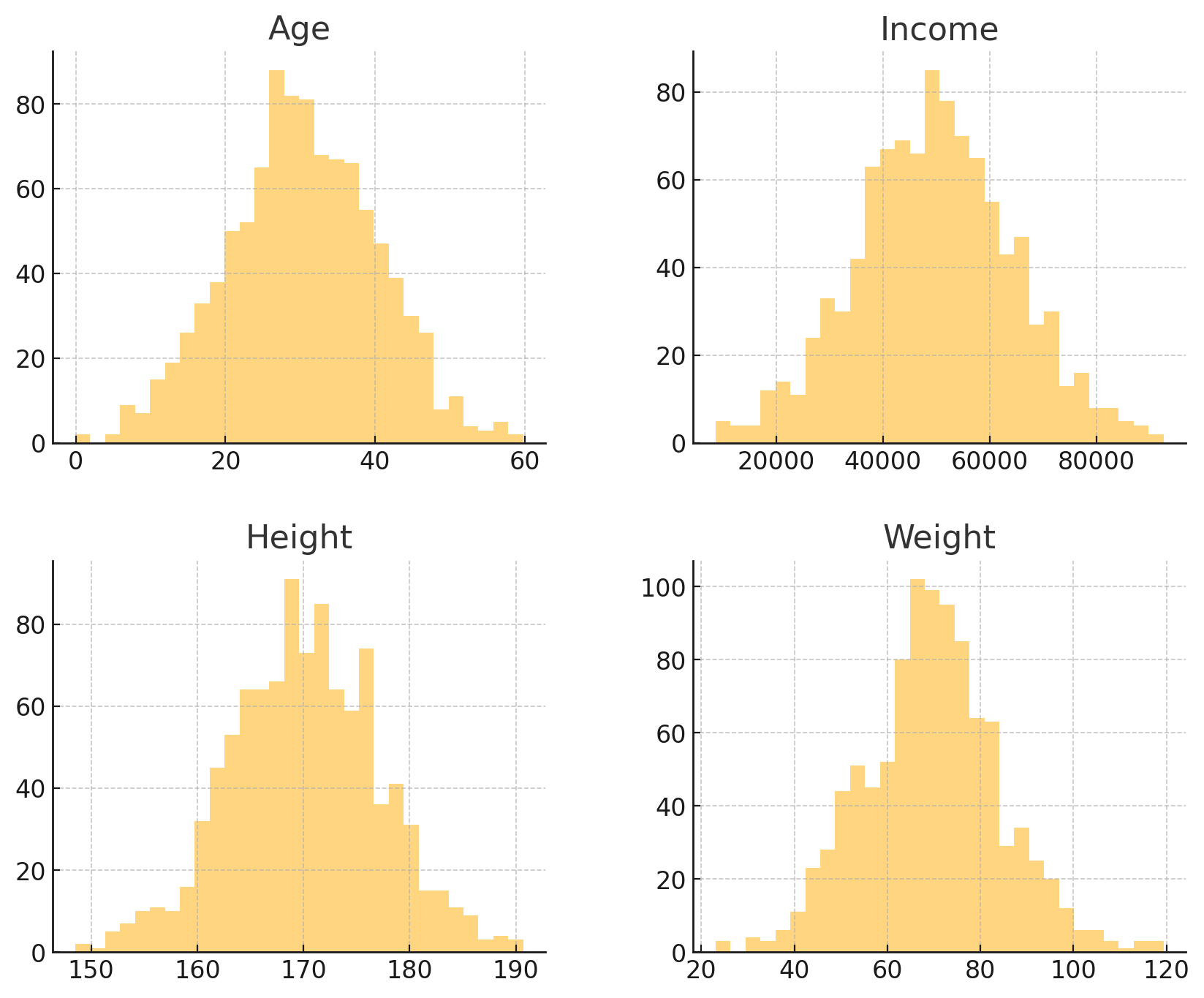
The overlay histogram compares the distributions of Age, Income, Height, and Weight, each following a normal distribution with different means and standard deviations. It visually highlights how these features vary in spread and central tendency across the dataset.
Moving ahead, let’s explore how specific transformations, such as logarithmic and square root, can help address the data's skewness, making it more suitable for machine learning models.
2. Detecting Skewness and Feature Engineering
Skewness in the data can significantly affect the performance of machine learning models. Histograms help identify skewed distributions, which can guide necessary transformations to improve model performance. The following describes how histograms can reveal skewness:
- Right-Skewed (Positive Skew): A histogram with a long right tail suggests that the data contains many smaller values and fewer larger ones (e.g., income or house prices).
- Left-Skewed (Negative Skew): If the histogram’s left tail is longer, it means most values are large, with fewer small ones.
How to handle Skewed Data for Machine Learning Models?
To handle skewed data and make it more suitable for machine learning models, transformations are applied. These transformations help make the data more symmetric, thus improving model accuracy.
- Logarithmic Transformation: A logarithmic transformation is used to normalize strongly right-skewed data with large positive values, such as income or population size. It compresses large values to make the data more symmetric. If the data includes zeros or small positive values, use the log1p transformation (log(1 + x)) to safely handle zeros.
- Square Root Transformation: A square root transformation is applied to moderately skewed data to reduce the impact of extreme values and make the distribution more symmetric without overly compressing the data.
However, it is often less effective for heavily right-skewed, heavy-tailed distributions because it doesn’t compress large values as much as a logarithmic transformation.
Before transformation, the histogram of skewed data typically shows a sharp peak on one side with a long tail on the other. After applying transformations, the distribution becomes more symmetric, reducing the skewness and making the data more suitable for modeling.
Code Example:
import numpy as np
import pandas as pd
import matplotlib.pyplot as plt
from sklearn.preprocessing import FunctionTransformer

# Sample data: right-skewed data (e.g., income or house prices)
data = {'income': [5000, 7000, 8000, 9000, 10000, 20000, 30000, 50000, 100000, 200000]}
df = pd.DataFrame(data)

# Visualize the histogram before any transformation (detect skewness)
plt.figure(figsize=(10, 6))
plt.subplot(1, 2, 1)
plt.hist(df['income'], bins=10, color='blue', edgecolor='black')
plt.title('Original Histogram - Right Skewed')

# Apply logarithmic transformation to reduce skewness
df['income_log'] = np.log(df['income'])

# Visualize the histogram after applying the logarithmic transformation
plt.subplot(1, 2, 2)
plt.hist(df['income_log'], bins=10, color='green', edgecolor='black')
plt.title('Log-Transformed Histogram')

plt.tight_layout()
plt.show()

# Apply square root transformation to moderately skewed data
df['income_sqrt'] = np.sqrt(df['income'])

# Visualize the square root transformation
plt.figure(figsize=(10, 6))
plt.hist(df['income_sqrt'], bins=10, color='orange', edgecolor='black')
plt.title('Square Root Transformed Histogram')
plt.show()
Explanation of the Code:
- Original Data: A small dataset with right-skewed data (e.g., income or house prices). A histogram is plotted to visually detect skewness. You should notice a long right tail if the data is right-skewed.
- Logarithmic Transformation: A logarithmic transformation is applied (np.log()), which is especially useful for highly right-skewed data. After the transformation, you should notice that the distribution becomes more symmetric, reducing the extreme values.
- Square Root Transformation: A square root transformation is applied (np.sqrt()), which is suitable for moderately skewed data. This transformation also reduces the impact of extreme values but does not compress the data as much as the logarithmic transformation.
- Visualization: The histograms are shown before and after applying the transformations to visually compare the effect on skewness.
Output: Below are the histograms that visualize the data before and after applying the transformations, allowing for a clear comparison of the effect on skewness.
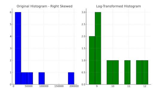
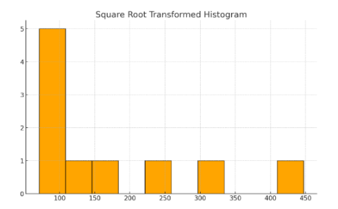
The original histogram shows a long right tail, indicating positive skewness. After applying a logarithmic transformation, the distribution becomes more symmetric. Similarly, the square root transformation reduces the skewness, but not as effectively as the logarithmic transformation.
Also Read: Bar Chart vs. Histogram: Which is Right for Your Data?
Let's now explore how to visualize and detect class imbalances and effectively handle them using histograms.
3. Using Histograms to Handle Imbalanced Data
Imbalanced datasets, where one class greatly outnumbers others, can cause models to favor the majority class and reduce overall performance. Histograms help detect and manage this imbalance by visualizing class distributions. Here’s how they assist in the process:
- Visualizing Class Distribution: Histograms display the count of each class. A much taller bar for one class indicates imbalance, guiding decisions on resampling methods like oversampling or undersampling.
- Handling Multiclass Imbalance: Histograms reveal underrepresented classes in multiclass problems, allowing you to apply class weighting or data augmentation to improve minority class performance.
- Detecting Feature-Label Differences: By comparing feature distributions across classes, histograms highlight skewness or class-specific patterns that affect model fairness and accuracy.
- Data Transformation Insights: Histograms identify skewed feature distributions, helping decide if transformations (log scaling, binning) can improve model performance for minority classes.
- Binning for Rebalancing: For continuous features, histograms help create bins to target underrepresented ranges, enabling synthetic sampling or reweighting to balance the dataset.
- Applying Sample Weights: Histogram analysis pinpoints underrepresented classes or feature bins where higher sample weights can ensure fairer learning.
Note: Histograms provide helpful visual clues, but should not be your only tool. Always combine them with quantitative measures like AUC (Area Under the ROC Curve) and use stratified sampling during training and testing. This ensures your model is evaluated and trained fairly despite imbalanced data. |
Code Example: Class Imbalance Visualization
import matplotlib.pyplot as plt
import seaborn as sns
from sklearn.datasets import make_classification

# Generate a synthetic imbalanced binary classification dataset
X, y = make_classification(n_samples=1000, n_features=20, n_informative=2,
                           n_redundant=10, n_classes=2, weights=[0.9, 0.1], flip_y=0, random_state=42)

# Visualize class distribution using a histogram
plt.figure(figsize=(8, 6))
sns.histplot(y, kde=False, bins=2, color='skyblue', edgecolor='black')

# Add labels and title
plt.title('Class Distribution in the Imbalanced Dataset', fontsize=14)
plt.xlabel('Class', fontsize=12)
plt.ylabel('Frequency', fontsize=12)
plt.xticks([0, 1], ['Class 0', 'Class 1'])

# Show plot
plt.show()
Explanation of the Code:
- Dataset Generation: We use make_classification from sklearn to create a synthetic imbalanced dataset where the first class (Class 0) has a much larger proportion (90%) than the second class (Class 1, 10%).
- Histogram Plot: sns.histplot is used to visualize the frequency of each class in the dataset. We set bins=2 since this is a binary classification problem.
- Customization: The plot is styled with matplotlib and seaborn to make the visualization clear and attractive, showing the class imbalance visually.
Output: Here is the histogram visualizing the class distribution in the imbalanced dataset.
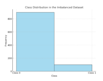
Class 0 is much more frequent than Class 1, showing the data imbalance. This visualization highlights when to use oversampling, undersampling, or class weighting to address the imbalance.
Histograms reveal data distribution, skewness, and class imbalances, which are important for building effective machine learning models.
Want to learn more about Data Science? Check out upGrad’s Programming with Python: Introduction for Beginners course! Learn core programming concepts like control statements, data structures and object-oriented programming to boost your skills and advance your data science journey!
Now, let's explore the key applications of histogram in data mining, focusing on their roles in data reduction, pattern recognition, and association rule mining.
Applications of Histogram in Data Mining Tasks: 3 Major Roles
When dealing with large datasets, a histogram in data mining offers significant advantages. By visualizing the distribution of data, histogram in data mining tasks help identify patterns, detect outliers, and summarize vast amounts of information. They empower data miners to uncover trends and anomalies that are essential for understanding large-scale systems. Below are three key roles that histograms play in data mining tasks, enabling more efficient analysis and insight extraction.
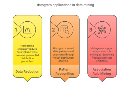
1. Histogram-Based Data Reduction Techniques
Histogram in data mining is a widely used technique for data approximation through binning, where the data is divided into equal-width or equal-depth bins to facilitate easier analysis. This method simplifies large datasets by summarizing the data into smaller, manageable chunks. It is especially useful in OLAP cubes and summarization tasks where complex data needs to be analyzed more efficiently.
Example: A retail company handling terabytes of sales data uses Apache Kylin or Apache Druid, which provide OLAP capabilities with native support for pre-aggregated histograms. These tools enable the company to efficiently query sales data aggregated into bins by region and time period. Instead of scanning billions of raw transactions, analysts query histograms summarizing sales frequency, speeding up trend analysis and decision-making.
Alternatively, using Apache Spark’s DataFrame API, the company can apply approximate quantile functions (approxQuantile()) or binning (Bucketizer) to preprocess and reduce data size before model training or dashboarding.
2. Pattern Recognition Through Histogram Distributions
Histogram in data mining help reveal visual patterns in data such as user activity logs, sales trends, or sensor data distributions. They assist in detecting repetitive structures or trends that can be further analyzed. Time-series histogram plots are particularly effective in spotting fluctuations and outliers, providing valuable insights into the underlying data behavior.
Example: An online platform tracks millions of user login events daily. Using Apache Flink or Kafka Streams, the platform aggregates login timestamps into time-windowed histogram bins. These histograms are stored in a time-series database such as InfluxDB or ElasticSearch, and visualized via Grafana dashboards. This setup enables rapid identification of peak login periods and sudden spikes, which may indicate security incidents or unusual user behavior requiring investigation.
For advanced anomaly detection, tools like Elastic SIEM incorporate histogram-based event frequency analysis alongside machine learning models for real-time security insights.
3. Histogram Use in Association Rule Mining
In association rule mining, histograms are vital in calculating support and filtering rules based on frequency thresholds. By summarizing the frequency of itemsets, histograms aid in eliminating weak or unimportant rules. This process streamlines rule generation and helps set minimum support and confidence values for better results.
Example: A grocery chain applies Apache Spark MLlib’s FP-Growth algorithm to millions of transaction records to discover frequent itemsets. Before mining, the data team uses approximate counting techniques like Count-Min Sketch to estimate itemset frequencies, which serves as a histogram-like frequency summary. This pre-filtering helps set minimum support thresholds appropriately, focusing the mining on itemsets that truly appear frequently (e.g., bread and butter pairs), improving performance and the quality of discovered association rules.
Also Read: 15+ Advanced Data Visualization Techniques for Data Engineers in 2025
How Well Have You Understood Histograms in Data Science?
Histograms are essential in data science for visualizing data distribution, spotting outliers, and understanding patterns. By utilizing histogram in data science, professionals can gain valuable insights into the structure of their datasets, which is crucial for tasks like data preprocessing, exploratory data analysis, and model selection.
Here are some questions to assess how well you understand histograms and how they can improve your ability to interpret data and enhance model performance.
1. What is the primary use of histogram in data science?
- To display categorical data
- To visualize the distribution of continuous data
- To show correlations between variables
- To predict future trends
2. What is the Freedman-Diaconis Rule used for in histogram analysis?
- To calculate the number of data points in a bin
- To calculate the optimal bin width based on data dispersion
- To assess the skewness of the data
- To determine the number of outliers in the data
3. In a histogram, what does the x-axis represent?
- Frequency of data points
- Data values or bins
- The number of bins
- None of the above
4. What is the effect of having too few bins in a histogram?
- It can lead to oversimplification and obscure details
- It makes the histogram more detailed
- It increases the transparency of the bars
- None of the above
5. Which rule calculates the optimal bin width based on the interquartile range (IQR)?
- Sturges' Rule
- Freedman-Diaconis Rule
- Empirical Rule
- Bayes' Rule
6. What does a bimodal distribution in a histogram represent?
- A uniform distribution
- A distribution with two peaks
- A symmetrical distribution
- A skewed distribution
7. In Python, which function is used to create a histogram?
- plt.scatter()
- plt.plot()
- plt.hist()
- plt.bar()
8. What does adjusting the 'alpha' parameter in a histogram plot affect?
- The number of bins
- The color of the bars
- The transparency of the bars
- The frequency of the data
9. How do you interpret a histogram with a long right tail?
- The data is negatively skewed
- The data is positively skewed
- The data is uniformly distributed
- The data is normally distributed
10. Why is it essential to analyze feature distribution before building a machine learning model?
- To ensure the data has normal distribution
- To avoid data leakage
- To detect and handle outliers and scaling issues
- All of the above
Also Read: What is Cluster Analysis in Data Mining? Methods, Benefits, and More
Become a Data Science Expert with upGrad!
Understanding histogram in data science is essential for interpreting data distribution, detecting anomalies, and guiding model selection. Using real datasets with visualization tools like matplotlib or seaborn, and experimenting with bin sizes, enhances your understanding of data patterns and distribution.
Many model issues arise from poor data visualization, so mastering histograms helps improve accuracy. upGrad’s industry-aligned data science programs equip learners with practical skills to apply such concepts effectively in practical scenarios.
These are some of the additional courses to enhance your data science expertise.
- Executive Post Graduate Certificate Programme in Data Science & AI
- Generative AI Foundations Certificate Program
If you're uncertain about your career direction or the skills needed to advance, upGrad’s expert counselors are here to provide personalized counseling. You can also visit one of our offline centers for a comprehensive consultation to help you choose the right course and take the next step in achieving your professional goals!
FAQs
1. How do histograms handle categorical variables in data analysis?
Histograms aren't suitable for categorical variables since they assume a continuous range and binning logic. Applying histograms to categories may mislead by implying order or spacing. For example, plotting city names on a histogram would falsely suggest numerical distance. In data analysis, categorical variables should be visualized with bar charts, which clearly show individual category frequencies without distorting meaning through improper binning or distribution logic.
2. Can histograms help in feature selection for machine learning models?
Yes, histograms help identify features with skewed or low-variance distributions that may contribute little to prediction. For instance, a feature showing a flat histogram with almost all values in one bin likely has limited informational value. Removing such features can reduce dimensionality and improve model generalization. Additionally, histograms can uncover multimodal distributions, hinting at the need for transformation or separate modeling strategies.
3. What challenges arise when interpreting histograms with skewed data?
In skewed data, histograms often misrepresent the central tendency, leading to misleading assumptions in algorithms that expect normality (e.g., linear regression). For example, if income data is right-skewed, the mean will be much higher than the mode, affecting feature scaling or imputation. Visualizing skewness in a histogram alerts analysts to apply normalization techniques like log or Box-Cox to stabilize variance and improve model robustness.
4. How do histograms contribute to data preprocessing in mining tasks?
Histograms help detect irregularities like outliers, missing values, or inconsistent bin densities in datasets before mining. For example, if a histogram reveals a spike in zero values for a numerical field, it might indicate faulty sensor data or default encoding. Recognizing such patterns allows teams to decide whether to impute, remove, or re-encode values—actions that directly impact algorithm input quality and final pattern mining accuracy.
5. Can histograms be combined with other visualizations for better insights?
Yes, combining histograms with Kernel Density Estimates (KDEs) or box plots helps provide both frequency and smooth probability insights. For example, overlaying a KDE on a histogram of transaction amounts can reveal multimodal behavior that the histogram alone may obscure. Similarly, adding box plots highlights outliers and quartile ranges, offering granular context. These combinations enable analysts to validate distribution assumptions before selecting algorithms.
6. How does histogram normalization affect data interpretation?
Normalized histograms convert raw frequencies to relative probabilities, enabling fair comparison between datasets of different sizes. For example, comparing session durations across two websites with different traffic volumes is misleading unless histograms are normalized. After normalization, bins represent the proportion of users per duration range, helping identify behavior trends consistently across datasets. This is especially useful when comparing test and production environments in model validation.
7. What role do histograms play in time series data analysis?
Histograms in time series don’t preserve temporal order but reveal value distribution over time. For instance, analyzing CPU usage over days with a histogram helps identify usage spikes or dominant activity levels without viewing trends. This complements time plots by showing dominant load zones or changes in range. It’s particularly useful when validating preprocessing steps like differencing or rescaling that aim to stabilize data variance.
8. How can histogram binning improve model accuracy?
Binning converts continuous variables into discrete intervals, which can reduce overfitting and improve interpretability, especially for tree-based models like Random Forests. For example, age can be binned into ranges (0–18, 19–35, etc.) to simplify splits. Binning also smooths outliers and stabilizes variance across features. Optimal bin size selection—using techniques like Sturges’ rule or entropy-based binning—ensures useful granularity without introducing artificial boundaries.
9. Are there any limitations of histograms in big data environments?
Yes, plotting histograms for massive or high-dimensional data can lead to performance bottlenecks or unreadable visuals. For example, visualizing a 100-million-row feature in real-time isn’t practical. In such cases, sampling techniques (e.g., stratified or reservoir sampling) are essential for approximation. Additionally, parallel histogram computation or sketch-based summaries like t-digest may be used for memory efficiency while preserving statistical fidelity in big data analytics.
10. How do histograms assist in class imbalance detection?
Histograms allow quick visual assessment of class distributions in datasets. In binary classification, for instance, a histogram might show 90% of records labeled as class 0 and only 10% as class 1, indicating severe imbalance. This affects model training by biasing towards the majority class. Early detection using histograms helps guide countermeasures like SMOTE, class weighting, or threshold adjustment to restore model fairness and performance.
11. Can histograms be used to monitor model drift in production?
Yes, production histograms of input features can be compared with training distributions to detect data drift. For example, if a feature like transaction amount shifts from a bell-shaped to a right-skewed histogram, it signals changes in user behavior. Such drift can degrade model performance over time. Automating histogram comparisons via statistical tests (e.g., KL divergence) can trigger alerts for model retraining before performance drops.


upGrad Learner Support
Talk to our experts. We are available 7 days a week, 10 AM to 7 PM
Indian Nationals
Foreign Nationals
Disclaimer
The above statistics depend on various factors and individual results may vary. Past performance is no guarantee of future results.
The student assumes full responsibility for all expenses associated with visas, travel, & related costs. upGrad does not .