All courses
Agentic AI
Agentic AI

IIIT Bangalore
Executive Programme in Generative AI for LeadersArtificial Intelligence
Degree / Exec. PG

IIIT Bangalore
Executive Diploma in Machine Learning and AI
OPJ Global University
Master’s Degree in Artificial Intelligence and Data Science
Liverpool John Moores University
Master of Science in Machine Learning & AI
Golden Gate University
DBA in Emerging Technologies with Concentration in Generative AIExecutive Certificate

IIITB & IIM, Udaipur
Chief Technology Officer & AI Leadership ProgrammeIIIT Bangalore
Executive Programme in Generative AI for Leaders
upGrad | Microsoft
Gen AI Mastery Certificate for Software DevelopmentupGrad | Microsoft
Gen AI Mastery Certificate for Managerial ExcellenceOffline Bootcamps

upGrad
Data Science and AI-MLDoctorate
For All Domains
IIITB & IIM, Udaipur
Chief Technology Officer & AI Leadership Programme
Swiss School of Business and Management
Global Doctor of Business Administration from SSBM
Edgewood University
Doctorate in Business Administration by Edgewood UniversityGolden Gate University
Doctor of Business Administration From Golden Gate University
Rushford Business School
Doctor of Business Administration from Rushford Business School, SwitzerlandGolden Gate University
Master + Doctor of Business Administration (MBA+DBA)-d9bdeff6165f4eb1ba2adcebde78e961.svg)
University of Waterloo
Chief Technology and AI Officer ProgramLeadership / AI
Golden Gate University
DBA in Emerging Technologies with Concentration in Generative AIMachine Learning
Machine Learning
Data Science
Degree / Exec. PG
O.P Jindal Global University
Master’s Degree in Artificial Intelligence and Data ScienceIIIT Bangalore
Executive Diploma in Data Science & AILiverpool John Moores University
Master of Science in Data ScienceExecutive Certificate
upGrad | Microsoft
Gen AI Foundations Certificate Program from MicrosoftupGrad | Microsoft
Gen AI Mastery Certificate for Data AnalysisupGrad | Microsoft
Gen AI Mastery Certificate for Software DevelopmentupGrad | Microsoft
Gen AI Mastery Certificate for Managerial ExcellenceupGrad | Microsoft
Gen AI Mastery Certificate for Content CreationOffline Bootcamps
upGrad
Data Science and AI-MLupGrad
Data AnalyticsMBA
Masters

Liverpool School of Business
Master of Business Administration from Liverpool Business School with IIM Udaipur Certification
Paris School of Business
Master of Science in Business Management and TechnologyO.P.Jindal Global University
MBA (with Career Acceleration Program by upGrad)Edgewood University
MBA from Edgewood UniversityO.P.Jindal Global University
MBA from O.P.Jindal Global UniversityGolden Gate University
Master + Doctor of Business Administration (MBA+DBA)Executive Certificate

IMT, Ghaziabad
Advanced General Management ProgramMarketing
Executive Certificate
Offline Bootcamps
upGrad
Digital MarketingManagement
Degree
O.P Jindal Global University
MSc in International Accounting & Finance (ACCA integrated)
Golden Gate University
Master of Arts in Industrial-Organizational PsychologyExecutive Certificate

IIIT-B & IIM, Udaipur
Chief Technology Officer & AI Leadership ProgrammeIIIT-B & IIM, Udaipur
Chief Data and AI Officer Programme
IIM Kozhikode
Human Resource Analytics Course from IIM-KupGrad | Microsoft
Gen AI Foundations Certificate Program from MicrosoftEducation
Education

Northeastern University
Master of Education (M.Ed.) from Northeastern UniversityEdgewood University
Doctor of Education (Ed.D.)Edgewood University
Master of Education (M.Ed.) from Edgewood UniversityCertifications
Project Management
Certification

Knowledgehut
Leadership And Communications In ProjectsKnowledgehut
Microsoft Project 2007/2010-ae8d039bbd2a41318308f8d26b52ac8f.svg)
Knowledgehut
Financial Management For Project ManagersKnowledgehut
Fundamentals of Earned Value Management (EVM)Knowledgehut
Fundamentals of Portfolio ManagementKnowledgehut
Fundamentals of Program Management-35c169da468a4cc481c6a8505a74826d.webp&w=128&q=75)
Knowledgehut
CAPM® CertificationsKnowledgehut
Microsoft® Project 2016Certifications & Trainings
-7f4b4f34e09d42bfa73b58f4a230cffa.webp&w=128&q=75)
Knowledgehut
PMP® CertificationKnowledgehut
PMI-RMP® CertificationKnowledgehut
PMP Renewal Learning PathKnowledgehut
Oracle Primavera P6 V18.8Knowledgehut
Microsoft® Project 2013Knowledgehut
PfMP® Certification CourseKnowledgehut
Project Planning and MonitoringPrince2 Certifications

Knowledgehut
PRINCE2® FoundationKnowledgehut
PRINCE2® PractitionerKnowledgehut
PRINCE2 Agile Foundation and PractitionerKnowledgehut
PRINCE2 Agile® Foundation CertificationKnowledgehut
PRINCE2 Agile® Practitioner CertificationManagement Certifications
Knowledgehut
Project Management Masters Certification ProgramKnowledgehut
Change ManagementKnowledgehut
Project Management TechniquesKnowledgehut
Product Management Certification ProgramKnowledgehut
Project Risk Management- Study abroad
- Offline centres
- uGSOT - B.Tech
More
%20(2)-db0b6f38da9c485faf76e366793c9b9e.webp&w=128&q=75)


49. Variance in ML
A Guide to Correlation in Machine Learning and Correlation Matrix Analysis
Did you know? While a perfect positive correlation (+1.0) between two features might seem ideal, it actually signals redundancy in your machine learning dataset. It's like having two identical twins providing the exact same information to your model, but one of them isn't really adding anything new!
While correlation in machine learning reveals the relationships between variables, it's vital to remember that it does not establish causation, a key distinction that significantly impacts how analytical insights are drawn. Consequently, correlation in machine learning plays a critical role in initial data exploration, with correlation matrices providing a structured overview of these inter-feature relationships.
This blog will guide you through correlation types, matrix construction and interpretation, practical Python implementations, and common mistakes to avoid.
Looking to deepen your understanding beyond correlation in machine learning? Explore upGrad's AI ML courses and learn from top 1% global universities. Specialize in data science, deep learning, NLP, and more to accelerate your career!
Understanding Correlation in Machine Learning: Role and Importance
Correlation in machine learning is a statistical measure that describes the extent to which two or more variables change together. It provides insights into the relationships between features in your dataset, which is crucial for effective model building and interpretation. Understanding correlation involves grasping a few key aspects:
- Definition: Correlation quantifies the strength and direction of a statistical relationship between variables. It doesn't imply a cause-and-effect relationship.
- Mathematical Basis: Correlation is often represented by a correlation coefficient, commonly Pearson's r, which ranges from -1 to +1. The formula for Pearson's r between two variables X and Y is:
- Role in Model Design: Understanding correlation is vital throughout the machine learning pipeline. It helps in:
- Feature Selection: Identifying and removing redundant features that provide similar information.
- Feature Engineering: Guiding the creation of new, more informative features based on existing ones.
- Model Selection: Informing the choice of algorithms that might be sensitive to correlated features.
- Model Interpretation: Understanding how different features relate to the target variable and to each other.
Consider exploring upGrad's comprehensive programs to gain a deeper understanding of the statistical foundations of machine learning and how correlation fits into the broader picture.
How Correlation Affects Model Performance?
Feature interdependence, particularly in multicollinearity, can significantly hinder the performance and interpretability of machine learning algorithms. Multicollinearity arises when two or more independent variables in a model are highly correlated. For example, predicting house prices with "square footage" and "number of rooms" suffers from multicollinearity. Larger houses typically have more rooms, making it hard to isolate each feature's impact on price, leading to unstable coefficient estimates.
Multicollinearity's impact on model performance and interpretability is multifaceted. These effects can be summarized as follows:
Impact of Multicollinearity | Description |
Unstable Model Coefficients | Small changes in the data can lead to large, unpredictable changes in the estimated coefficients of the correlated variables. |
Reduced Statistical Power | It becomes harder to determine the true effect of each independent variable on the dependent variable, potentially leading to Type II errors. |
Difficulty in Feature Importance | It's challenging to ascertain the individual contribution of each correlated predictor to the model, making feature importance assessment unreliable. |
Overfitting | In some cases, multicollinearity can contribute to overfitting, where the model learns the noise in the training data and performs poorly on unseen data. |
Also Read: What is Overfitting & Underfitting In Machine Learning ? [Everything You Need to Learn]
The impact of feature interdependence due to high correlation can manifest in various ways:
- Inflated Standard Errors: The standard errors of the regression coefficients tend to increase, making it difficult to achieve statistical significance for the individual coefficients.
- Counterintuitive Coefficient Signs: The coefficients of highly correlated variables might have signs that contradict domain knowledge or expected relationships.
- Model Instability: The model's performance can vary significantly with minor changes in the training data or the inclusion/exclusion of correlated variables.
Addressing high correlation through techniques like feature selection (removing one of the correlated features) or dimensionality reduction (combining correlated features) is often necessary to build more stable and interpretable machine learning models.
Also Read: Exploring the Types of Machine Learning: A Complete Guide for 2025
To better understand how feature relationships are quantified, let’s explore the common types of correlation in machine learning and how each impacts model behavior.
Types of Correlation Used in Machine Learning
To effectively analyze the relationships between variables in your machine learning datasets, it's essential to understand the nuances of different correlation measures.
The choice of method depends on the nature of your data and the type of relationship you are trying to identify. Let's explore three commonly used correlation coefficients:
1. Pearson Correlation: This method measures the strength and direction of a linear relationship between two continuous variables. Its calculation relies on the covariance and standard deviations of the two datasets.
- Formula: As previously mentioned, Pearson's correlation coefficient (r) is calculated as:
- Assumptions: For Pearson correlation to be reliable, the data should ideally meet several assumptions.
- Linearity: The relationship between the two variables should be linear. Pearson's r might underestimate the true association if the relationship is curved.
- Normality: The variables should be approximately normally distributed. Significant deviations from normality can affect the significance tests associated with the correlation.
- Homoscedasticity: The variance of one variable should be roughly constant across all values of the other variable. Unequal variances can lead to unreliable results.
- Interval or Ratio Data: Pearson correlation is most appropriate for continuous data measured on an interval or ratio scale.
When to Use: Employ Pearson correlation when investigating a potential linear relationship between two continuous variables, and your data reasonably satisfies the underlying assumptions of linearity and normality.
2. Spearman Correlation: Unlike Pearson's, Spearman's rank correlation coefficient assesses the strength and direction of a monotonic relationship between two variables. This means it evaluates how well the relationship between the variables can be described using a monotonic function (a function that is either entirely non-increasing or entirely non-decreasing), without necessarily being linear.
- Formula: Spearman's rank correlation coefficient (ρ or rs) is calculated on the ranked values of the data. First, both datasets are ranked independently. Then, the Pearson correlation formula is applied to these ranks:
- Assumptions: Spearman correlation makes fewer assumptions about the data distribution.
- Monotonicity: The relationship between the two variables should be monotonic.
- Ordinal, Interval, or Ratio Data: Spearman can be used with ordinal data (where the order matters but not the exact values) and interval or ratio data that may not meet the linearity or normality assumptions required for Pearson.
When to Use: Opt for Spearman correlation when you suspect a non-linear but consistently directional relationship between variables, or when dealing with ordinal data or continuous data that contains significant outliers, as ranking reduces the influence of extreme values.
3. Kendall Correlation: Kendall's tau (τ) is another non-parametric measure of the relationship between two datasets. It focuses on the similarity of the orderings of the data when ranked by each of the quantities.
It assesses the proportion of concordant pairs (where the ranks of both elements are in the same order) minus the proportion of discordant pairs (pairs where the ranks are in opposite orders).
- Formula: Kendall's tau (τ) is calculated as: τ=Total number of pairs
- Assumptions: Similar to Spearman, Kendall correlation is non-parametric and makes fewer assumptions about the data distribution.
- Ordinal, Interval, or Ratio Data: Suitable for ordinal and continuous data.
- Monotonicity: It primarily assesses the monotonic relationship between the variables.
When to Use: Choose Kendall's correlation when you are particularly interested in the degree of similarity in the rankings of the two variables.
It is often preferred over Spearman when dealing with smaller datasets or when many tied ranks could affect the Spearman coefficient.
If you want to learn more about statistical concepts, upGrad’s free Basics of Inferential Statistics course can help you. You will learn probability, distributions, and sampling techniques to draw accurate conclusions from random data samples.
Understanding Positive, Negative, and Zero Correlation
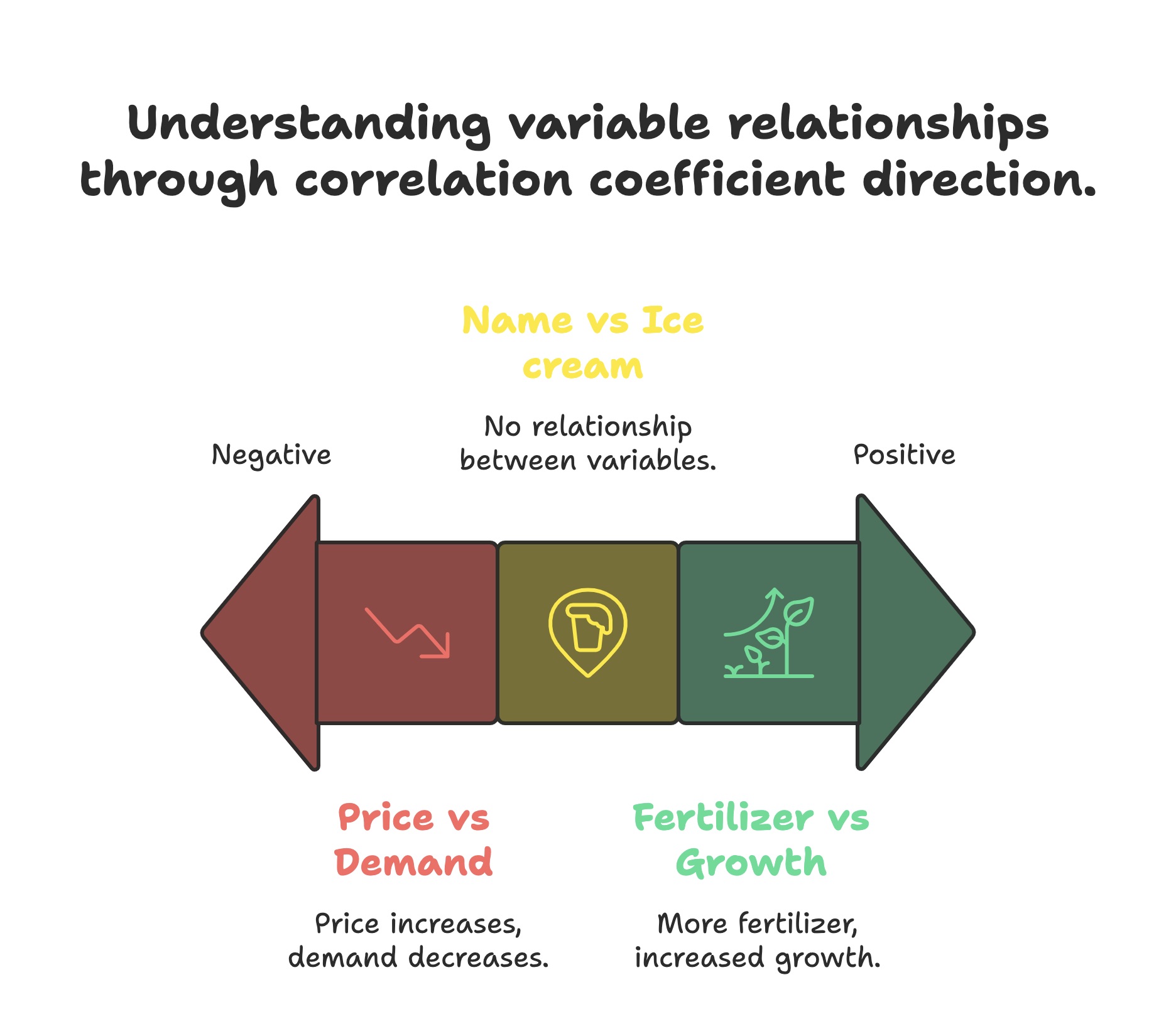
The sign and magnitude of the correlation coefficient, regardless of the method used, provide crucial information about the direction and strength of the association between variables. Understanding these directional correlations is key to interpreting your data:
- Positive Correlation (Coefficient > 0): This indicates a direct relationship between the two variables. As one variable increases, the other tends to grow as well. The closer the coefficient is to +1, the stronger the positive association.
- Example: Consider the relationship between the amount of fertilizer used on a plant and its growth. Generally, up to a certain point, more fertilizer leads to increased plant growth, illustrating a positive correlation.
- Negative Correlation (Coefficient < 0): This signifies an inverse relationship between the two variables. As one variable increases, the other tends to decrease. The closer the coefficient is to -1, the stronger the negative association.
- Example: Consider the relationship between a popular product's price and demand. Typically, as the product price increases, the quantity demanded by consumers tends to decrease, demonstrating a negative correlation.
- Zero Correlation (Coefficient ≈ 0): A correlation coefficient close to zero suggests that there is no linear (in the case of Pearson) or consistent monotonic (in the case of Spearman and Kendall) relationship between the two variables. Changes in one variable do not systematically correspond to changes in the other.
- Example: The correlation between the number of letters in a person's name and their favorite ice cream flavor is likely close to zero, indicating no meaningful relationship between these two attributes.
Furthermore, machine learning also excels at capturing non-linear relationships without explicit correlation calculations. Tree-based methods partition data, kernel SVMs map to higher dimensions, and neural networks learn complex patterns.
Polynomial regression adds non-linear terms to linear models, and feature engineering creates interaction features. These techniques are crucial for accurate modeling beyond linear correlations.
Also read: What is Overfitting & Underfitting In Machine Learning?
Let's now understand the practical application of these concepts by constructing and utilizing a correlation matrix in machine learning workflows.
Building and Using a Correlation Matrix in Machine Learning
A correlation matrix is a fundamental tool in the exploratory analysis of multivariate datasets. It provides a structured way to understand the pairwise linear relationships between all the continuous variables within your data.
- It is a square table where the rows and columns represent the variables in your dataset.
- Each cell in the correlation matrix in machine learning holds the coefficient between the variable in its row and the one in its column.
- The correlation coefficient typically used is Pearson's r, but depending on the data and the relationships you want to assess, Spearman's ρ or Kendall's τ could also populate the matrix.
- The matrix is always symmetric along the main diagonal (from the top left to the bottom right) because the correlation between variable A and variable B is the same as between variable B and variable A.
- The diagonal elements of the matrix are always 1, representing the perfect positive correlation of a variable with itself.
- The primary utility of a correlation matrix lies in its ability to provide a concise overview of the linear dependencies within a dataset. This makes it easier to spot potential redundancies (high correlations) or interesting relationships that warrant further investigation or inform feature engineering.
How to Read and Interpret the Matrix?
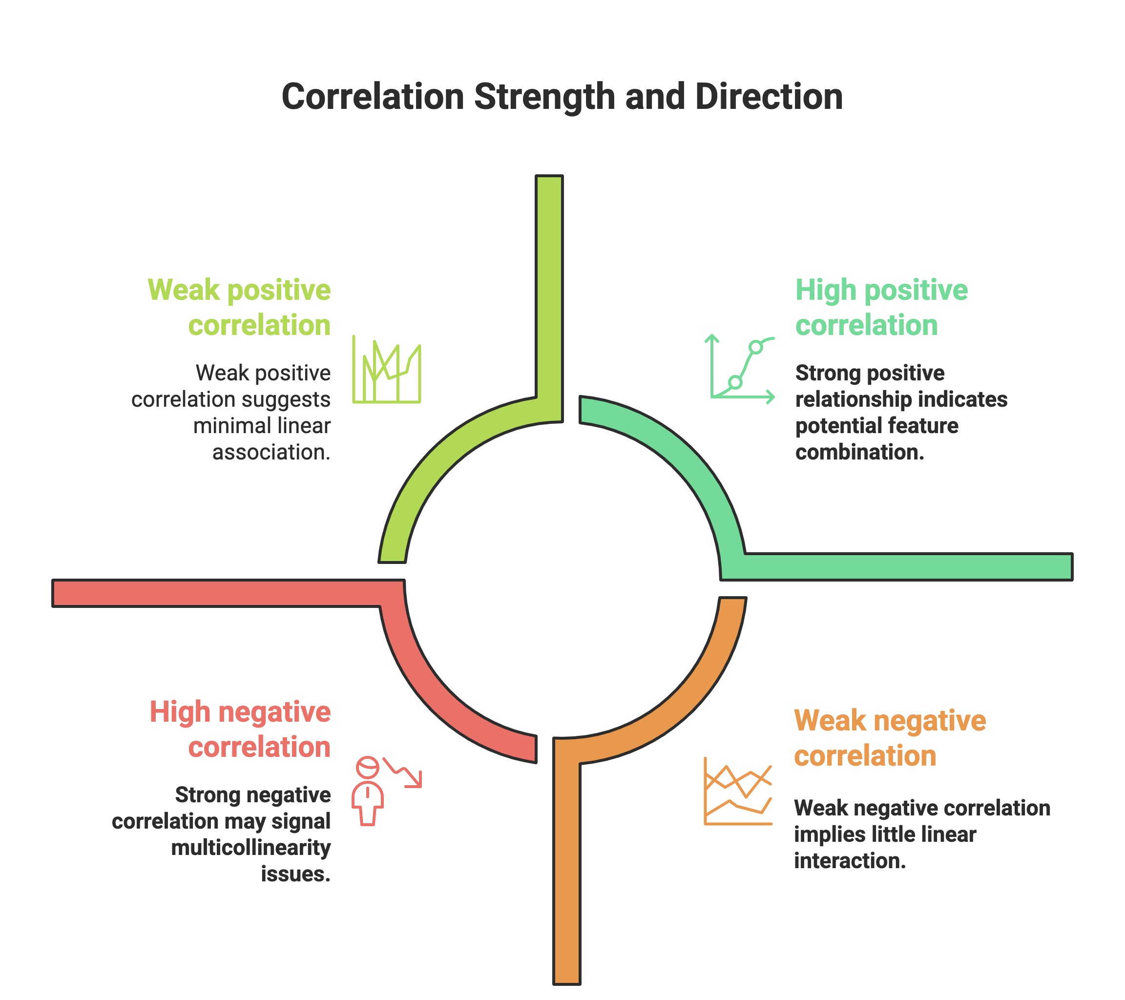
Effectively interpreting a correlation matrix is crucial for gaining insights from your data. The values within the matrix, ranging from -1 to +1, convey both the strength and the direction of the linear relationship between variable pairs.
- Strength of Relationship: The absolute value of the correlation coefficient indicates the strength of the linear association:
- Values close to 1 (positive or negative) signify a strong linear relationship.
- Values around 0.5 suggest a moderate linear relationship.
- Values close to 0 indicate a weak or no linear relationship.
- Direction of Relationship: The sign of the correlation coefficient indicates the direction of the linear association:
- A positive sign (+) means that as one variable increases, the other tends to increase.
- A negative sign (-) means that as one variable increases, the other tends to decrease.
- Identifying Strong Relationships: Look for correlation coefficients with absolute values closer to 1. These strong positive or negative correlations might suggest:
- Potential multicollinearity if these are independent variables, which could affect model stability.
- Features that might be good candidates for combination or transformation if they are related to the target variable.
- Identifying Weak Relationships: Coefficients close to 0 suggest that the variables have little to no linear association. These features might be less informative, but could still be valuable when combined with other features or in non-linear models.
- Identifying Potentially Misleading Relationships: A correlation matrix only captures linear relationships.
- Non-linear Relationships: Two variables can have a strong non-linear relationship but a correlation coefficient close to zero. Consider visualizing your data (e.g., with scatter plots) to check for such patterns.
- Spurious Correlations: A correlation between two variables might be due to a confounding third variable, rather than a direct relationship. For example, ice cream sales and crime rates might be positively correlated in summer due to warmer weather, not because one causes the other.
- Correlation vs. Causation: A strong correlation does not imply that one variable causes the other. Further investigation and domain expertise are needed to establish causality.
Become an expert in predictive modelling! Enroll in upGrad's free Logistic Regression for Beginners course today! You'll gain essential skills in Linear Regression, ROC analysis, Data Manipulation, and Data Preparation through 17 hours of comprehensive learning.
How Do We Implement Correlation Matrix Plots in Python?
You can implement correlation matrix plots in Python using libraries like seaborn and matplotlib. Matplotlib is the underlying plotting library that seaborn leverages. While you could create a correlation matrix plot directly using matplotlib functions like imshow(), pcolormesh(), or matshow(), it typically requires more code to achieve a similar level of visual clarity and information as seaborn's heatmap().
Creating a Correlation Matrix Using Pandas
Pandas, a powerful data manipulation library in Python, offers a straightforward method to compute the correlation matrix of a DataFrame using the .corr() function. This function, by default, calculates the Pearson correlation coefficient between all pairs of columns.
Code example:
import pandas as pd
# Sample DataFrame
data = {'Feature_A': [1, 2, 3, 4, 5],
            'Feature_B': [2, 4, 5, 4, 6],
             'Feature_C': [5, 3, 2, 6, 1]}
df = pd.DataFrame(data)
# Calculate the correlation matrix correlation_matrix = df.corr()
print("Correlation Matrix:\n", correlation_matrix)
Output:
Correlation Matrix:
Feature_A Feature_B Feature_C
Feature_A 1.000000 0.866025 -0.707107
Feature_B 0.866025 1.000000 -0.500000
Feature_C -0.707107 -0.500000 1.000000
Explanation:
The output is a DataFrame representing the correlation matrix. Each cell shows the Pearson correlation coefficient between the corresponding pair of features. For instance, the correlation between 'Feature_A' and 'Feature_B' is approximately 0.87, indicating a strong positive linear relationship. The diagonal values are 1 because each feature is perfectly correlated with itself.
Eager to master the fundamentals of data analysis in Python? Kickstart your journey with upGrad's Python Libraries: NumPy, Matplotlib, and Pandas course! In 15 hours, you'll learn crucial NumPy, Vectors, Pandas, and Python Programming skills.
Visualizing With Seaborn Heatmap
Seaborn, a Python data visualization library built on Matplotlib, provides a convenient way to create visually appealing heatmaps of correlation matrices. Heat maps help quickly identify patterns of correlation through color intensity.
Code Example:
import seaborn as sns
import matplotlib.pyplot as plt
import pandas as pd
# Sample DataFrame (same as above)
data = {'Feature_A': [1, 2, 3, 4, 5],
        'Feature_B': [2, 4, 5, 4, 6],
        'Feature_C': [5, 3, 2, 6, 1]}
df = pd.DataFrame(data)
correlation_matrix = df.corr()
# Create a heatmap
sns.heatmap(correlation_matrix, annot=True, cmap='coolwarm', fmt=".2f")
plt.title('Correlation Matrix Heatmap')
plt.show()
Output:
-2bb692b5c21544c3a155c1d851796fb9.png)
Explanation:
The sns.heatmap() function takes the correlation matrix as input.
- annot=True displays the correlation values on the heatmap cells.
- cmap='coolwarm' sets the color map. 'coolwarm' is a common choice for correlation as it visually distinguishes between positive and negative correlations.
- fmt=".2f" formats the correlation values to two decimal places.
- plt.title() sets the title of the plot.
- plt.show() displays the heatmap.
Filtering Highly Correlated Features With Code
Removing highly correlated features to reduce redundancy and potential multicollinearity in machine learning pipelines is often beneficial. The following code identifies and drops one feature from each pair that correlates with a specified threshold (e.g., 0.85).
Code example:
import pandas as pd
import numpy as np
# Sample DataFrame (replace with your actual data)
data = {'Feature_1': [1, 2, 3, 4, 5],
             'Feature_2': [2, 4, 5, 4, 6],
              'Feature_3': [5, 3, 2, 6, 1],
               'Feature_4': [1.8, 3.5, 4.8, 3.7, 5.2]}
df = pd.DataFrame(data)
correlation_matrix = df.corr().abs()
upper = correlation_matrix.where(np.triu(np.ones(correlation_matrix.shape), k=1).astype(bool))
to_drop = [column for column in upper.columns if any(upper[column] > 0.85)]
df_filtered = df.drop(columns=to_drop)
print("Original DataFrame shape:", df.shape)
print("Filtered DataFrame shape:", df_filtered.shape)
print("Features dropped:", to_drop)
print("Filtered DataFrame:\n", df_filtered)
Output:
Original DataFrame shape: (5, 4)
Filtered DataFrame shape: (5, 3)
Features dropped: ['Feature_2']
Filtered DataFrame:
Feature_1 Feature_3 Feature_4
0 1 5 1.8
1 2 3 3.5
2 3 2 4.8
3 4 6 3.7
4 5 1 5.2
Explanation:
- The code calculates the absolute correlation matrix to consider both positive and negative strong correlations.
- np. triu creates an upper triangle mask of the correlation matrix to avoid checking the same pair of features twice.
- It then identifies columns where the absolute correlation with another column in the upper triangle exceeds the threshold (0.85).
- Finally, it drops these identified columns from the DataFrame, resulting in df_filtered, which contains a reduced set of less correlated features. In this example, 'Feature_2' was highly correlated with 'Feature_1' and was dropped.
Also Read: Python Modules: Explore 20+ Essential Modules and Best Practices
Now that we understand how to calculate and visualize these relationships, we can examine practical applications of correlation in machine learning workflows.
Applying Correlation Matrices in Machine Learning Pipelines
Beyond exploration, correlation matrices are crucial for ML pipelines, guiding feature selection to reduce redundancy and inspiring feature engineering. They also inform model choice and aid in interpreting model behavior by revealing feature relationships, ultimately leading to more effective models.
Feature Selection Using Correlation Thresholds
One of the most direct applications of correlation matrices in a machine learning pipeline is feature selection. By identifying and removing highly correlated features, you can reduce the dimensionality of your dataset, potentially leading to more straightforward, more interpretable, and less overfit models.
The process typically involves setting a threshold for the correlation coefficient. One can be removed if two features correlate at this threshold (in absolute value).
Practical Example: Dropping Redundant Features Before Training:
- Consider a dataset with features 'Temperature in Celsius' and 'Temperature in Fahrenheit'. These two features are perfectly linearly correlated. Including both in your model would be redundant and could lead to multicollinearity issues.
- By calculating the correlation matrix, you would observe a correlation coefficient 1 between these two features.
- If you set a threshold (e.g., 0.9), your feature selection process would identify this high correlation.
- You would then drop one of the features (e.g., 'Temperature in Fahrenheit') before training your machine learning model. This simplifies the model without losing significant information.
- Similarly, suppose you have features like 'Total Spending' and 'Number of Items Purchased', which might be positively correlated. In that case, keep 'Total Spending' as a more direct indicator of customer behavior or engineer a new feature like 'Average Spending per Item' instead.
Impact on Feature Engineering and Scaling
The insights derived from correlation analysis can also significantly inform your feature engineering and scaling strategies. Understanding how features relate can guide the creation of new, more informative features.
Feature Engineering:
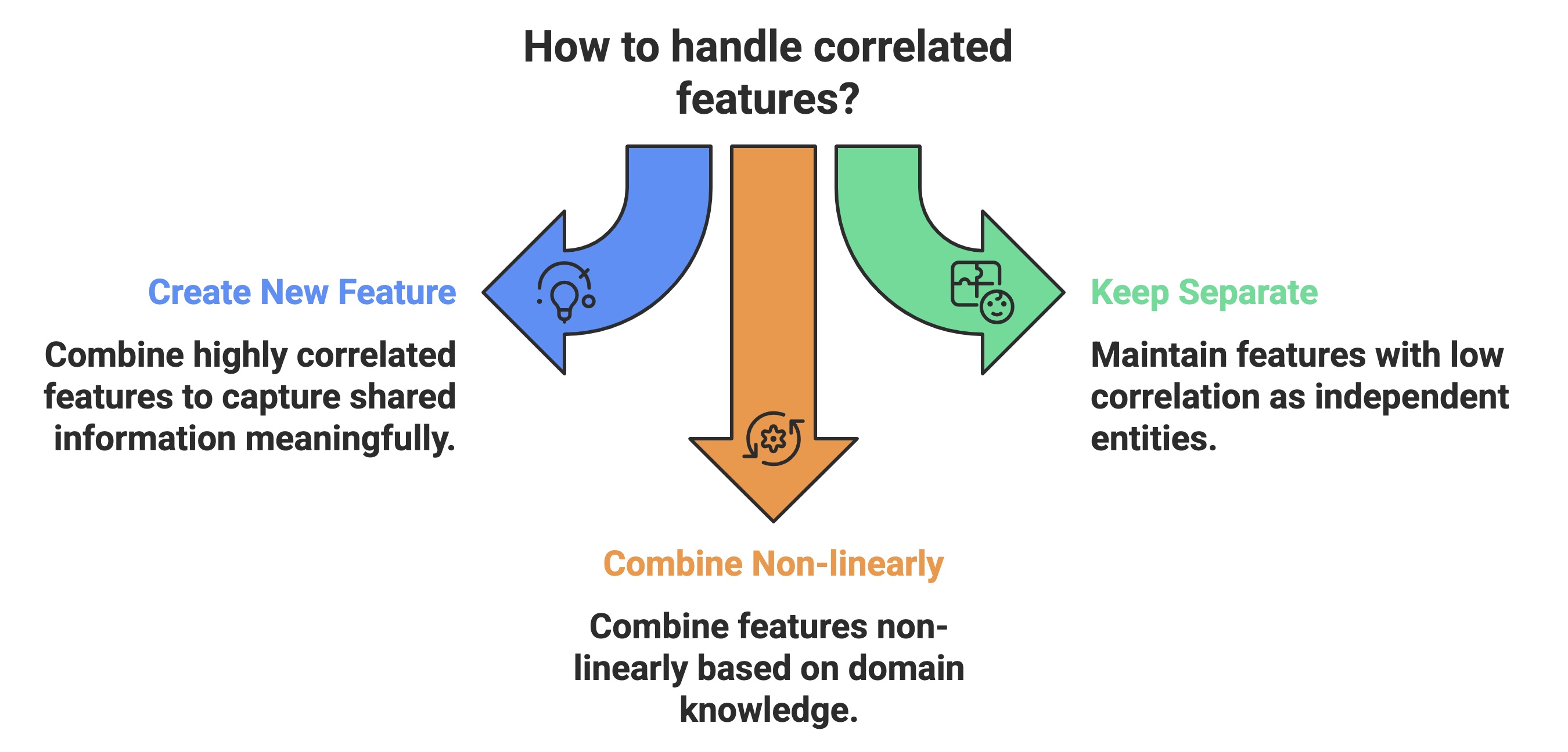
If two highly correlated features are present, create a new feature that captures the shared information more meaningfully instead of just dropping one. For example:
- If 'Height' and 'Weight' correlate, you might engineer a 'Body Mass Index (BMI)' feature.
- You might create a 'Total Spending on Related Products' feature if different spending amounts on related product categories are correlated.
- Conversely, features with low correlation represent independent aspects of the data. They should be kept as separate entities, or combined non-linearly if domain knowledge suggests an interaction.
Scaling:
Correlation analysis can indirectly influence your choice of scaling methods. For instance, if highly correlated features have very different scales, some scaling techniques might be more appropriate than others to ensure that the model doesn't give undue importance to features with larger values simply due to their scale.
However, the direct impact of correlation on the choice of scaler (e.g., StandardScaler vs. MinMaxScaler) is less pronounced than the impact of the features' distributions and the algorithm being used. Correlation primarily guides which features to scale or combine, rather than how to scale them.
How Correlation Insights Help Decide Feature Transformations or Combinations?
Understanding correlation in ML provides key guidance for the feature engineering process, specifically when deciding whether to transform individual features or combine existing ones.
- High correlation often signals shared information, suggesting combining these features into a more representative single feature or removing one might benefit model efficiency and stability.
- Conversely, features with weak correlation typically offer distinct information, warranting their retention as separate entities, although interactions might still be explored.
Furthermore, while correlation primarily captures linear relationships, examining correlated pairs can indirectly point towards non-linear patterns that could be better modelled through appropriate feature transformations.
Also Read: Top 9 Machine Learning benefits in 2025
Now, let’s take a look at some of the key limitations and best practices for correlation in ML.
Limitations and Best Practices of Correlation in ML Contexts
While correlation analysis is a valuable tool in machine learning, it's crucial to understand its inherent limitations to avoid drawing incorrect conclusions and to apply it effectively.
A fundamental principle in statistics is that correlation does not equal causation. Just because two variables tend to move together does not mean that one directly influences the other. A confounding third variable might be at play, or the relationship could be purely coincidental.
Counter Examples:
- Number of Doctors and Prevalence of Disease: A study might find a positive correlation between the number of doctors in a region and the prevalence of certain diseases. This doesn't mean that having more doctors causes more disease. Instead, areas with higher disease prevalence are more likely to attract more doctors.
- Website Engagement Metrics and Conversion Rate: Website engagement metrics like time spent on page, number of pages visited, and clicks on internal links often correlate positively with conversion rates. However, users spending more time on a page doesn't necessarily cause them to convert, and higher conversion rates don't inherently make users spend more time on a page. A significant third factor likely influences both: strong user intent, leading users to spend more time exploring relevant content and being more likely to convert.
- Missing Non-linear Dependencies: Standard correlation coefficients like Pearson's r are designed to detect linear relationships between variables. If the relationship between two variables is non-linear (e.g., quadratic, exponential), the correlation coefficient might be close to zero, even if there is a strong and consistent relationship. To illustrate this, the table below shows:
Scenario | Pearson Correlation Coefficient | Actual Relationship |
Quadratic Relationship | Close to 0 | Strong, consistent, but non-linear (quadratic) relationship exists. |
Exponential Relationship (Curved) | May be moderate, but doesn't fully capture the nature | Strong, consistent, but non-linear (exponential) relationship exists. |
Periodic Relationship (Sine Wave) | Close to 0 | Strong, consistent, but non-linear (periodic) relationship exists. |
Relationship with Outliers Driving Correlation | High or low, depending on outliers | Weak or no underlying relationship; correlation driven by outliers. |
Consistent Non-Monotonic Relationship | Close to 0 | Strong, consistent, but non-monotonic and non-linear relationship exists. |
This table illustrates that relying solely on linear correlation coefficients can lead to overlooking important relationships in your data. Visualizing variable pairs with scatter plots is crucial in correlation in ML, helping uncover non-linear dependencies that coefficients alone might miss.
Best Practices of Correlation in Machine Learning
One crucial initial step when working with datasets is visualizing the relationships between features. By creating scatter plots or pair plots, you can gain an intuitive understanding of whether the connections between variables appear linear, non-linear, or show no clear pattern. This visual exploration complements correlation analysis, helping identify potential non-linear relationships that correlation coefficients might miss.
To leverage the power of correlation analysis effectively while being mindful of its limitations, it's essential to follow certain other best practices as well:
- Feature Selection Based on Redundancy: Employ correlation coefficients to pinpoint highly correlated feature pairs. These features might provide similar information to your model. Consider removing one feature from each highly correlated pair to simplify the model, reduce dimensionality, and mitigate multicollinearity issues.
- Guidance for Feature Engineering: Leverage insights from correlation analysis to inform the creation of new features. High correlations suggest opportunities to combine existing variables into more meaningful representations, while low correlations prompt the exploration of interaction terms if domain knowledge supports such combinations.
- Importance of Visualization: Always visualize the correlation matrix in machine learning using heatmaps. This graphical view helps quickly grasp correlation strength and direction across all feature pairs compared to solely examining numerical values. Color intensity and hue can quickly highlight significant relationships.
- Setting Appropriate Correlation Thresholds: When using correlation for feature selection, establish a threshold to determine which correlations are considered high enough to warrant action (e.g., feature removal). While an absolute value of 0.8 is a common starting point, this threshold should be flexible and adjusted based on the specific dataset, the learning task, and expert knowledge. Experiment with different thresholds and evaluate their impact on model performance.
- Beyond Linear Relationships: Recognize that standard correlation measures like Pearson's primarily capture linear relationships. Always supplement correlation analysis with visualization techniques, such as scatter plots, to identify potential non-linear relationships between variables that correlation coefficients might miss.
- Distinguishing Correlation from Causation: Understand that correlation does not imply causation. Observing that two variables move together does not mean one causes the other. Avoid making causal inferences based solely on correlation analysis; further investigation and domain expertise are necessary to establish causality.
- Considering Complex Interactions: Correlation analysis typically examines pairwise relationships between variables. It might not reveal complex interactions involving three or more features. Explore other techniques if you suspect higher-order interactions are essential for your model.
- Appropriate for Numerical Data: Understand that correlation matrices, particularly those using Pearson's coefficient, are best suited for continuous numerical data. When dealing with categorical variables, employ alternative methods like chi-squared tests or measures of association to assess relationships.
- Temporal Data Considerations: Standard correlation measures might not adequately capture dependencies in time series data. Consider using specialized techniques such as autocorrelation and cross-correlation to analyze relationships within time-dependent data.
Integrating these practices ensures more robust insights from correlation in ML, helping drive cleaner data and stronger model results.
Also read: Top Differences Between Correlation and Regression
Conclusion
Mastering correlation in machine learning is key for any practitioner looking to optimize feature selection and model interpretability. By computing and interpreting correlation matrices, you'll gain crucial insights into feature relationships, enabling informed decisions for feature selection and engineering. Remember to consider the type of correlation, avoid inferring causation, and visualize potential non-linear patterns.
Achieve your potential in this critical area of machine learning with these additional industry-relevant courses by upGrad:
- Artificial Intelligence in the Real World
- Learn Basic Python Programming
- Fundamentals of Deep Learning and Neural Networks
For personalized guidance on which program best suits your career goals, contact our expert counselors. You can also visit our offline career counseling centers for aan in-person experience!
FAQs
1. How can understanding correlation help improve the performance of my machine learning models?
Understanding correlation is crucial for improving model performance as it allows you to identify and handle feature redundancy (multicollinearity). Highly correlated features can lead to unstable model coefficients and reduced interpretability. By removing or combining such features, you can often build simpler, more robust models that generalize better to unseen data. Additionally, analyzing the correlation between features and the target variable can guide feature selection, helping you focus on the most relevant predictors.
2. Are there any scenarios where a high correlation between features benefits machine learning?
While high correlation often indicates redundancy, there might be specific scenarios where it could be leveraged. For instance, in some cases, highly correlated features represent different aspects of the same underlying concept, and keeping both (or combining them thoughtfully) could provide more robust information to the model, especially if one feature is noisy or has missing values. However, this needs careful consideration and often depends on the specific algorithm and domain.
3. If two features correlate close to zero, does it mean they are entirely unrelated?
Not necessarily. A correlation coefficient close to zero indicates a lack of a linear relationship between the two features. They could still be related in a non-linear fashion. Visualizing the data (e.g., using scatter plots) is essential to check for non-linear patterns. Additionally, these features might interact with other variables in a way that makes them essential for the model, even if their pairwise linear correlation is low.
4. How do I decide on an appropriate correlation threshold for feature selection?
Choosing the right correlation threshold for feature selection is not a one-size-fits-all approach. A common starting point is an absolute value of 0.8, but this should be adjusted based on the specific dataset, the number of features, and the goals of your modeling task. A higher threshold will result in fewer features being removed, while a lower threshold will lead to a more aggressive reduction. It's often beneficial to experiment with different thresholds and evaluate their impact on model performance using cross-validation.
5. Can correlation analysis help identify the most essential features in my dataset?
While correlation analysis can show the linear relationship between individual features and the target variable, it doesn't directly indicate feature importance in the context of a specific model. A feature with a high correlation to the target might not be the most important in a complex model with interactions. Techniques like feature importance from tree-based models or coefficient analysis in linear models provide a more direct assessment of feature importance for prediction.
6. What are some common mistakes to avoid when using correlation analysis in machine learning?
One common mistake is assuming causation from correlation. Another is relying solely on linear correlation and ignoring potential non-linear relationships. Additionally, blindly removing highly correlated features without considering their relevance or potential interactions can lead to information loss. It's also important to remember that correlation is sensitive to outliers, which can artificially inflate or deflate correlation coefficients.
7. Are the methods for calculating correlation (Pearson, Spearman, Kendall) equally suitable for all data types?
No, the suitability of each correlation method depends on the type and distribution of your data. Pearson correlation is best for linear relationships between continuous, normally distributed data. Spearman correlation is suitable for monotonic relationships and is less sensitive to outliers, making it useful for ordinal or non-normally distributed data. Kendall correlation is another non-parametric measure focused on the similarity of rankings and is often preferred for smaller datasets or data with many ties.
8. How does the size of my dataset affect the reliability of correlation coefficients?
With larger datasets, correlation coefficients tend to be more stable and provide a more reliable estimate of the true linear relationship between variables in the population. In smaller datasets, correlation coefficients can be more susceptible to random fluctuations and might not accurately reflect the underlying relationship. Therefore, it's important to be more cautious when interpreting correlations derived from small samples.
9. Can I use correlation analysis for categorical features in my dataset?
Standard correlation methods like Pearson, Spearman, and Kendall are designed for numerical data. To assess relationships between categorical features, you need to use different techniques such as chi-squared tests, Cramer's V, or other measures of association for categorical variables. These methods evaluate the statistical dependence between the categories of the variables.
10. How should I approach correlation analysis in a time series dataset?
Standard pairwise correlation analysis might not fully capture the temporal dependencies inherent in time series data. Consider using techniques like autocorrelation (correlation of a variable with its past values) and cross-correlation (correlation between two different time series at various lags) for time series. These methods help identify lagged relationships and temporal patterns that standard correlation might miss.
11. Besides feature selection, are there other ways correlation matrices can be useful in a machine learning project?
Yes, beyond feature selection, correlation matrices can be valuable for: Data Understanding: Providing a quick overview of feature relationships during exploratory data analysis.Identifying Potential Issues: High correlations among independent variables can signal potential multicollinearity issues that must be addressed.Guiding Feature Engineering: Suggesting which features might be good candidates for combination or transformation.Model Interpretation: Helping to understand how different features relate to each other, which can help interpret model coefficients or feature importance. Data Understanding: Providing a quick overview of feature relationships during exploratory data analysis. Data Understanding: Providing a quick overview of feature relationships during exploratory data analysis. Identifying Potential Issues: High correlations among independent variables can signal potential multicollinearity issues that must be addressed. Identifying Potential Issues: High correlations among independent variables can signal potential multicollinearity issues that must be addressed. Guiding Feature Engineering: Suggesting which features might be good candidates for combination or transformation. Guiding Feature Engineering: Suggesting which features might be good candidates for combination or transformation. Model Interpretation: Helping to understand how different features relate to each other, which can help interpret model coefficients or feature importance. Model Interpretation: Helping to understand how different features relate to each other, which can help interpret model coefficients or feature importance.


upGrad Learner Support
Talk to our experts. We are available 7 days a week, 10 AM to 7 PM
Indian Nationals
Foreign Nationals