Power BI Dashboard: Complete Guide
By Sriram
Updated on Jul 08, 2026 | 12 min read | 3.33K+ views
Share:

All courses
Certifications
More
By Sriram
Updated on Jul 08, 2026 | 12 min read | 3.33K+ views
Share:
Table of Contents
Quick Overview
This guide covers everything you need to know about a Power BI dashboard, from the basics to design best practices, common problems, and use cases across different teams.
Understanding AI concepts is only the first step toward building a successful career in this field. Explore AI courses offered by upGrad and compare programs designed to help you develop practical, industry-ready skills.
Popular AI Programs
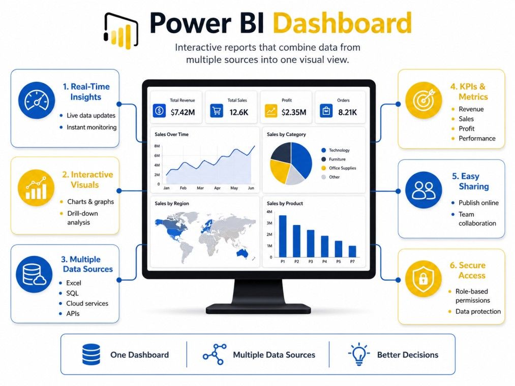
A Power BI dashboard is a single page made up of visuals, charts, and numbers pulled from one or more reports. Think of it as a summary screen. It gives you the big picture at a glance, without forcing you to click through pages of data.
Each visual on a dashboard is called a tile. You can pin tiles from different reports onto one dashboard, even if those reports use different data sources. That's what makes dashboards so useful for teams that need a quick daily or weekly snapshot.
Here are the core features that define a Power BI dashboard:
Similar Read: Power BI Tutorial: Components, Usage, Operation.
This is probably the most searched confusion around power BI dashboards. Here's a simple breakdown:
Aspect |
Dashboard |
Report |
| Pages | Single page | Can have multiple pages |
| Source | Pulls tiles from one or more reports | Built from one dataset |
| Interactivity | Limited, mostly click to open source report | Highly interactive, filters and slicers work directly |
| Purpose | Quick overview | Deep dive analysis |
| Created in | Power BI Service only | Power BI Desktop or Service |
In short, a report is where the detailed analysis happens. A dashboard is where you go to see the summary of that analysis.
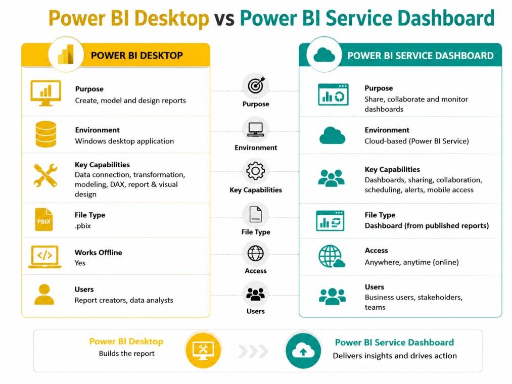
Another common point of confusion is Desktop versus Service. Here's the clear answer: you cannot build a dashboard in Power BI Desktop. Dashboards only exist in Power BI Service, the cloud based platform.
Power BI Desktop is where you build reports, model data, and create visuals. Once you publish that report to Power BI Service, you can then pin visuals from it to build a dashboard. So the workflow is always Desktop for reports, then Service for dashboards.
Free Courses
Seeing real examples makes the concept click faster than any definition. Power BI dashboard examples usually fall into a few common categories depending on what a business needs to track.
Some of the most common Power BI sample dashboards include:
Microsoft also provides free Power BI dashboard templates through their sample datasets, which are a good starting point if you want to explore before building your own from scratch.
AI Courses to upskill
Explore Artificial Intelligence Courses for Career Progression
Templates save a lot of time, especially for beginners. A Power BI dashboard template usually comes with pre-built visuals, a defined color theme, and placeholder data that you can replace with your own.
Where to find good templates:
Using a template doesn't mean your dashboard has to look generic. You can still customize colors, layout, and visuals to match your brand or specific reporting needs.
A small detail that makes a big visual difference is the background. You can add a power BI dashboard background image to give it a more polished, branded look. Go to the dashboard settings, select a custom image, and adjust the tile transparency so your visuals remain readable against the background.
Themes work the same way. Power BI lets you apply a consistent color theme across all visuals in one click, either using built in themes or uploading a custom JSON theme file that matches your company's brand colors.
A Power BI dashboard can only take you as far as your ability to turn data into strategic decisions. If you're looking to lead in an AI-first world, IIM Kozhikode Strategic AI for Business Professionals - Leadership for an AI-First World offered by upGrad is built to help you get there.
Now for the part most people actually search for: how to create a Power BI dashboard step by step.
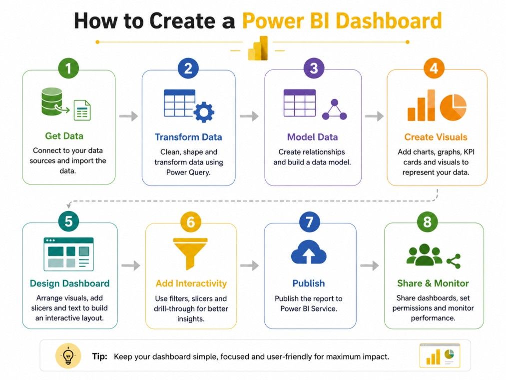
Here is the general process for how to create dashboard in Power BI:
If you're starting with nothing, here's a more detailed walkthrough for how to build a Power BI dashboard from scratch:
Step 1: Open Power BI Desktop and import data. You can connect to Excel files, SQL databases, SharePoint, or dozens of other sources under Get Data.
Step 2: Clean and shape your data. Use Power Query Editor to remove duplicates, fix column types, and merge tables if needed.
Step 3: Build relationships between tables if you're using multiple data sources. This is essential for accurate calculations later.
Step 4: Create visuals on the report canvas. Start with the metrics that matter most, like total sales or monthly growth.
Step 5: Add filters and slicers so users can interact with the data without needing you to build a new report each time.
Step 6: Publish to Power BI Service using the Publish button in Desktop.
Step 7: Create a new dashboard in the Service, then pin the visuals you want from your published report.
Use this quick reference to navigate Power BI dashboards, create visualizations, and analyze data with confidence.
Task |
Where to Do It |
| Connect data | Power BI Desktop |
| Build visuals | Power BI Desktop |
| Create dashboard | Power BI Service |
| Pin visuals to dashboard | Power BI Service |
| Set refresh schedule | Power BI Service settings |
| Share with team | Power BI Service |
A Power BI dashboard is only as good as the data behind it. Common Power BI dashboard data sources include:
You can combine multiple sources into a single report, which then feeds into your dashboard tiles.
Filters and slicers let users narrow down what they see without changing the whole dashboard. On a dashboard specifically, filtering is more limited than on a report. Most filtering happens at the report level and is reflected when you click into a tile.
If you need users to filter data directly in the dashboard view, consider using a Power BI app instead, which allows for more interactivity across pages.
Picking the right visual type matters more than people realize. A wrong chart type can make simple data look confusing. Common Power BI dashboard visuals types include:
Power BI dashboard KPIs are visuals that show a value against a goal, along with a trend indicator. They are useful for at-a-glance performance tracking, like whether sales are on target for the month or falling behind.
To set one up, you need three things: a value, a goal, and a trend axis such as date. Power BI then shows whether you're above or below target using color-coded indicators.
Nobody wants to look at old numbers. A Power BI dashboard refresh schedule determines how often your data updates automatically. In Power BI Service, go to your dataset settings and configure scheduled refresh, up to eight times a day on shared capacity, or more frequently on premium capacity.
For truly live data, you can use DirectQuery or streaming datasets instead of scheduled refresh.
Subscribe to upGrad's Newsletter
Join thousands of learners who receive useful tips
Good data means nothing if the dashboard is hard to read. Following Power BI dashboard design best practices ensures people actually use what you built.
Here are practices that consistently work:
Many people check dashboards from their phones. Power BI dashboard mobile view lets you rearrange tiles specifically for smaller screens, separate from the desktop layout.
To set this up, open your dashboard, click Edit, then switch to Mobile Layout. Drag tiles into a single-column order based on priority. The most important metric should always sit at the top.
People often want to know how Power BI stacks up against other tools before committing to it. Here's how a power BI dashboard compares to popular alternatives.
Power BI and Excel dashboards both visualize data, but they differ significantly in interactivity, scalability, and real-time analytics capabilities.
Factor |
Power BI Dashboard |
Excel Dashboard |
| Data volume | Handles millions of rows | Struggles beyond a few hundred thousand rows |
| Refresh | Automated scheduled refresh | Mostly manual refresh |
| Sharing | Cloud based, easy sharing | File based, harder to keep versions in sync |
| Learning curve | Moderate | Low, familiar to most users |
| Visual variety | Wide range of interactive visuals | Limited to charts and pivot tables |
Excel is still great for quick, one-off analysis. But for anything recurring or shared across a team, a Power BI dashboard scales much better.
Power BI and Tableau are leading business intelligence tools, but they differ in data visualization, ease of use, integration, and pricing.
Both are distinguished tools, and the right one often depends on your existing tech stack.
For most business teams already in the Microsoft ecosystem, a Power BI dashboard is often the more practical and cost-effective choice.
Report Builder (Paginated Reports) is a separate tool meant for print ready, pixel perfect reports like invoices or regulatory documents. A Power BI dashboard is meant for interactive, at-a-glance monitoring instead. They serve different purposes and often get used together within the same organization.
Also Read: Difference between Tableau and Power BI
Even well built dashboards run into issues. Here are the most common ones and how to fix them.
If your Power BI dashboard is not refreshing, check these first:
When Power BI dashboard filters aren't working as expected, it's usually because filtering behaves differently on a dashboard than in a report.
A slow Power BI dashboard is usually a data model problem, not a Power BI problem. Common fixes:
Different teams use dashboards differently. Here's how a Power BI dashboard fits specific roles.
If you're new to this, start small. Build a dashboard that tracks a single metric you understand well, such as weekly sales or website visits. Get comfortable with pinning tiles and refreshing data before adding complexity. Microsoft's free sample datasets are a great way to practice without needing your own data first.
A Power BI dashboard for a sales team usually tracks pipeline value, win rate, deals closed this month, and performance by rep or region. It replaces the need for manual weekly sales reports and gives managers a live view of where the team stands against targets.
Finance teams use dashboards to monitor cash flow, budget variance, accounts receivable, and expense trends. Since finance data is often sensitive, row-level security is commonly applied so different stakeholders only see what's relevant to them.
Executive dashboards stay high level by design. They typically show revenue, growth rate, customer acquisition cost, and a handful of company wide KPIs. Executives usually don't need drill down detail, they need a fast read on business health.
For a power BI dashboard tailored to a small business, keep it simple: track cash flow, sales, and top expenses. Small businesses often benefit most from combining a few key metrics into one view rather than building multiple complex reports.
HR teams use dashboards to track headcount, attrition, time-to-hire, and diversity metrics. This helps leadership spot trends like rising turnover before they become bigger problems.
Power BI Dashboard pricing varies by plan, offering options for individuals, teams, and enterprises with different collaboration and analytics capabilities.
Choosing the right pricing tier depends on your data size, sharing needs, refresh frequency, and advanced BI requirements.
Plan |
Cost |
What You Get |
| Power BI Desktop | Free | Build reports, connect data, create visuals |
| Power BI Free (Service) | Free | Personal use, limited sharing |
| Power BI Pro | ₹ 1,165.00 user/month, paid yearly
|
Full sharing, collaboration, scheduled refresh |
| Power BI Premium | ₹ 1,995.00 user/month, paid yearly |
Larger datasets, faster refresh, advanced AI features |
You can build and explore reports in Power BI Desktop at no cost. But if you want to share a Power BI dashboard with your team or organization, you'll need at least a Pro license for most users involved. Power BI dashboard pricing scales based on team size and the features you need, so it's worth checking Microsoft's current plans before committing.
A Power BI dashboard is one of the simplest ways to turn scattered data into something people can actually act on. Whether you're building your first one as a beginner or refining an executive-level view, the basics stay the same: clean data, clear visuals, and a layout that makes sense at a glance.
Start small, learn the difference between a dashboard and a report, and build from there. Once you get comfortable pinning tiles and setting up refresh schedules, creating your next dashboard gets a lot faster.
Want personalized guidance on Artificial Intelligence and upskilling? Speak with an expert for a free 1:1 counselling session today.
Not really. The basics, like connecting data and pinning tiles to a power BI dashboard, can be picked up in a few days. What takes longer is mastering DAX formulas and data modeling. Most beginners get comfortable within a few weeks of regular practice.
Yes, Power BI is one of the more self-learning friendly tools out there. Microsoft's free documentation, YouTube tutorials, and sample datasets cover almost everything you need. Building a small power BI dashboard on your own data is usually the fastest way to actually learn it.
Excel works fine for one-off analysis, but it struggles with large datasets and doesn't refresh automatically. A power BI dashboard handles millions of rows, updates on a schedule, and is far easier to share across a team without version control issues.
No, AI is being built into Power BI rather than replacing it. Features like Copilot help generate visuals and suggest layouts, but someone still needs to understand the business context, validate the data, and design the Power BI dashboard around what the team actually needs.
A Power BI app is a packaged collection of dashboards and reports meant for easier distribution across an organization. A single dashboard is a single page, while an app can bundle multiple dashboards and reports for a specific team or department.
No, Power BI does not support real-time collaborative editing like Google Docs. Only the dashboard owner or someone with edit access can make changes, and changes are saved once completed rather than simultaneously by multiple users.
A good power BI dashboard design keeps things simple: one screen, a limited color palette, and the most important number placed where the eye lands first. Clear labels and consistent fonts also matter more than adding extra charts that don't add value.
Yes, Power BI has a dedicated mobile app for iOS and Android. You can view dashboards on the go, and if you've set up a mobile layout, tiles will display in an optimized single column format for smaller screens.
There isn't a strict limit on the number of dashboards within a workspace, but practical limits depend on your license type and how your organization structures workspaces. Most teams organize dashboards by department or project instead of creating too many in one place.
Yes, Microsoft has integrated Copilot features into Power BI that can help generate visuals, summarize data, and even suggest report layouts based on natural language prompts. This is especially helpful for beginners who aren't sure where to start.
Yes, many developers and analysts upload their power BI dashboard files, including pbix files and sample datasets, to GitHub repositories. Searching GitHub for specific project types, like "Power BI sales dashboard," is a good way to see how others structured their reports and data models.
727 articles published
Sriram K is a Senior SEO Executive with a B.Tech in Information Technology from Dr. M.G.R. Educational and Research Institute, Chennai. With over a decade of experience in digital marketing, he specia...
Speak with AI & ML expert
By submitting, I accept the T&C and
Privacy Policy
Top Resources
Master's Degree
18 Months
Executive Diploma
12 Months
IIIT Bangalore
Executive Programme in Generative AI & Agentic AI for LeadersIndia’s #1 Tech University
Dual Certification
5 Months