All courses
Agentic AI
Agentic AI
Artificial Intelligence
Degree / Exec. PG

IIIT Bangalore
Executive Diploma in Machine Learning and AI
OPJ Global University
Master’s Degree in Artificial Intelligence and Data Science
Liverpool John Moores University
Master of Science in Machine Learning & AI
Golden Gate University
DBA in Emerging Technologies with Concentration in Generative AIExecutive Certificate

IIITB & IIM, Udaipur
Chief Technology Officer & AI Leadership Programme
IIIT Bangalore
Executive Programme in Generative AI for Leaders
upGrad | Microsoft
Gen AI Foundations Certificate Program from MicrosoftupGrad | Microsoft
Gen AI Mastery Certificate for Data AnalysisupGrad | Microsoft
Gen AI Mastery Certificate for Software DevelopmentupGrad | Microsoft
Gen AI Mastery Certificate for Managerial ExcellenceOffline Bootcamps

upGrad
Data Science and AI-MLDoctorate
For All Domains
IIITB & IIM, Udaipur
Chief Technology Officer & AI Leadership Programme
Swiss School of Business and Management
Global Doctor of Business Administration from SSBM
Edgewood University
Doctorate in Business Administration by Edgewood UniversityGolden Gate University
Doctor of Business Administration From Golden Gate University
Rushford Business School
Doctor of Business Administration from Rushford Business School, SwitzerlandGolden Gate University
Master + Doctor of Business Administration (MBA+DBA)-d9bdeff6165f4eb1ba2adcebde78e961.svg)
University of Waterloo
Chief Technology and AI Officer ProgramLeadership / AI
Golden Gate University
DBA in Emerging Technologies with Concentration in Generative AIMachine Learning
Machine Learning
Data Science
Degree / Exec. PG
O.P Jindal Global University
Master’s Degree in Artificial Intelligence and Data ScienceIIIT Bangalore
Executive Diploma in Data Science & AILiverpool John Moores University
Master of Science in Data ScienceExecutive Certificate
upGrad | Microsoft
Gen AI Foundations Certificate Program from MicrosoftupGrad | Microsoft
Gen AI Mastery Certificate for Data AnalysisupGrad | Microsoft
Gen AI Mastery Certificate for Software DevelopmentupGrad | Microsoft
Gen AI Mastery Certificate for Managerial ExcellenceupGrad | Microsoft
Gen AI Mastery Certificate for Content CreationOffline Bootcamps
upGrad
Data Science and AI-MLupGrad
Data AnalyticsMBA
Masters

Paris School of Business
Master of Science in Business Management and TechnologyO.P.Jindal Global University
MBA (with Career Acceleration Program by upGrad)Edgewood University
MBA from Edgewood UniversityO.P.Jindal Global University
MBA from O.P.Jindal Global UniversityGolden Gate University
Master + Doctor of Business Administration (MBA+DBA)Executive Certificate

IMT, Ghaziabad
Advanced General Management ProgramMarketing
Executive Certificate
Offline Bootcamps
upGrad
Digital MarketingManagement
Degree
O.P Jindal Global University
MSc in International Accounting & Finance (ACCA integrated)Paris School of Business
Master of Science in Business Management and Technology
Golden Gate University
Master of Arts in Industrial-Organizational PsychologyExecutive Certificate

IIM Kozhikode
Human Resource Analytics Course from IIM-KupGrad | Microsoft
Gen AI Foundations Certificate Program from MicrosoftEducation
Education

Northeastern University
Master of Education (M.Ed.) from Northeastern UniversityEdgewood University
Doctor of Education (Ed.D.)Edgewood University
Master of Education (M.Ed.) from Edgewood UniversityCertifications
Project Management
Certification

Knowledgehut
Leadership And Communications In ProjectsKnowledgehut
Microsoft Project 2007/2010-ae8d039bbd2a41318308f8d26b52ac8f.svg)
Knowledgehut
Financial Management For Project ManagersKnowledgehut
Fundamentals of Earned Value Management (EVM)Knowledgehut
Fundamentals of Portfolio ManagementKnowledgehut
Fundamentals of Program Management-35c169da468a4cc481c6a8505a74826d.webp&w=128&q=75)
Knowledgehut
CAPM® CertificationsKnowledgehut
Microsoft® Project 2016Certifications & Trainings
-7f4b4f34e09d42bfa73b58f4a230cffa.webp&w=128&q=75)
Knowledgehut
PMP® CertificationKnowledgehut
PMI-RMP® CertificationKnowledgehut
PMP Renewal Learning PathKnowledgehut
Oracle Primavera P6 V18.8Knowledgehut
Microsoft® Project 2013Knowledgehut
PfMP® Certification CourseKnowledgehut
Project Planning and MonitoringPrince2 Certifications

Knowledgehut
PRINCE2® FoundationKnowledgehut
PRINCE2® PractitionerKnowledgehut
PRINCE2 Agile Foundation and PractitionerKnowledgehut
PRINCE2 Agile® Foundation CertificationKnowledgehut
PRINCE2 Agile® Practitioner CertificationManagement Certifications
Knowledgehut
Project Management Masters Certification ProgramKnowledgehut
Change ManagementKnowledgehut
Project Management TechniquesKnowledgehut
Product Management Certification ProgramKnowledgehut
Project Risk Management- Study abroad
- Offline centres
- uGSOT - B.Tech
More


49. Variance in ML
Visualization in Data Mining: Techniques and Applications for Better Insights
Did you know? Data visualization techniques in data mining will significantly improve the detection of patterns and outliers, showing a 35% increase in effectiveness. This advancement, combined with visual tools like heatmaps, box plots, and decision trees, allows data scientists to identify anomalies 40% faster than relying solely on traditional statistical methods. |
Visualization in data mining helps turn complex data into clear, easy-to-understand pictures, making it easier to find patterns and draw insights. Unlike regular data visualization, which shows general information, data mining visualization is focused on exploring large datasets to uncover hidden trends and outliers.
In this blog, we will focus on visualization methods, tools, and applications, especially how it's used in data mining and machine learning to improve decision-making and insights through data visualization techniques in data mining.
Learn from top 1% global universities with upGrad's AI ML Courses. Specialize in AI, Data Science, NLP, and Deep Learning. Build skills for roles like Machine Learning Engineer and apply them to areas like data mining visualization.
Understanding Visualization in Data Mining and Its Importance
Data visualization is essential in data mining because it transforms complex datasets into visually accessible formats, allowing data scientists and analysts to quickly interpret large volumes of information. Raw data, often represented in rows of numbers, can be overwhelming and difficult to make sense of.
Without proper visualization, it would take much longer to spot meaningful patterns, if they're even possible at all. For example, a heatmap can quickly show which variables in the data are closely related, helping analysts make decisions faster and improving model evaluations.
Machine learning professionals skilled in data visualization techniques are in high demand due to their ability to handle complex data. If you're looking to develop skills in AI and ML, here are some top-rated courses to help you get there:
- Master's in Artificial Intelligence and Machine Learning
- Executive Diploma in Machine Learning and AI
- Master's Degree in Artificial Intelligence and Data Science
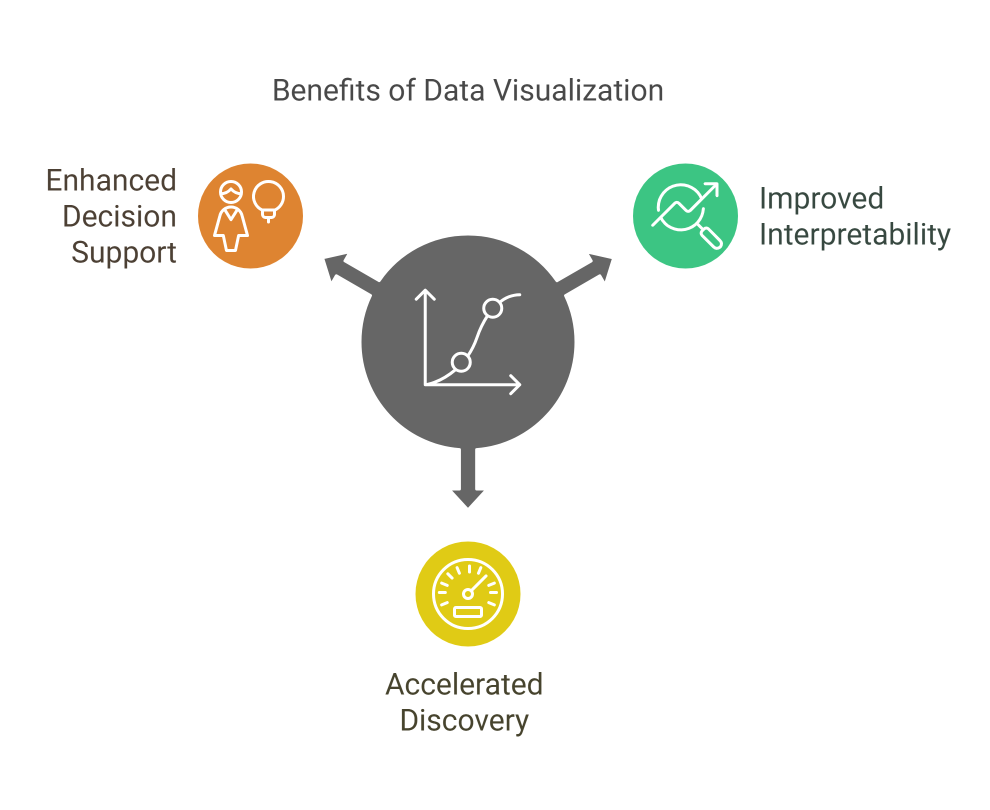
Why Visualization Matters in Data Mining:
- Improving Human Interpretability: Data mining often involves complex datasets that are difficult to analyze without visual aids. For instance, scatter plots can reveal customer segments, while heatmaps highlight variable correlations. These visuals allow quick pattern identification without deep statistical analysis.
- Speeding Up Insight Discovery: Visualization accelerates trend and anomaly detection. For example, a line chart can quickly show seasonal sales patterns, while network graphs in fraud detection highlight suspicious connections, helping teams act faster.
- Enhancing Decision Support: Clear visuals enable decision-makers to grasp complex data and make informed choices. In predictive maintenance, a time-series graph can forecast equipment failure, allowing preemptive action. Visuals bridge complex analysis and actionable outcomes, allowing for quicker, smarter decisions.
Also read: Data Visualisation: The What, The Why, and The How!
Visualization in Data Mining vs. General Data Visualization
Data visualization in data mining is different from general data visualization in terms of goals, scale, and output. While general data visualization focuses on simplifying data for broad understanding, data mining visualization dives deeper. Here's how they differ:
Aspect | Visualization in Data Mining | General Data Visualization |
Goal | Extract insights and reveal patterns in large datasets | Simplify data for easier understanding |
Scale | Focuses on large, complex datasets for deeper exploration | Can be applied to smaller or summarized datasets |
Output | Supports model evaluation, decision-making, and deeper analysis | Typically used for reports and presentations |
Also Read: Data Mining Techniques & Tools: Types of Data, Methods, Applications [With Examples]
Now that you better understand data visualization, let's explore some key techniques used in data mining.
Key Visualization Techniques in Data Mining
Datasets can be difficult to interpret by simply looking at the numbers. This is where visualization comes in. Visualization techniques help make the data clearer, allowing you to see patterns, trends, and relationships more easily. Once the data is visualized, it becomes simpler to find insights and make decisions based on the findings.
Let's examine some of the most useful visualization techniques in data mining and understand how they simplify complex data.
Dimensionality Reduction Techniques
When working with datasets that have many features, it can be difficult to visualize and analyze them directly. Dimensionality reduction techniques like PCA and t-SNE reduce the number of features, allowing you to view the data in a simpler format, such as two or three dimensions.
- Principal Component Analysis (PCA) combines correlated features into fewer components while maintaining the dataset's main characteristics. It's often used in image analysis or when working with customer data.
- t-SNE focuses on keeping similar data points together in the visual space, making it useful for spotting clusters or groups in the data.

These techniques allow you to quickly see if there are any clear patterns or groupings in your data, which would be hard to detect in a higher-dimensional space.
Clustering and Segmentation Visualizations
Clustering visualizations are used to identify groups within data based on similarities. These visual tools show how data points group together, making it easier to understand how data is structured.
- Scatter Plots are commonly used for visualizing clusters. Each point represents a data point, and when grouped, it becomes clear which points belong together.
- Dendrograms display hierarchical relationships, showing how data points merge into clusters.
- Heatmaps are great for visualizing data intensity, showing where certain values or patterns occur more frequently.
-7458d8f362794b22881bfa460ef4bfe7.png)
Graph-Based and Network Visualizations
In some cases, it's the connections between data points that matter, such as social media users, website links, or connections in a network. Graph-based visualizations show how data points are related to each other.
- Node-Link Diagrams show data points (nodes) and the relationships between them (edges).
- Force-Directed Graphs use a physical simulation to spread out the nodes and make connections more visible.
- Adjacency Matrices use tables to display relationships, particularly when there are many connections between nodes.
%20(1)-d944593690784f63a62105ab78d6053b.png)
Time Series and Trend Visualizations
Time-based data is crucial in many areas, such as sales, stock prices, or sensor data. Time series and trend visualizations allow you to track changes over time and understand the patterns in that data.
- Line Plots are the most common way to display changes in data over time.
- Area Charts show trends in the same way as line plots but add the area beneath the line, making the volume more visible.
- Seasonal Plots and Lag Plots help identify repeating patterns or relationships between different periods.
%20(1)-ea05ce2fdda44dbfab2fdb3778fb4049.png)
These visualizations allow you to answer the question, "How is the data changing over time, and what are the trends or patterns?"
If you want to learn more about statistical analysis, upGrad's free Basics of Inferential Statistics course can help you. You will learn probability, distributions, and sampling techniques to draw accurate conclusions from random data samples.
Also read: 15+ Advanced Data Visualization Techniques for Data Engineers in 2025
Now, let us examine some data visualization tools and platforms used today.
Data Visualization Tools and Platforms
Raw data can be overwhelming, and simply looking at numbers won't reveal the insights you need. That's where data visualization comes in. It turns complex data into visual formats like graphs, charts, and maps, making it easier to spot patterns, trends, and outliers.
Below are some of the most widely used tools and platforms in data mining, which help make data visualization accessible and effective. These tools allow you to quickly understand complex data and make better, more informed decisions by applying data visualization techniques in data mining effectively.
Specialized Tools for Mining Visualization:
- Orange: This is a great tool for anyone who is just starting with data mining. It provides a user-friendly, drag-and-drop interface that allows you to perform complex data analysis without writing any code. With just a few clicks, you can build data mining workflows, run machine learning models, and visualize data.

Source: Orange
- Weka: Weka is another powerful tool for exploring datasets and applying machine learning algorithms. It's great for learning and experimenting with machine learning techniques, and it includes several visualization options to help you better understand your data.
%20(1)-9753807cfff14d1880db4373f1df01a3.png)
Source: Weka
- KNIME: KNIME is an open-source platform that integrates different data mining tasks, including visualization. It's great for creating workflows that automate your data analysis process. With its wide array of tools, KNIME allows you to visualize data in many different ways, from simple charts to advanced heatmaps and scatter plots.
%20(1)-fd60281866034720a995b1730474946f.png)
Source: KNIME
Common Data Visualization Libraries in Machine Learning:
- Matplotlib: This is one of the most popular libraries in Python for creating basic visualizations like line plots, bar charts, and histograms. It's highly customizable, which means you can create exactly the type of visualization you need.
%20(1)-3bd2a7ec78f04c26b750eca9fdd76eb2.png)
Source: Matplotlib
- Seaborn: Built on top of Matplotlib, Seaborn makes it easier to create more advanced visualizations, especially when dealing with statistical data. It offers built-in themes and color palettes that make your charts look more appealing and informative.
%20(1)-d86cce8f732b4416aa3a18e0f42ccdc5.png)
Source: Seaborn
- Plotly: If you need interactive, web-ready visualizations, Plotly is a perfect tool. It allows you to create charts that users can interact with by hovering over data points, zooming in, and filtering information. This is especially useful when you're analyzing large datasets and need to explore them more deeply.
%20(1)-b66de1ab8efd4176978639a8ce6bc4f9.png)
Source: Plotly
- D3.js is a JavaScript library for creating custom, dynamic data visualizations. Unlike static charts, D3.js lets you manipulate your visualizations in real time, making it incredibly powerful for web-based applications and interactive dashboards.
%20(1)-0c7b14d83cec4004b39b9239b307a142.png)
Source: D3.js
You can get a better understanding of Python libraries with upGrad's Learn Python Libraries: NumPy, Matplotlib & Pandas. Learn how to manipulate data using NumPy, visualize insights with Matplotlib, and analyze datasets with Pandas.
Interactive vs. Static Visualizations:
- Static Visualizations: These are charts that don't change or respond to user input. They include bar charts, line plots, and pie charts. Static visualizations are great when you want to present a clear, simple picture of the data, but they don't allow the user to explore the data in detail.
- Interactive Visualizations: These types of visualizations allow users to interact with the data. For example, in Plotly, you can click on data points to get more information, zoom into specific areas of the chart, or filter out data. Interactive visualizations are especially useful when you need to explore big numbers.
%20(1)-aaef1c82409949e897ca8f0e3dbcd099.png)
Bokeh and Holoviews:
- Bokeh: Bokeh is great for creating interactive plots that can handle large datasets. It's highly customizable and lets you create beautiful, interactive visualizations that can be embedded into web applications. It's perfect for when you need to visualize big data and allow users to interact with it in real-time.
- Holoviews: Built on top of Bokeh, Holoviews makes it easier to create interactive visualizations. It is particularly useful for visualizing large datasets and creating exploratory charts that can be interacted with.
NetworkX and Graphviz:
- NetworkX: This library is used for creating and analyzing complex networks. If you're working with relationship data, like social networks or communication systems, NetworkX is perfect for visualizing connections and analyzing how different data points are related.
- Graphviz: Graphviz is used for drawing graphs and networks. It's especially useful for visualizing decision trees, organizational structures, and other hierarchical data. If you need to represent relationships between different entities, Graphviz provides a simple way to do that.
Yellowbrick and SHAP:
- Yellowbrick: Yellowbrick is a visual analysis tool designed specifically for machine learning models. It helps visualize model performance, feature importance, and residuals, making it easier to understand how your model is performing and which features are most important.
- SHAP: SHAP provides visualizations to explain machine learning models' predictions. It shows the contribution of each feature to a specific prediction, helping data scientists and stakeholders better understand how models make decisions.
%20(1)-af6ad8699fef4e47a9379ed611af9332.png)
Before presenting insights, you need to accurately assess patterns in data. This is where upGrad's free Analyzing Patterns in Data and Storytelling course can help you. You will learn pattern analysis, insight creation, the Pyramid Principle, logical flow, and data visualization. It'll help you transform raw data into compelling narratives.
Also Read: 14 Essential Data Visualization Libraries for Python in 2025
Now that you have a clearer understanding of various data visualization tools, let's explore how data visualization benefits machine learning.
How Data Visualization Supports Machine Learning in Data Mining?
In data mining, machine learning uncovers patterns and makes predictions, but even advanced algorithms require a deep understanding of the data. Data visualization is key in this process, helping data scientists explore data, select relevant features, and evaluate model performance.
Visualization tools clarify relationships within data, highlight model strengths and weaknesses, and identify areas for improvement. By supporting various stages of machine learning, data visualization enhances interpretability and makes insights more actionable..
Data Exploration and Feature Selection:
- Pattern Detection: Visualizations like scatter plots and heatmaps make it easy to spot patterns and relationships between variables, and are central to effective data visualization techniques in data mining.
- For example, a correlation heatmap can show which features are strongly related to each other, helping you select relevant features for your machine learning model.
Model Evaluation and Interpretation:
- ROC Curves: A Receiver Operating Characteristic (ROC) curve helps evaluate the performance of a classification model by showing the trade-off between sensitivity and specificity at various thresholds.
- Confusion Matrices: A confusion matrix visualizes the performance of classification algorithms by showing the true positive, false positive, true negative, and false negative values. This makes it easy to understand where the model is making errors and where it is succeeding.
- SHAP Plots: SHAP (SHapley Additive exPlanations) plots explain individual predictions in machine learning models. They show the contribution of each feature to the model's decision, making the model's behavior more interpretable.
Additional Visual Tools for Model Evaluation:
- Learning Curves: Visualizing learning curves can help understand whether a model is underfitting or overfitting. A learning curve shows the error rate on training data vs. validation data as the model is trained over time, helping to fine-tune hyperparameters.
- Precision-Recall Curves: A Precision-Recall curve helps evaluate the trade-offs between precision and recall, especially for imbalanced datasets. This is particularly useful when evaluating models for tasks like fraud detection.
- Feature Importance Plots: Feature importance plots show which features have the most impact on a machine learning model's predictions. This is helpful for understanding which variables are most influential and can be crucial in model optimization.
Also Read: Difference Between Data Mining and Machine Learning: Key Similarities, and Which to Choose in 2025
Now, let us examine some advantages and disadvantages of data visualization in data mining.
Benefits and Challenges in Visualization in Data Mining
Visualization is a powerful tool in data mining; it allows you to move beyond rows of numbers and quickly uncover trends, relationships, and patterns using proven data visualization techniques in data mining. However, like any tool, it comes with its advantages and limitations.
In this section, we'll explore the key benefits of using visualization in data mining and the challenges that can arise, especially when dealing with big or intricate data sets.
Benefits of Visualization in Data Mining:
- Easier Pattern Recognition: Visualizations, such as scatter plots and heatmaps, make it easier to identify patterns within data. For example, heatmaps can show which variables have the strongest correlations, helping you pinpoint key insights quickly.
- Improved Data Interpretation: Raw data can be difficult to interpret. Visualization allows data scientists to see trends and patterns clearly, which simplifies the interpretation process.
- Faster Decision-Making: Visualizing data immediately reveals key trends and relationships. This allows for quicker decision-making since data is easier to interpret and act on in a visual format.
- Effective Communication of Results: Sharing findings with others is simpler and more effective with visuals. Instead of presenting a table full of numbers, you can use graphs and charts that communicate insights in a way that's easy for anyone to understand, regardless of their technical background.
- Supports Exploratory Data Analysis (EDA): Visualization is an important part of the exploratory phase in data mining. It helps you explore and understand the data before diving into complex analyses, making it easier to spot issues or patterns early on.
%20(1)-f370b045bf8a4254911b49fa7d2bb371.png)
Challenges in Visualization in Data Mining
Despite its advantages, visualization in data mining comes with certain challenges, especially as datasets grow larger and more complex. Here are some common hurdles data scientists face when working with visualizations.
Visual Scalability and Data Complexity:
- When Standard Charts Are Not Enough: As data becomes larger and more intricate, basic charts like bar graphs or pie charts may not capture the complexity of the data. More advanced visualizations are often needed to represent the full range of data accurately and clearly.
Cognitive Overload and Misinterpretation:
- Risk of Overplotting: One of the most common pitfalls in visualization is overloading a chart with too much information. When too many data points or features are crammed into a single graph, it becomes hard to understand, leading to confusion rather than clarity.
- Misleading Visuals: Poorly designed charts can distort the data's true meaning. Misleading choices in scale, color, or chart type can cause viewers to draw incorrect conclusions. For example, using a non-zero axis on a bar chart can exaggerate differences, making them appear more significant than they actually are.
%20(1)-1ef634c89f0f4d9591a1361a8042ca64.png)
Other Common Challenges:
- Choosing the Right Visualization: With so many types of visualizations available, it can be difficult to choose the right one for the task at hand. Using the wrong type of chart can obscure important insights, making the data harder to interpret.
- Data Preparation: Before visualization even begins, data often needs to be cleaned and organized. This step can be time-consuming, especially when dealing with incomplete or messy data. Without proper preparation, visualizations may not accurately reflect the true data.
- Real-Time Visualization: For tasks involving real-time data, such as monitoring systems or financial data, it's crucial to have visualization tools that can handle data updates instantly. Some visualization platforms may struggle with large data volumes or real-time changes, limiting their usefulness in dynamic environments.
%20(1)-40c87ac00a5d4d4ab2d6d8239c79dbd3.png)
Practical Applications of Visualization Techniques in Data Mining
Visualization helps by turning this data into clear, easy-to-understand charts and graphs. These visuals help spot patterns, identify trends, and support better decision-making. Let's explore some real-world applications where visualization techniques are used to solve practical problems.
Business Intelligence and Customer Segmentation:
- Retail Churn: In the retail industry, customer churn (when customers stop purchasing) is a major concern. Retailers use scatter plots and heatmaps to track customer activity. For example, a retailer may observe that customers who stop buying have a decline in the number of visits over a few months. Visualizing this data helps the retailer spot the trend quickly, leading to targeted marketing efforts or customer retention strategies.
- Use Case: A clothing store uses a heatmap to identify customers who are at risk of leaving based on their spending habits and frequency of visits. They launch a special promotion targeting those customers, increasing retention by 20%.
- Telecom Churn: Telecom companies face high churn rates. Visualization tools like decision trees can help these companies identify factors that contribute to customer cancellations, such as poor customer service or high data usage. By visualizing these factors, companies can act to improve services or offer discounts to at-risk customers.
- Use Case: A telecom provider visualizes customer usage data using scatter plots and identifies high-risk users who might cancel their contracts. They offer these users personalized discounts, reducing churn by 15%.
Anomaly Detection in Fraud or Security:
- Fraud Detection: Fraud is a big issue in banking. Scatter plots and box plots are used to detect anomalies in transaction data, such as unusually high amounts or transactions from unfamiliar locations. If a customer suddenly makes a large purchase overseas, these visualizations can immediately alert fraud analysts to investigate further.
- Use Case: A bank uses box plots to visualize transaction amounts over time. A sudden, large transaction outside of the customer's typical spending pattern triggers an alert for fraud, helping prevent potential losses.
- Network Security: In network security, detecting unusual patterns in data can help identify security breaches. Network graphs visualize connections between devices, making it easier to spot abnormal connections. For example, if an employee's login credentials are used from multiple locations in a short period, it may indicate a security breach.
- Use Case: A company uses network graphs to monitor device connections. It spots a suspicious link between two devices that shouldn't be connected, triggering an investigation and preventing a potential breach.
Text and Web Mining Visualizations:
- Word Clouds: Word clouds are an effective way to visualize the most frequent words in a large text dataset. For example, a company analyzing customer feedback can use word clouds to quickly identify common complaints or positive feedback. Larger words in the cloud represent more frequent mentions, helping the company address key issues or promote popular features.
- Use Case: A customer service department uses word clouds to analyze customer feedback from surveys. The largest words in the cloud are "delivery" and "returns," helping the team focus on improving these areas.
- Topic Maps: In text mining, topic maps help represent relationships between different topics within a text corpus. For example, when analyzing customer reviews or articles, a topic map helps show how different subjects or keywords are related. This is useful for clustering similar topics together, allowing you to understand large bodies of text better and extract actionable insights.
- Use Case: A company analyzes customer feedback using topic maps and discovers that complaints about "battery life" are frequently associated with "charging issues." This insight helps the company prioritize improvements in its next product version.
- Link Graphs: In web mining, link graphs are used to map connections between different web pages or content. This can help businesses understand how their content is shared across the web, improving SEO strategies. For example, a link graph can show which blog posts or pages are getting the most backlinks, indicating which content is most valuable to visitors.
- Use Case: An e-commerce company uses link graphs to analyze how products are linked to one another across different categories. They discover that their product page for "wireless headphones" is frequently linked to "smartphones," leading them to cross-sell more effectively.
Future Trends in Data Visualization in Data Mining and Machine Learning
Data visualization is advancing rapidly, thanks to new technologies and techniques that make exploring data even easier. In the future, we'll see more powerful tools that allow users to interact with data in ways that were previously not possible. Here's a look at what's to come.
AI-Assisted Visualization:
- Auto-Generated Visuals: New AI-powered tools can now automatically generate the best types of visualizations based on the data. Instead of manually selecting the right chart, AI tools analyze the dataset and recommend the most appropriate visualization, saving time and improving the quality of insights.
- Use Case: A company uses an AI tool to analyze its sales data. The tool automatically generates a set of graphs highlighting key trends in the data, so the company can focus on interpreting the insights without spending time creating visuals.
- Smart Dashboards: Dashboards are becoming smarter, with tools that automatically adjust based on the data. They can highlight important trends or outliers as they appear in real time. This makes it easier for businesses to stay on top of key metrics without constantly checking data manually.
- Use Case: A logistics company uses a smart dashboard that automatically updates with delivery performance metrics. When a delay is detected in real-time, the dashboard highlights it, helping the company respond to issues faster.
Immersive and 3D Visualization Methods:
- Virtual Reality (VR) and Augmented Reality (AR): The future of data visualization includes VR and AR, allowing users to interact with data in a fully immersive 3D environment.
- Use Case: A marketing team uses VR to walk through a 3D map of customer behavior data, interacting with the data by zooming into specific regions or filtering by different demographics. This interactive exploration allows them to uncover insights faster.
- Spatial Interfaces: Alongside VR and AR, new spatial interfaces are emerging that allow users to interact with data through gestures, voice commands, or touch. These interfaces will enable data scientists and business users to explore data more naturally and intuitively. Instead of clicking on charts and buttons, users could manipulate the data using hand movements or by speaking commands..
- Use Case: A team of data scientists uses spatial interfaces to manipulate data visualizations with gestures. They can rotate a 3D plot of product sales data, zooming in to focus on specific regions and easily identifying trends.
You can also continue expanding your machine learning skills with upGrad, which will help you deepen your understanding of advanced ML concepts and real-life applications.
Take the Next Step for Your Career with upGrad!
By applying the right visualization techniques, businesses can uncover patterns, spot anomalies, and make faster, more informed decisions. To get the most out of your data, mastering these visualization tools is essential for effective data mining.
However, many businesses and professionals struggle to turn their complex data into meaningful insights. If you want to unlock your data's full potential, upGrad can help you develop the necessary skills and tools to succeed.
While the course covered in the tutorial can significantly improve your knowledge, here are some additional free courses to facilitate your continued learning:
- Hypothesis Testing
- Unsupervised Learning: Clustering
- Logistic Regression for Beginners
- Linear Regression - Step by Step Guide
- Introduction to Natural Language Processing
Need personalized guidance? upGrad's personalized career guidance can help you chart the right course. You can also visit your nearest upGrad center to start hands-on training today!
FAQs
1. What is data visualization in data mining?
Data visualization in data mining refers to the use of graphical representations, such as charts, graphs, and plots, to make sense of large datasets. It helps data scientists and analysts quickly spot patterns, trends, correlations, and anomalies that may not be apparent in raw data.
2. Why is data visualization important in data mining?
Data visualization simplifies complex datasets, making them easier to interpret. It enables faster decision-making, improves data exploration, and enhances communication of insights. Visualizing data helps uncover hidden patterns and supports actionable outcomes.
3. What are some key techniques used in data mining visualization?
Common techniques include: Dimensionality Reduction (PCA, t-SNE) for reducing data complexity.Clustering Visualizations (e.g., scatter plots, dendrograms) for identifying groups in data.Graph-based Visualizations for network and relationship analysis.Time Series Visualizations are used to analyze data trends over time. Dimensionality Reduction (PCA, t-SNE) for reducing data complexity. Dimensionality Reduction (PCA, t-SNE) for reducing data complexity. Clustering Visualizations (e.g., scatter plots, dendrograms) for identifying groups in data. Clustering Visualizations (e.g., scatter plots, dendrograms) for identifying groups in data. Graph-based Visualizations for network and relationship analysis. Graph-based Visualizations for network and relationship analysis. Time Series Visualizations are used to analyze data trends over time. Time Series Visualizations are used to analyze data trends over time.
4. How do visualization techniques improve decision-making?
Visualization techniques help decision-makers quickly identify important trends and outliers by providing a clear, intuitive view of complex data. This leads to more informed, data-driven decisions, saving time and improving outcomes.
5. Can visualization help in anomaly detection in data mining?
Yes, visualization is highly effective for anomaly detection. Techniques like box plots, scatter plots, and heatmaps allow analysts to visually spot outliers and irregularities in the data, which could indicate fraud, errors, or unusual behaviors.
6. How is data visualization applied in business intelligence?
In business intelligence, data visualization helps companies monitor key performance indicators (KPIs), analyze customer behavior, and predict trends. For example, retail companies can use customer segmentation visualizations to identify high-value customers and develop targeted marketing strategies.
7. What are the challenges in using data visualization in data mining?
Some challenges include: Handling large datasets: Standard charts might not work well with vast amounts of data.Cognitive overload: Overcomplicating visuals can make data harder to interpret.Misleading visuals: Poor design choices can lead to misinterpretation of data. Handling large datasets: Standard charts might not work well with vast amounts of data. Handling large datasets : Standard charts might not work well with vast amounts of data. Cognitive overload: Overcomplicating visuals can make data harder to interpret. Cognitive overload : Overcomplicating visuals can make data harder to interpret. Misleading visuals: Poor design choices can lead to misinterpretation of data. Misleading visuals : Poor design choices can lead to misinterpretation of data.
8. How does AI assist in data visualization?
AI tools can automate the process of generating appropriate visualizations for different datasets, providing instant insights, and saving time. AI can also enhance interactive dashboards, highlighting key trends and changes in real time.
9. What is the future of data visualization in data mining?
The future includes immersive technologies like virtual and augmented reality (VR/AR), which allow for 3D data exploration, and advanced AI-driven tools that automatically generate visuals and provide real-time, actionable insights.
10. Where can I learn more about data visualization in data mining?
Explore upGrad's programs in Data Science, Machine Learning, and Business Analytics to master the visualization techniques used in data mining. Courses cover essential tools and concepts for effective data exploration and analysis.


upGrad Learner Support
Talk to our experts. We are available 7 days a week, 10 AM to 7 PM
Indian Nationals
Foreign Nationals
Disclaimer
The above statistics depend on various factors and individual results may vary. Past performance is no guarantee of future results.
The student assumes full responsibility for all expenses associated with visas, travel, & related costs. upGrad does not .