


A business can have the best data analysts and researchers gathering the most useful information, but it is useless for the clients and other teammates if that information is not easily understandable. That is where data visualization comes into the picture. Data visualization allows data scientists and analysts to present their findings in a way that is easy to understand, using visual tools like graphs, charts, and such. A picture has always been worth a thousand worth, and it is more so in the domain of data science.
In simple terms, data visualization can be understood as the process of communicating and translating information using various visual aids. Visualization can also use images to express the relationships between multiple data sets. Data visualization is also known as information graphics, statistical graphics, or information visualization and is an essential step in the data science and data analysis process. Once all the required data has been collected, processed, integrated, and modeled, it comes into the picture. Data visualization also forms a part of the broader discipline of DPA – Data Presentation Architecture. This discipline aims to identify, manipulate, format, and process data in the best possible way.
Python has been one of the most useful languages for data science and analysis, especially when it comes to data visualization. Python brings you the most interactive data visualization tools. With additional libraries, Python allows you to go as specific and detailed as you want in your visualization. The most commonly used visualization libraries available with Python are:
- Matplotlib
- Seaborn
- Plotly
- GGPlot
- Geoplotlib
- Pygal
You can create different visualizations using these libraries, such as scatter plots, bar charts, pie charts, line graphs, area charts, histograms, heatmaps, and more.

Since this article is about heatmaps – more specifically heatmaps using Seaborn – let us first take a moment to understand heatmap as a data visualization aid and the situations where you must create a heatmap to represent your data.
Check out our data science training to upskill yourself
Heatmap for Data Visualization
By definition, heatmaps are graphical representations of data using color-coded systems. The most crucial purpose of heatmaps is to create a better visualization system for the volume of locations or events within a dataset to assist in the areas that matter most.
But that’s not it!
Check our US - Data Science Programs
Heatmaps are much more than that. Since they use shades of colors to communicate values, heatmaps are most commonly used to display numeric values in a more understandable format. This comes in particularly handy when dealing with huge volumes of data because colors are easier to distinguish and understand than raw numbers. Plus, heatmaps are multifaceted and can also be used to showcase ‘hot and cold’ zones on a map.
Being extremely efficient and versatile, heatmaps have become increasingly popular in the global data analysis community. But that’s just a fraction of the big picture. The real reason for the popularity of heatmaps as a data visualization tool is that while other visualizations need to be interpreted, heatmaps are inherently self-explanatory. The darker the shade of the color, the higher the value (greater the quality, tighter the dispersion, greater number of tweets, etc.). Hence, heatmaps pair wonderfully with other data visualizations to bring about much more enhanced data communications.
Talking in more technical terms, a heatmap is a rectangular plot of data as a color-coded matrix. It takes a 2D dataset as a parameter, and that dataset can be coerced into an n-dimensional array.
For example, you could use a heatmap to understand how noise pollution varies according to the time of day across various cities. Heatmaps can also observe human behavior, understand their social media usage, etc. Heatmaps are extremely useful when it comes to examining patterns in behavior. Check the below heatmap and the example that follows to understand this better:
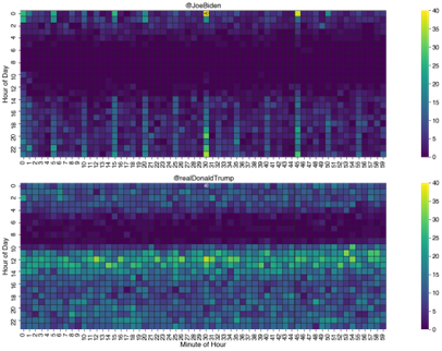
The charts in the image above contain all the components of a heatmap. As you can see, it is a grid of colored squares or bins, where each square marks the intersection of values on two axes. These variables, in our example, are the hour of the day and the minute of the day.
The squares are then colored based on how many tweets fall into the hour-minute bin. There is also a legend that shows us the relationship of various colors to the count values. In our example, lighter colors mean more tweets, and darker colors means fewer. That is why the name – heatmap.
The darker strips in the morning indicate that both the candidates didn’t tweet much before noon. Other vital insights can also be derived from the above heatmap, like:
- The second candidate tweets more frequently than the first.
- The second candidate has a sharper cut-off line at 10 AM, while the first candidate lacks such specific cut-offs.
More insights can be drawn, too. As a result, heatmaps are a good starting point for a more in-depth and sophisticated analysis. In Python, you can work with heatmaps using the Seaborn library. Let’s check out how!
Heatmaps in Python with Seaborn
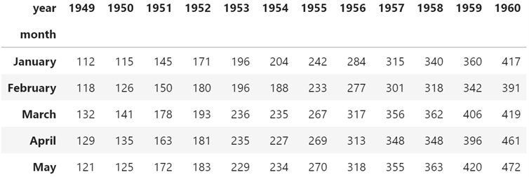
Let’s quickly go through some examples to understand how to use the Seaborn library in Python to create and customize heatmaps. First, we will need to import Seaborn and load our dataset. This is how it’s done:
import seaborn as sb
#load “flights” dataset
dataset = sns.load_dataset(“flights”)
dataset = data.pivot(“month”, “year”, “passengers”)
#view first five rows of dataset
data.head()
Now, let’s look at how to create basic heatmaps and do some modifications to them.
Read our Popular US - Data Science Articles
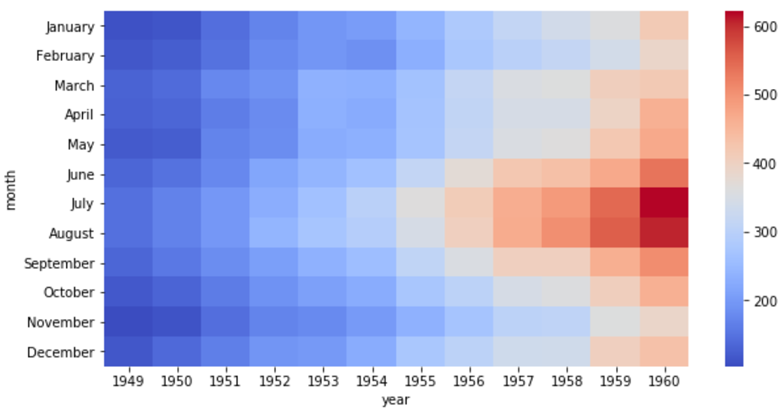
Basic heatmap
We can use the following syntax to create a basic heatmap for this dataset:
sb.heatmap(dataset)
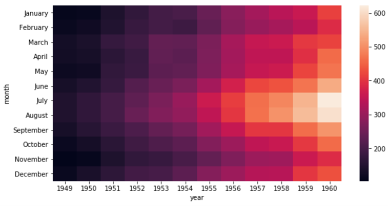
As you can see, the x-axis here displays the year, the y-axis indicates the month, and the color corresponds to the number of flights in those particular combinations.
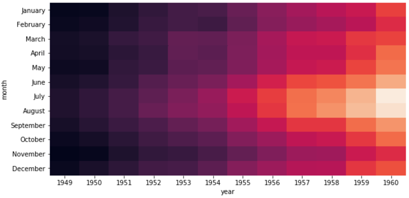
Changing the colors
The ‘cmap’ argument can be used to alter the colors. For example, if we use “cmap=Spectra”, we get the following colors in our heatmap:
sb.heatmap(data, cmap=”Spectral”)
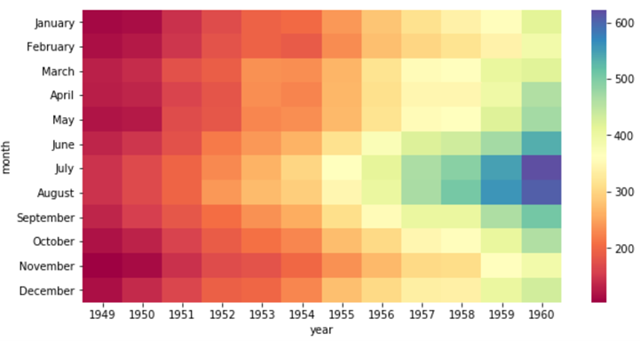
Alternatively, we could also use “coolwarm”, and we will have the results as follows:
sb.heatmap(data, cmap=”coolwarm”)
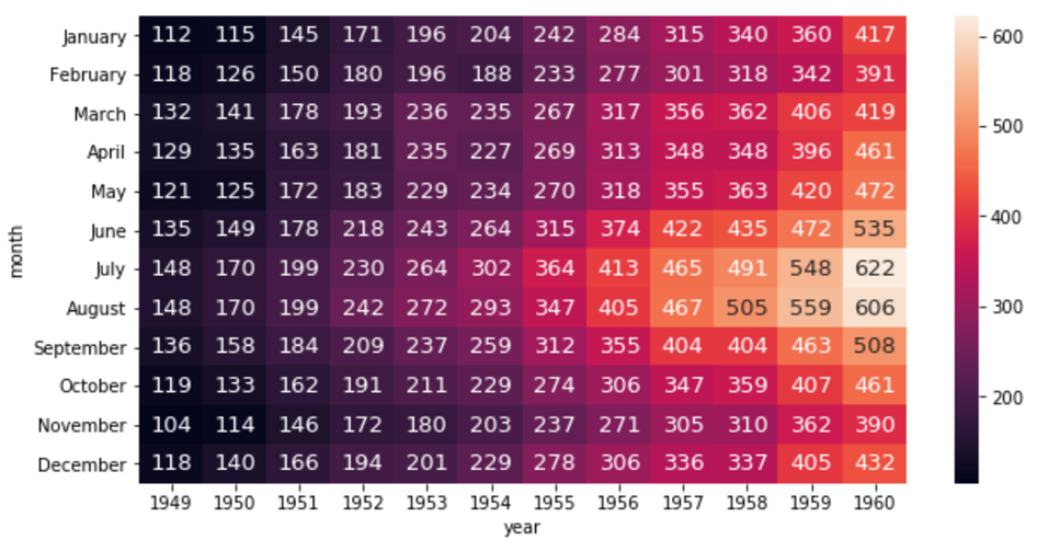
Annotating the heatmap
We can annotate each cell in the heatmap with an integer by using the following syntax:
sb.heatmap(data, annot=True, fmt=”d”, annot_kws={“size”:13})
Modifying the color bar
We can also turn the color bar off using the ‘cbar’ argument.
sns.heatmap(data, cbar=False)
In Conclusion
The world of data science and analytics is wonderful – and there is so much to learn every day. We hope this article gave you a sense of direction on how to get started with using heatmaps in Python using the Seaborn library. Feel free to explore other data visualizations and pair them with heatmaps to understand how to get the best of them all for your purpose.
Also, if you are looking for professional and expert support to guide you in this journey, check out our Professional Certificate Program in Data Science and Business Analytics. The course is designed to help you start from the very basics and develop enough concepts to work on standalone projects and applications of Data Science.


![13 Exciting Data Science Project Ideas & Topics for Beginners in US [2024]](/__khugblog-next/image/?url=https%3A%2F%2Fd14b9ctw0m6fid.cloudfront.net%2Fhttps%3A%2F%2F65.0.10.158%2Fblog%2Fwp-content%2Fuploads%2F2019%2F07%2FBlog_FI_July_upGrads-Knowledge-base.png&w=3840&q=75)

